collection1b

collection1b

March 13, 2016

The early Waterman’s ads


  , an Internet project.


Ad from David Nishimura’s “Waterman’s First Advertisement?” on his Vintage Pens website.


[Posted on L&P on Feb 11, 18, June 27, 28, 29, July 1, 2013.]
        Whenever I get a new volume of The American Stationer from Google Books, the first thing I do is strip off the pages at the beginning and end of the PDF and save the new version.  That way, page 1 of the text is the same as page 1 of the PDF, and unless the pagination gets screwed up by missing pages, or missing whole issues, the page numbering of the two is exactly the same.  It makes it very easy to navigate the text.  And since the ads for certain manufacturers are always located on the same pages in all the issues, or in every second issue, or once every month, etc., it makes it very easy to establish an algorithm for finding all the ads by a certain pen company.
        I recently used this method to look for all the Waterman’s ads.  The ads don’t start until the mid-1890s, so I filled in the 1880s and early 1890s with the Shipman’s ads, which in the early period used the “Waterman’s” name.  It took 3-4 days altogether, but I ended up with a PDF consisting of 703 images that I called “Wat Ads In Am Stat”.  I’m still missing the ads from the volumes that haven’t been digitized, yet, but even so, it’s already a great research aid for a history of the company.  The only thing better than this would be
a complete run of The Pen Prophet!  
I wonder whether Google Books will ever digitize that.  Over the years, I also collected about 61 images of 1880s, 1890s, and 1900s Waterman’s ads from Ebay, Google Books, and elsewhere on the Internet, so I added those as well.  That’s 764 pages altogether, now, contained in three 2-inch binders.  This has helped a little to fill in this early period, but we still need more images to fill in the gaps created by the missing volumes.  I added some articles, and some ads from other magazines, and the number of pages now stands at 1,167.
        Other people have found early images of Waterman’s ads.  Rob Astyk and Len Provisor posted images of four of the Waterman’s “Dapper Dandy” trade cards from 1883-84.  David Nishimura posted a
picture of the “Oldest Waterman’s Advertisement” in an article on his website, and a page from Waterman’s “Circular No.7” in a related article on the “Oldest Surviving Waterman’s Pen”.  Olle Hjort has over 50 Waterman’s ads in his Pennarkivet website.  And Simone has 200 Waterman’s ads on his Fountain Pen Wiki website, but most of them are in the modern period, after 1900.  Here’s the specific link to the Waterman’s page.  And Cliff & Judy Lawrence’s 1986 book of pen ads and their PFC magazines have hundreds of Waterman’s ads.
        Does anyone have any more Waterman’s ads to share, ads from 1883 to 1906 from magazines such as Harper’s, McClure’s, Atlantic, and the other stationers’ magazines, but especially The Century Magazine, etc.?  With Google Books placing more and more online, someone should be checking these magazines online, and especially this Ebay listing for a DVD of all the issues of
Century Magazine.  That’s the magazine for which Edward T. Howard worked as an advertising agent at the time when he became one of the directors in Waterman’s company in the early 1880s.  I am willing to share my images with anyone who is willing to share theirs.

        David Nishimura wrote, “Since there are so few of us actively working on this, we really should put our heads together to figure out how best we can work together.  We don’t want to duplicate efforts, but at the same time we don’t want to introduce corrupt information, such as images of ads that are misdated.  We might want to consider setting up a private blog for working purposes.  That would avoid copyright issues that might arise if the blog were public.  The information could be made public in due time, after being arranged and checked.”

        Simone Piccardi wrote, “I’ll be glad to help, and you can use the ads I scanned.  Almost 99% were directly scanned by me using original publications, some of them are my property, others were borrowed from collectors.  Only a few are scans given to me by other people, but I always got publication permission under the Wiki license, so copyright should not be an issue.  None come from archives, or other on-line publications.  But you have to take it into account that dating of these ads could be wrong.  I did my best to track down dates, but some are just guess, and others were just given by the ad seller, and some later proved to be plain wrong.  But every one of them brings a little explanation about dating, specifying where it comes from.”

        David Nishimura wrote, “That is a very kind offer.  The problem of unreliable dating is not trivial.  The great thing about digitized publications such as The American Stationer is not just the ads themselves, but that they can be dated precisely and securely.  If I were compiling an archive of pen ads myself, I would give an exact date and source for each ad that could be securely dated, and for all the rest make it clear that the date was an estimate, using either “circa” before, or “?” after.  Over the years, I’ve repeatedly seen cases of circular logic, where a feature has been dated by reference to ads, whose dating was based upon the appearance of that feature.”

        And I wrote, “Also, Simone, your website is already a great resource, so I don’t want to duplicate your effort, but thanks for the offer.  I can only add my stress to David’s council that you try to give as precise a date and source for each ad as possible.  And for the rest, make it clear that the dates are guesstimates by using David’s suggestions.  I really intended the list that I proposed to be one that covered the early Waterman’s years, the 1880s, 1890s, and early 1900s.  The ads from 1906 to the present should be relatively easy to find, compared to the early ads.”

        Simone Piccardi wrote, “Thanks for the appreciation.  Unfortunately I have just few ads dated before 1906, just five for Waterman, so my contribution will be very small.  But for the dating I already did something like what you are suggesting, thanks to the semantic features of the Wiki software.  If you look at the “Information” section of each ad page, you can find a short summary about it, and that’s where the source of the date is explained.  Unfortunately in Italy the fountain pen started to appear later than 1906, and the early ads I have all came from the US.”

        And I wrote, “That’s very thorough, Simone.  I think David and I were looking at the early Waterman’s ads only, and our sample was too small.  I really wish that someone with full access to Google Books in the US would check the online issues of such early magazines as Harper’s, McClure’s, Atlantic, and the other stationers’ magazines, but especially The Century Magazine.  There are Waterman’s ads every month in those magazines.  Above I mentioned the DVD of all The Century Magazine issues on Ebay, but I don’t know whether all the ads
have been stripped out of them.”

        David Nishimura wrote, “A number of us have already done extensive searching across Google Books, restricting by date, so I don’t think there’s as much out there as you imagine, at least, not yet.  Most of the issues of the magazines you name aren’t available online, and many have been scanned from copies stripped of their ads.”

George Kovalenko.

.
 

March 10, 2016

Waterman’s v. Shipmans


  , the Ideal pen war of 1888, the second fountain pen war.


[Posted on L&P in September 2005, August 2007, March-April-May 2012, and January 2013.]
        The “Sheaffer v. Barrett” case is important because it involves so many of the penmakers at the time.  Dennis Bowden wrote that Jim Lobb told him he found the original “Sheaffer v. Barrett” transcript in the files of the Circuit Court for the Northern District of Illinois, Chicago.
        Here’s another seminal pen battle, the second fountain pen war, covered by two court cases that involved many of the early penmakers.  The earlier-decided “Waterman v. MacKenzie[sic]”, case,
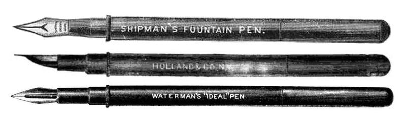
138 U.S. 252, 11 S. Ct. 334, was argued on Nov 19, 1890 and decided on Feb 2, 1891.  The defendant’s name was misspelled in the title.  It’s actually McKenzie.  And the complete list of defendants included James A. McKenzie & Samuel R. Murphy, owners of Harvard Pen Co. and Siphon Pen Co., but also included the Yale Pen Co., Rowley Pen Co., and Lapham & Bogart, the distributors of the Rowley.  But the major lawsuit, “Waterman v. Shipman”, was started in 1888, and not decided until Apr 18, 1893.  The summary of the case appears in The Federal Reporter, vol. 55, pp.982-987, but the original court file may still exist in the original circuit court.  The report even cites the earlier-decided case, but of special note is an 1886 pamphlet, which is called “scandalous” on p.987 of the case report.  The author of this 25-page exposé, a rival of Waterman, is unnamed in the report, but is revealed in the transcript.  That rival was the Yale Pen Co.  Now, get this.  The full title of the booklet is “Penthemis, An Exposé of the Assumptions and Business Methods of a Dealer and Reputed Inventor”.  The fairly long synopsis of the case in The Federal Reporter makes for some interesting reading, but it’s only a summary, and the best evidence of all is contained in the transcript of this case.  The transcript of the “Waterman v. Shipman” court case is obviously the whole basis for the Bob Tefft article “The Stormy Birth of Waterman”, in Pen World, vol. 2, no. 4, Summer 1989, pp.19-22, although the court case isn’t mentioned specifically by title in the article.  Tefft covers the court case fairly well, but I wish he had dealt with certain aspects of the case in more detail, especially the booklet that was filed as an exhibit in the case.  Tefft also covers another aspect of the case that is almost glossed over in the report.  The Shipman lawyers rested part of their defense on “the prior invention of Fisher”, see p.987 of the report, but Tefft tells us on p.19 of his article that on May 24, 1883, Waterman placed an order for “hard rubber feeds based on his new design” with machinist and model maker Herbert Fisher.  And then on p.20 he writes, “It was not until June 28, 1883, that Waterman finally got around to filing an application for a U.S. patent on his new feed.  When he did, he discovered a [prior] competing application had already been filed by none other than Herbert Fisher, the craftsman hired by Waterman to produce his feeds.  [Fisher] had claimed the design for his own!  To compound the situation, Waterman’s lawyers failed to respond to the Patent Office’s request for testimony, and the question of priority was decided in favor of Fisher.  The matter would not be finally settled for over [a year].  In August of 1884, Fisher finally agreed to give up any competing claims in return for a payment of $250”.  I want to see the transcript!  And it’s absolutely imperative to find a copy of “Penthemis”! But I’m more interested in the incidentals and circumstantials than the essentials and fundamentals of the case.  And here are three look-a-like pens, the Shipman, Waterman, and Holland pens.


Now, all we need is an example of a fourth one, the Fisher pen, if there is a surviving example.  Don’t worry, the image of the Fisher Pen below exists only in Photoshop.


        Rob Astyk wrote, “I believe that the court in the Shipman suit originally was the Southern District of Manhattan and the state, not Federal, court.  That case meandered through the state and Federal courts because one of the issues was the contract between Waterman and Shipman that transferred ownership of both Waterman 1884 patents to Shipman.  Key to the Shipman suit was a prior ruling of the U.S. Supreme Court in “Waterman v. McKenzie”, handed down on Feb 2, 1891.  Lewis Waterman lost his patent infringement suit against James A. McKenzie and Samuel R. Murphy because he was not the owner of his patents, and therefore, had no standing to sue McKenzie and Murphy.  The court ruled that Waterman had transferred ownership of the patents to his wife Sarah, and from Sarah had mortgaged them to Asa L. Shipman.  When the mortgage was not redeemed as agreed, the collateral for the mortgage, the patents, became Shipman’s property.  The U.S. Supreme Court determined that Shipman was, in fact and in law, the owner of those patents and that Lewis E. Waterman’s only interest in those patents was an exclusive and unrevoked license to manufacture pens under those patents.  That license became the crux of the Shipman suit.  Justice Gray, writing for the majority in “Waterman v. MacKenzie”, held that the only circumstance that could void Shipman’s ownership interest would be a clear violation of Waterman’s license to manufacture.  In the suit of “Waterman v. Shipman” (130 N.Y. 301; 29 N.E. 111), James D. & Edward L. Shipman, his sons, co-partners, and heirs were named because Asa Shipman had died in 1888.  Waterman appealed an earlier, unfavorable decision in the light of the McKenzie decision on Dec 8, 1891.  The New York Court of Appeals found that Asa L. Shipman’s brief foray into manufacturing pens under the Waterman patents in April and May 1888 had violated Lewis Waterman’s exclusive license to manufacture, thereby voiding the mortgage that had transferred ownership to Shipman and returning patent ownership to Waterman.  The U.S. Second Circuit Court of Appeals issued an affirming decision on April 18, 1893, 55 F. 982, finally closing the issue.
        “We definitely need to examine the transcripts.  Of even greater interest is the pamphlet and its contents.  Scurrilous attack or not, I think most of us would love to hear his fellow penmaker contemporaries dish the dirt on L. E. Waterman.  Let me also suggest that there is an opportunity for great research here for anyone who might be interested.  In most major cities, especially those in which a U.S. Circuit Court of Appeals sits, there are going to be court records of suits like the ones above.  Digging into those files going back into the 1870s-to-1920s, and copying transcripts, and even getting lists of suits will give us all a clearer picture of the early pen business in the U.S.”

        David Nishimura wrote, “The underlying material [in the “Waterman v. Shipman” case] was not found in any public institution, but rather in a flea market, so likely was a copy belonging to one of the parties in the trial.  It was reportedly quite voluminous, and was being lent around between a handful of older collectors.  Take note, this does not mean that another copy of the full transcript might not be on file somewhere else, so it would still be well worth tracking down.  Ever since that article was published, I’ve wanted to get my eyes on the documentation behind it.  It seems that it has changed hands many times, including some long loans.”

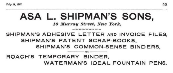
        And I wrote, “One of the biggest disappointments in The American Stationer is the lack of any Waterman’s pen ads in the 1883, 1884, 1885, and 1886 volumes.  In fact, the first time the name “Waterman’s” appears in an ad in the magazine is in an Asa L. Shipman’s Sons ad that starts appearing on
July 14, 1887, p.50.  This was after Waterman parted ways with this wholesale stationer who was an early partner with and investor in Waterman’s penmaking venture.  It’s a simple text-only ad, and the name “Waterman’s Ideal Fountain Pens” appears last in a list of products that Shipman dealt in.  The Shipman company continued having the pen made for them, and continued selling the pens, even while Waterman was taking them to court over it, so these ads are, technically speaking, not Waterman’s ads.
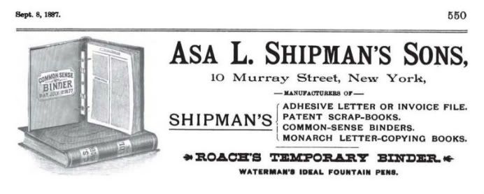
        “A few months later a second type of Asa L. Shipman’s Sons ad, this time with some imagery, starts appearing on
Sept 8, 1887, p.550.  But the image is of some of their other products, and the size of the type for the line about pens is smaller than the type for the other products in the ad.
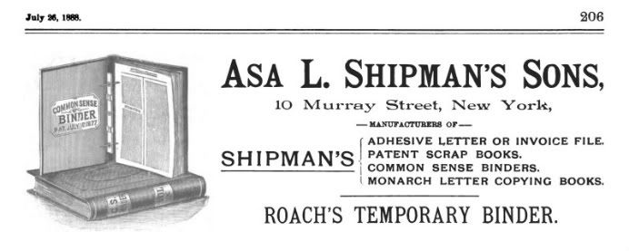
        “Then the phrase “Waterman’s Ideal Fountain Pens” disappears altogether in the third type of ad that starts appearing on
July 26, 1888, p.206.
        “And this is why.  A fourth distinctly different ad starts appearing on
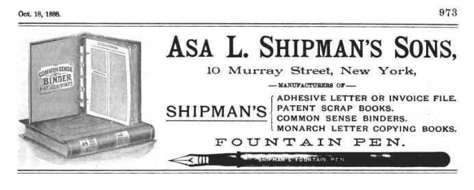
Oct 18, 1888, p.973, and this one finally has a picture of a pen in it.  This pen looks exactly like a Waterman’s pen, but this pen has the name “Shipman’s Fountain Pen” on the barrel.
        “And an advertising article on
Nov 8, 1888, p.1123, has the same picture and an explanation.  It’s not a pen with the Waterman’s three-fissure feed. Instead it has the spiral-groove feed in US patent no. 397,413.
        “Then finally this ad started appearing on
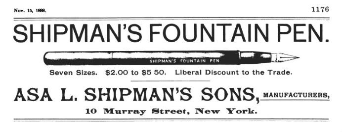
Nov 15, 1888, p.1176.  The Waterman’s company was finally free of the Shipman Co. even though the court case wasn’t settled until the early 1890s.
        “This article from
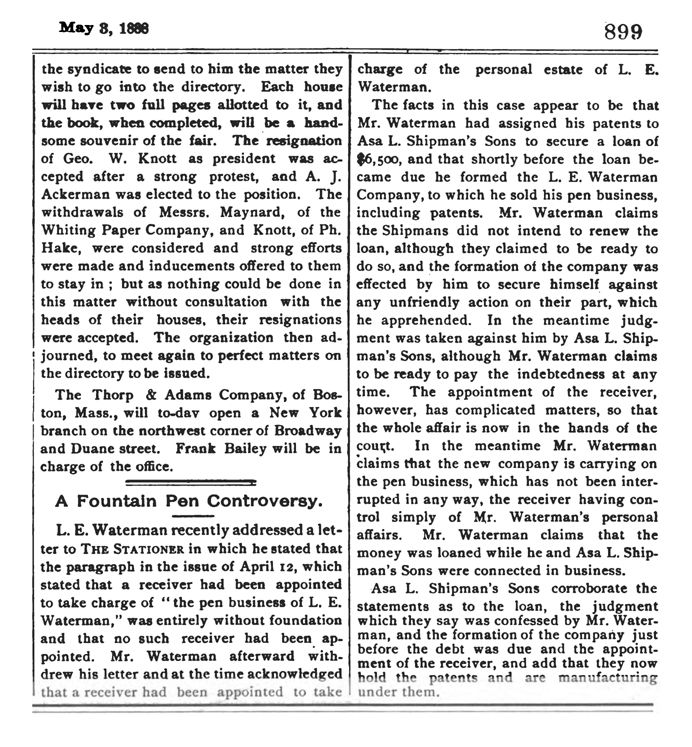
May 3, 1888, p.899, is about the appointment of a receiver to take charge of the estate of L. E. Waterman.
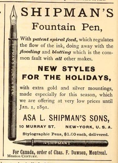
        “More elaborate ads for the Shipman’s pen with the spiral feed also appeared in The Century Magazine,
January 1890, and October 1890.
        “At last, the first Waterman’s ad makes its late appearance in Am. Stat.,
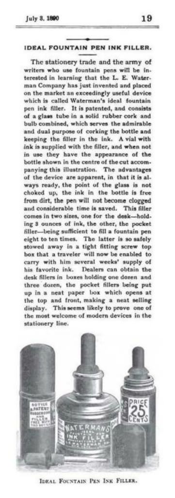
July 3, 1890, p.31, but it’s not for their pens.  It’s for their traveling ink bottles with their eyedropper stoppers.  Two types were available, one for the desk top, and one for the pocket, or suitcase of a traveler.  Their pens are mentioned only peripherally in a short line at the bottom of the ad, “Manufacturers of Waterman’s Ideal Fountain Pens”.  It’s strange that they didn’t place any images of their pens in this ad, let alone place any ads for their pens in this magazine this late.


        “And here’s an article about the “Waterman’s Ideal Fountain Pen Ink Filler” from Am. Stat., July 3, 1890, p.19.  It refers to a patent, even though the Barnes patent wasn’t applied for until 1891, and not issued until 1892, which is to be discussed in this later blog topic.
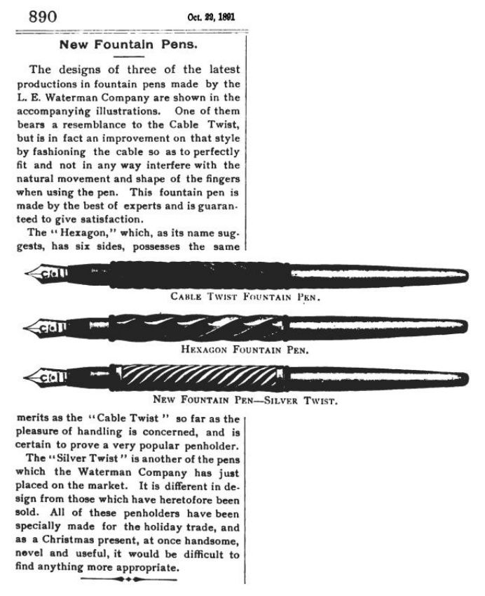
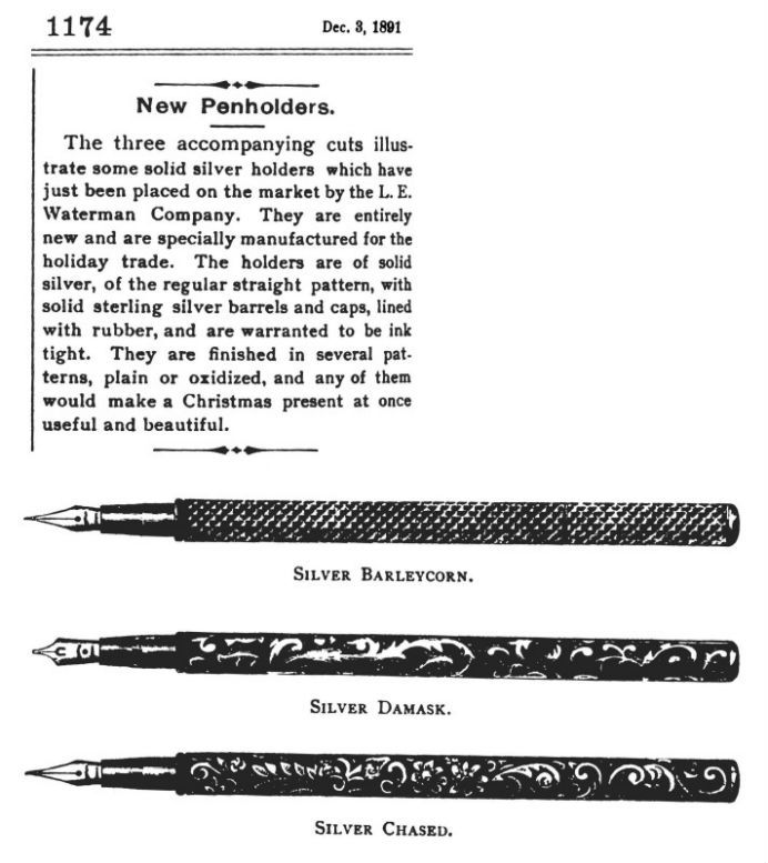
        “The first images of Waterman’s pens in Am. Stat. don’t show up until
Oct 23, 1891, p.890, and Dec 3, 1891, p.1174.  What a shame that they are so late, since that means that we are robbed of any images of the early pens, but what makes up for it, somewhat, is that we are shown the large variety of models available just 7-to-8 years after Waterman’s started manufacture.
        “So even in 1893, there are no Waterman’s ads in Am. Stat., but here’s a curious coincidence.  In
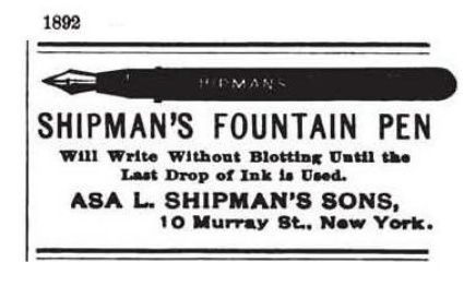
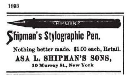
the 1892 Shipman’s Sons ads, they still featured a fountain pen, but in the 1893 Shipman’s Sons ads, they switched to advertising their stylograph.
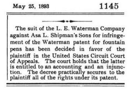
        “And this may be the reason why.  The Shipmans lost the court case initiated by Waterman’s in
1893, and had to stop infringing on Waterman’s fountain pen patent, and that Waterman’s was “entitled to an accounting”, and that’s the coincidence.
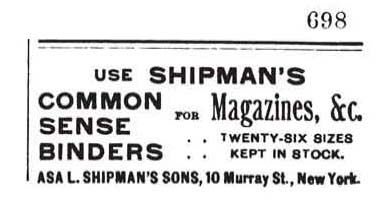
        “This is what the Shipman’s Sons ads had dwindled down to in the first half of
1894, an ad for their “Common Sense Binders”.  It was their staple before they got into pens, and it was still there to fall back on after the pen market had dried up for them.
        “It’s because in
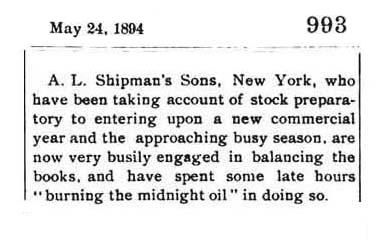
1894 they were “burning the midnight oil” while creatively “balancing” their books, and probably trying to figure out the entitled accounting that they owed Waterman’s in the above mentioned infringement lawsuit that they lost.
        “Finally! a Waterman’s pen ad shows up in Am. Stat. on
Nov 1, 1894, p.815.  It’s only 10, or 11 years late.  It’s ten years, if you use the November 1884 Century ad as a starting point, and eleven, if you use the December 1883 ad that David Nishimura found.  It almost looked like they were avoiding placing ads in Am. Stat. as long as the Shipman’s Sons ads were still in the same magazine.  They wanted the Am. Stat. roost all to themselves, or else they wouldn’t play.  The ad says that the two-kerf feed “has been proved by ten years’ use”, and it shows the two types of pen styles in one ad, the old straight-cap type made since 1883, and the “new style of holder” since 1894.  The ad appeared at about the time of the introduction of the new cone-cap style, which Waterman’s stole unrepentantly from A. A. Waterman without attribution and without giving him his due credit, his entitled accounting. But the appearance of the new type didn’t mean the demise of the old type, which was kept in production by the old fogeys well into the self-filler era.”


  George Kovalenko.

.
 

March 07, 2016

Stylographic Pens In Fiction


 , in Oliver Wendell Holmes’s “Over The Teacups”,

        In a story serialized in The Atlantic Monthly, in the November 1890 issue, on pages
663 & 664, the stylographic pen was criticized because “nothing seems more prosaic”, and because “it deprives the handwriting of its beauty, and to some extent its individual character”, and for “the brutal communism of the letters it forms”, and for filling the page “with the most uniformly uninteresting characters”, but “the stylographic pen, in the hands of one who knows how to care for it” was also praised by saying, “let me pay the tribute which I owe to one of the humblest and most serviceable of my assistants”, and for not interrupting “the fine flow of thought” because of “the unimpeded flow of the fluid which is the vehicle of the author’s thoughts and fancies”, and because “its movement over the paper is like the flight of a swallow”, since the pen no longer had to take “short, laborious journeys [to stop] to drink every few minutes” at the inkstand.

, in Edith Wharton’s The Age of Innocence, chapter XXIII,

  [Posted on
FPN on July 13, 2009.]
       In the novel The Age of Innocence, written by Wharton in 1920 about the late 1870s, the character Newland Archer lends Mme Olenska a stylograph to write a note while in the park.

      “You can write here”.  He drew out a note-case and one of the new stylographic pens.  “I’ve even got a envelope–you see how everything is predestined!  There–steady the thing on your knee, and I’ll get the pen going in a second.  They have to be humoured; wait–”  He banged the hand that held the pen against the back of the bench.  “It’s like jerking down the mercury in a thermometer: just a trick.  Now try–”

      She laughed, and bending over the sheet of paper which he had laid on his note-case, began to write.  Archer walked away a few steps, staring with radiant unseeing eyes at the passers-by, who, in their turn, paused to stare at the unwonted sight of a fashionably-dressed lady writing a note on her knee on a bench in the Common.
, in a short story titled ...?... about a detective who used a stylographic pen,

        I lost the reference, but there was a woman who was either going to write, or had written a short story about a detective in the 1870s, or 1880s who was named Inspector Dubiel [?] who used a stylographic fountain pen to write in his notebook.  The character, named after Frank Dubiel, is a case of double tuckerization, since Frank was also famously a collector of stylographs.


, and in the “anti-stylograph”, an early, now-forgotten synonym for “fountain pen”.

        The word “anti-stylograph” was used as a synonym for “fountain pen” in the period 1881-84.  In the short story “Tommy” in Blackwood
’s Magazine, August 1884, p.225, the word has nothing to do with fountain pens.  The story concerns the misuse of an eyedropper in the perpetration of a medical fraud, literally using it for blowing dust in people’s eyes, and not for filling fountain pens.  Don’t worry–don’t waste your time.  It’s a boring story, but for the mention of an “anti-stylograph pen-filler, the apparatus for injecting into [a pen] its supply of ink”, and “a little glass vessel, with a nozzle at one end of the tube, and an india-rubber receiver at the other”, and the “filler of the anti-stylograph pen”, and the “ink-injector of your anti-stylographic pen”, and “those little squirts of glass and india-rubber”.  And here’s the link for almost every anti-stylograph pen ad ever made, showing that the stylograph helped to accelerate the development of the fountain pen.


  George Kovalenko.

.
 

March 01, 2016

Quink and Superchrome Inks


The top and front sides of a Parker 51 ink box.

[Posted on L&P on Aug 3, 4, 6, 2005, and Feb 9, 2006, and on Pentrace on Mar 7, 2014.]
        There has always been some confusion among pen collectors about the names of Parker’s “Quink”, “Super Quink”, “Double Quink”, “Parker 51”, and “Superchrome” inks.  All the talk of different ink names was getting confusing, so I offered up the patent numbers for Superchrome, 1,932,248 and 2,528,390, issued to Gaylen H. Sayler.  Olle Hjort also offered up US patent no. 2,489,463 by William B. Reynolds for an azo dye for a stable blue alkaline ink.  Personally I think the names “Parker 51” and “Superchrome” are one and the same ink, for all intents and purposes, just under different names.  Both are highly corrosive inks.  They are basic, or caustic, or alkaline, which is just as bad as being acidic.  They are both meant to be quick drying, but the second Sayler patent is also supposed to be less aggressive to the rubber parts of a pen by inhibiting the catalytic action of free copper radicals in the ink.  “Quink”, as it says right in the name, was also marketed as a
“Quick drying ink”, but was, however, relatively mild.
        Now, what about the names “Super Quink” and “Double Quink”?  I got the name “Super Quink” from a Parker patent list written up by Daniel Zazove, but I think it was a slip of the pen.  He meant to write “Superchrome”.  David & Mark Shepard’s book Parker “51” says on p.102 that Quink, the first ink developed by Gaylen Sayler, was launched in 1931.  What might have thrown Daniel off was the fact that the first patent for Superchrome was also applied for in 1931.  There are also pictures there of Double Quink ink bottles and boxes on p.102, and Super Quink ink bottles and boxes on p.104.  The Shepherds also complicate matters further by revealing that Parker’s first alkaline ink was marketed in 1939 as “Double Quink”, but was renamed and repackaged as “Parker 51 Ink” in 1941 after the launch of their new pen.  But Super Quink is actually just Quink in the cobalt-blue-glass, diamond-shaped ink bottles.

        Quink with Sol-X is one of the safest and gentlest inks ever made.  If you find an old bottle of this ink, it’s almost always good to use.  It almost never has sediment, or Snot-In-The-Bottle, but make sure that it hasn’t dried out and thickened up.  Sometimes if an ink is frozen, it can be spoiled.  But otherwise it’s almost indestructible.  It’s one of those vintage inks that Frank Dubiel swore by and recommended, along with Sheaffer’s Skip, and Waterman’s Washable Blue.  Since Quink was mostly water, Frank used to say that you could drink it without any harm, except maybe for stained tongue and teeth.  This is not true of the highly alkaline Superchrome and Parker 51 inks.  You wouldn’t want to try the Frank Dubiel taste test with those inks.  There is no patent for Quink because it’s so simple, and there’s nothing new there to patent.  The only patent number for a non-alkaline ink such as Quink is Gaylen Sayler’s patent no. 1,972,395 for some formulas for brilliantly colored permanent inks.
        But what is the mystery ingredient in Parker’s proprietary brand name Solv-X?  I remember reading somewhere that the special ingredient in Quink might also be called “A-11”.  Once when someone was visiting the Parker repair department in Janesville, he noticed a container with the label “A-11” sitting on a shelf.  This was the secret ingredient that improved ink flow, “All” laundry detergent.  Gaylen Sayler calls these wetting agents “flow promoters” in his patents.  Solv-X, or “A-11”, was in Quink, but not in the other alkaline Parker inks.  Quink has a fragrant, soapy smell because it has some sort of detergent in it.  What we need to find out is whether Gaylen Sayler’s Parker Quink with Solv-X was ever patented.

        Mark Z. wrote, “I’ve done a little research about whether Super Quink, and Double Quink, et al, were the same as regular Quink.  In the electronic archives most of the direct questions about whether Quink and Super Quink were the same went unanswered, but something by Naphtali Hoffman turned up in the
Zoss archives.  “Super Quink and New Quink are Quink.  Parker actually created a great marketing story many years ago when it introduced “New Quink” while regular Quink was still on the market.  You guessed it, they were the identical inks at different prices.  Parker was trying to determine the price elasticity of demand for its ink.  I recall the case being cited in an old edition of a textbook in Intermediate Microeconomics out of which I once taught.  Sadly, I have discarded the text”.  Unless someone else has a better source, I think this takes Super Quink and New Quink out of the mix.”

        And I wrote, “If we could only finish the documentation of this by finding Naphtali’s obscure reference to that “old edition of an Intermediate Microeconomics text”.  So Super Quink and New Quink = Quink, and Double Quink and Parker 51 Ink = Superchrome.”

        Matt McColm wrote, “Here’s an eyewitness account of the special ingredient called “A-11”.  Quoting from Vincent Fatica’s
website, “A-11” was used to condition Parker 61 fillers.  “If ever the term “gentleman” were appropriate, it was appropriate to describe Bob Jones and Romain Brunett.  In 1980-81, I was fortunate to live in Chicago, which is a couple hours from Janesville.  
I visited Parker’s customer service department several times, and the folks there were delighted that someone took so great an interest in pens.  Bob Jones was manager of the customer services department.  He would take me into his office where he’d show me the manuals for the various Parker instruments and tell stories as he made a list of the parts I needed.  Romain Brunett was the chief repairman and had been so for a long time.  He would take me to the work-benches, show me the tools and techniques, and occasionally let me in on a “secret” or two.  My favorite was the “A-11” secret solution with which they would condition the 61 fillers so that they would more readily accept ink when they were returned to the customer.  On a shelf near the work area was a canister of crystals, unceremoniously labelled “A-11”.  In it was, and here’s the secret, “All” laundry detergent. Both gentlemen are now deceased, but I remember them with much affection.” Detergents, which act as wetting agents and emulsifiers, were first introduced during WWI, and were an advance over lye soap for cleaning.  Solv-X was probably a detergent [or wetting agent, 
or some other sort of surfactant that Parker added to their ink to make it flow better, but not necessarily “All” laundry detergent].”

        And I wrote, “Thanks for jogging my memory, Matt.  I knew I had seen that story somewhere.
There weren’t that many pen websites in the early days of online pen research, and I used to visit Vince Fatica’s website a lot in the early 1990s, when I just started getting online.  Early on, it was one of the few scholarly pen websites around.  Another one at the time was Tony Fischier’s Parker and Montblanc Penography
website.  [Here are two earlier versions on wayback.]  It’s nice to see that these sites are still around today.”  [And now it’s ten years later, and they’re still around!]

George Kovalenko.

.
 

February 27, 2016

The Funnel Inkwell


   , a not-so-recent invention.


[Revised Sept 27, 2016.]
        I don’t want to goose you with too many old-fashioned “inkhorn terms” [section 13], but last year I visited the Museum of Antiquities at the University of Saskatchewan where they recently acquired the Minden Glass Collection, which dates from 500 Before Zero to 1100 After Zero, and one piece in that collection especially caught my eye, an urn-shaped, emerald-green-glass inkwell.
        The distinctive thing about this inkwell is that it is a very early example of what is now known as a funnel inkwell.  That’s not an official name, just one used by ink bottle collectors and writing instrument researchers and historians.  William E. Covill, in his 1971 book, Ink Bottles And Inkwells, has a chapter titled “Inkwells with Funnel-type Openings” on pp.315-323, with photos of 42 examples of this type of inkwell.  Not all of them are dated, but the earliest dated examples, some versions with geometrically embossed sidewalls, are said to be from 1815-30.  There are also a few examples with similar embossed sidewalls on the Corning Glass
website.  Here’s a nice cobalt blue example from 1820-50.  [See more items below.]  Covill writes that they are also referred to as conical, or depressed openings.  He also says that they were made “over a long period of years, from the early 19th century well into the 20th”, and that they were popular because they were “not easily spilled when overturned”, and hence they were listed in catalogues as “Safety Inkstands”, and “Common Sense Inkstands”.  The only problem with them is they are also not easily cleaned.  Ed and Lucy Faulkner’s 2009 book Ink, 150 Years Of Bottles And Companies, 2nd edition, pp.224-5, shows a few similar geometric examples, this time dating from 1800-40.  They do, however, show a rare glazed pottery version on p.232a.  Leo J. Walter’s 1968 book, Walter’s Inkwells Of 1885, Book 1, p.48, reproduces an engraved illustration of an example from a stationers’ catalogue from that period with the caption “Safety Inkstand”.  The catalogue for the large Charles G. Moore auction, 2-sessions in 1996 and 1997, of The Watt White Collection Of Important 19th Century Ink Bottles shows a large selection of these types of funnel inkwells and excise ink bottles in the illustrations of auction items numbered 1 to 36.  The descriptions of the various items extend the date range variously to between 1775 and 1860, and some of the items are marked as “Ex. Wm. Covill Collection”.
        All the above examples, however, are American.  What is needed is some international flavor.  In Michael Finlay’s 1990 book, Western Writing Implements, in the Age of the Quill Pen, p.146, illustration 202a shows an 18th-century leather penner.  A
penner is a portable container for the pocket that held a quill, and a tiny bottle of ink, and possibly other writing implements such as a penknife for mending the quill, and it looks like a cigar wallet for a single cigar.  The tiny inkwell in this penner definitely has a funnel opening, which would probably have to be stoppered with a cork before being put away in the pocket.  The other 16th-century inkwells on p.136, made of cuir bouilli and horn, seem to have funnel openings, but the 19th-century, glass excise and buttonhole inkwells on p.151, illustrations 216 and 217, meant to be worn in the “buttonhole” of an overcoat or jacket, or “on a suspension cord”, or in a vest pocket, definitely have “funnelled openings to prevent spillage”.  The whole idea of a funnel inkwell might have come from pounce pots, or ink sanders, which usually have a concave cup on top to facilitate pouring the sand, or cuttlefish powder back into the container.  Finlay shows some examples on pp.134-5.  It just occurred to me that a small inkhorn inkwell could also be worn in a buttonhole.  Finlay’s book has some inkhorns on p.136, and illustration 169 shows how they could be mounted on a desk top by being placed in holes, just like those in a school desk, and where they would be held safely and securely.  I have also dealt with inkhorns here before in my blog post about the Carter’s trademark.
        Now, here’s a funnel inkwell to blow all the others out of the international waters.  It precedes the others by about 1500 years!  The inkwell from the
Minden collection is from Syria-Palestine, and it dates from the 1st to 2nd centuries after zero.  In that case, what we need is a book titled Mid-eastern Writing Implements, in the Age of the Reed Pen.  The museum accession record describes it as a “Footed, two-handled inkwell”, in other words urn-shaped.  They also call it “trapezoidal-shaped”, but I’d call it cone-shaped.  Same difference.  It is said to have an “internal neck”, which is what I call a funnel neck, about 4 cm deep.  The sloped, footed base is concave with a pontil mark where it was held by the glassblower during manufacture.  It is also said to have a “flattened collar rim”.  My guess is that the inkwell was made in at least two separate parts, not counting the two handles.  The body of the well was made on one pontil rod, and the funnel was made on another separate pontil, possibly a pontil tube rather than a rod, and the two pieces were married together while the edges were still molten.  The funnel was formed while pushing the second pontil inside the body of the well until the glass was stretched thin and cooled, and then the glass was burst off the pontil and the sharp edge was cleaned up.  The rim was then flattened by pressing it against a flat surface to help bond the two parts.  The “two opposing loop handles” were then applied to the shoulder of the bottle as molten glass blobs and pulled and stretched up and crimped down at the rim.  The inkwell has some iridescence, and two fractures, but it’s intact, although it is partially covered with what looks like calcium and lime scale, or whitewash.  It reminds me of the old rail road stock yards across rural Saskatchewan that were painted with whitewash.  The white crumbs lying at the base of the little urn in the photo below are some of the scale deposits that have flaked off.  Tracene Harvey, the director of the Museum of Antiquities, thinks that the white flakes are the result of the deterioration of the glass, rather than a scale deposit on the surface of the glass, but I don’t buy it.  It almost looks like some sort of paint, or deposit, or encrustation.


        Helanna Miazga, assistant curator at the Museum of Antiquities, is working on a description of the inkwell for a forthcoming publication on the Minden glass collection, and steered me to the website of the Corning Glass collection, and David Whitehouse’s catalogue raisonné of Roman Glass in the Corning Museum of Glass.  In volume 1, p.199, item #347 in the book, and 70.1.22 on the website, has a similar outward shape, but has a dome-topped opening instead of a funnel top.  It is also dated to the Roman era, in the 1st to 2nd centuries after zero.  On p.209 there is also item #360, 66.1.222 on the website, which is called a “Vessel With Lid” in the book, and is also said to be a possible inkwell, but the opening is obscured by the lid, with its elegant, little, swirled, triangular finial knob, so it’s impossible to tell whether it has a funnel opening.  The Minden inkwell with its flattened rim might be missing a similar type of lid.  Searching for the word inkwell in the Corning website, however, found a few items very similar to the Minden inkwell.  Inkwells with accession numbers 76.1.375, and 2007.1.31, and 50.1.38 are all said to be Islamic and to date to the period 800 to 1100.  The first one especially resembles the Minden inkwell, except for the lack of a footed base.  And the last one looks like a scribe’s inkwell, or an excise inkwell.  All three of them also have the same distinctive little handles, except that they all have four, not two.  And here are two little long-lost urn cousins reunited after fifteen centuries.
        The size of the opening in the first Roman inkwell in the Corning collection, item
70.1.22, is quite large, and would easily accommodate a reed pen, but the size of the opening in the Minden inkwell appears to be too small for a reed pen, and is just right for a quill pen.  That places it in the age of the quill [section 2], which started in the 5th or 6th centuries.  My suspicion is that the Minden inkwell dates to the Islamic era, sometime in the Islamic Golden Age from the 8th to the 13th centuries, and well within the age of the quill, which makes it precede the others by only a 1000 years!  It was a time of great scientific, literary, and cultural flourishing, and a time of a lot of writing, and it was also the time when the very first fountain pen [section 3] was created.
        Here are two other cobalt-blue-glass Roman inkwells with lids from the Art Institute of Chicago, accession number 1943.1166a-b, and the J. Paul Getty Museum, 2003.239, but both with clunkier, less-elegant finial knobs.  Another one in aqua glass with a lid sold at a 2009 Christie’s auction.  But the most interesting one is the smokey-green inkwell in The Metropolitan Museum of Art, 17.194.119.  The interesting feature that all these dome-topped, Roman inkwells share is the anti-drip lip around the shoulder, which stops the ink from running down the sides of the dome after some errant dipping.  They still required this anti-drip lip because they were dome-
topped, and didn’t have funnel openings, except for the one from The Met.  That one has the early beginnings of a funnel, but just an ur-funnel opening, not the full, deep funnel of the later Islamic inkwells.  Another one at the Met, 17.194.124, has a reversed dome, or concave dish, which acts as a sort of makeshift, dish-shaped funnel, and makes another tentative step toward addressing the need for a full funnel opening.  Seeing as they’re just two isolated examples, it’s not clear whether they could have exerted any influence on the style of the later Islamic examples.
        Someone must have been first to have had the idea.  Instead of a vessel with a neck pointing up, the neck was removed and replaced with a funnel pointing down.  Someone must have had that eureka moment and been the first to think up a flared opening, or vortex.  Instead of making an ink bottle with a spout pointing up, the glassblower made an inkwell with a funnel pointing down.  The neck of the bottle was inverted and turned into a funnel.  Instead of having a neck for pouring, it had a funnel for dipping.  What a great concept.
        Now, here’s another local inkwell, and it’s a double decker, or a double-double, as we say in Canada.  It came to light locally in the bottle collection of Walter W. Brown, a bottle digger and collector living here in my province.  It showed up in an untitled article in the newsletter of a local bottle collecting club, Parkland Bottle Collector,
No. 12, December 1973, p.13.  The signed illustration below was hand-drawn by Jan Ursulescu, also a bottle digger and collector living in this province, and the unsigned accompanying article calls it “an intriguing little pocket inkwell” that was made in two sections and “joined at the arrow”.  It also notes that, “Once filled, this inkwell can only with difficulty be emptied or cleaned”, and that there is no comparable example like this one in Covill’s book.  That was in 1973, just two years after the book was published.  If a single funnel is hard to spill, then a double funnel would be almost impossible to spill.  No cork, nor stopper, nor lid would be required at all.  It was probably made in the 19th century in Britain, or somewhere on the continent, and was probably brought to the Prairies by a pioneer settler in the early 20th century.  I wonder where this intriguing little funnel-funnel inkwell ended up.


George Kovalenko.

.
  

Addendum
        A funnel inkwell is almost half way to becoming that topological oddity, the Klein bottle, a vessel with only one surface, so that it has no inside, nor outside.  But it would make a perfectly unspillable scribe’s inkwell, or excise inkwell.  You could carry it upside down safely, and flip it over for dipping into.  The liquid would, of course, flow down into the loop to give you access for dipping.  It’s the only inkwell that could be worn upside down without being sealed, and without fear of spilling.  It’s upside down already, but to dip into it, it would have to be turned upside down again.  And as Heraclitus famously said, mutatis mutandis, or with all the relevant parts changed, “You can never dip a pen into the same ink twice”.  [Diels, Frag. 91.]  That’s because the river of ink is always flowing from the inkwell.