collection1b

collection1b

November 11, 2014

The Waterman’s ‘Fasces’ pen


  , another obscure Waterman’s pen.


[Posted on L&P on Dec 26, 2011.]
      Does anyone own, or has anyone ever even seen one of these Waterman’s fountain pens?  It has a
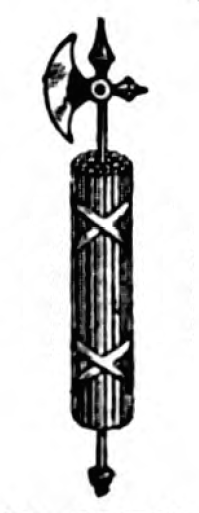
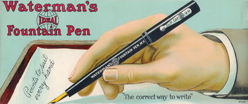
“Fasces” half-overlay on the barrel, and that makes the fountain pen the axe inside the bundle of wooden rods.  It’s from an advertisement in Am. Stat., Nov 9, 1918, p.21, where it is called “The Service Pen, A Convenience, Gift, and Heirloom All in One”.  Two examples of the pen are shown, and between them are illustrations of all the Waterman’s office and factory buildings, in the past and up to 1918.  It looks like it might be a #270-series or #370-series safety-capped eyedropper with a half-overlay, depending upon the size of the nib, and whether the half-overlay is sterling silver or solid gold, and also upon whether there’s a lever box out of view and hidden on the back side of the pen.
      Perhaps there’s a visual pun in there somewhere, something about the pen being mightier than the war, since the axe is missing from the bundle, in which case the design might have something to do with the date and the looming end of hostilities in WWI.  It anticipates the signing of the armistice by only a couple of days.
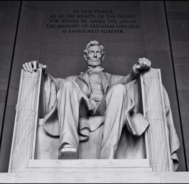
      David Nishimura wrote that he didn’t think any pun was intended, and posted the above Wikipedia link, which has a list of uses to which the fasces was commonly put.  Two fasces are prominently featured in the front posts of the armchair in which Lincoln sits in his eponymous
statue http://www.attractionsofamerica.com/images/washington/Lincoln_Memorial.jpg.  Then David added, “In the context of imminent victory, the fasces could have been read simply as celebrating that victory, since fasces was carried in Roman triumphal processions”.
      Well, we don’t know for sure whether the visual metaphor was intended, but the axe blade inside the bundle was definitely replaced with the nib of the pen.  However, the best bet for an interpretation is probably that the pen was intended to celebrate the triumph after the armistice.


George Kovalenko.
 
.

November 09, 2014

Pen Catalogues Online


      David Armstrong
posted on FPN that there are some vintage pen company catalogues available online through the Internet Archive.  He placed them in chronological order in groups by company name in an easily searchable index list on his website.  There is some controversy over the source of the PDFs, which originally came from the PCA library, but that is an issue for the Internet Archive to deal with.  There are also lots of pen company catalogues available for purchase on Bill Acker’s website.
      For those who can’t find the documents in the Internet Archive, here they are.  Click on the links in the column at the left to see the individual catalogues, which are, as David Armstrong said, “not chronological and are named a bit oddly”.

Waterman’s
https://archive.org/details/WatermanFountainPenCatalogs, 16 items


Parker’s
https://archive.org/details/ParkerPensCatalog1923, 4 items
https://archive.org/details/ParkerPenServiceManuals, 7 items
https://archive.org/details/ParkerVacumaticPensCatalogs, 7 items


George Kovalenko.
 
.

November 08, 2014

Grrr!, the opposite of GARR


[Posted on L&P on July 4, 2012.]

        I know, I know, we’ve all been spoiled by the Internet, and we all want the same things.  We want to be entertained.  We want instant gratification.  We want someone else to do all our work for us.  We want the information, we want it now, and we want it for free.  The lurkers out there want us to give them pictures of all of these things so they can harvest them, don’t they?  Well, of course they do, the image scavengers!  But there’s been way too much spoon-feeding going on these days in the pen message boards and blogs and websites.  So they’ll have to wake up and look up and research some of these things themselves, and not just for themselves.  They might want to share some of these things with others for a change.  No Grrr’s around here, only GARR’s.

George Kovalenko.

.
   

November 07, 2014

The Waterman’s pen factories


  , and other buildings.


        I posted this on L&P on Feb 29, 2012 after I finally finished gleaning and reading through all the issues of The American Stationer between the years 1906 and 1922.  The ones after the latter date, and the ones from the years 1898 to 1905, have not been digitized, yet, and then I plowed ahead into the past, that is, I started gleaning through the issues from 1878 to 1897.  Please excuse all the
georgic metaphors, but I’m feeling like I’m bringing in a very bounteous harvest of pen history.  And that’s putting it very lightly.  There is no hyperbole or over-exaggeration involved here at all.  Don’t worry about being surprised, because I astounded even myself.  So before I get too involved with my reading and researching again, let me leave you a list of all the ads and articles that either mention or illustrate some of Waterman’s pen factories and buildings in the years 1883 to 1922.  All the dates with page numbers, unless otherwise cited, are from Am. Stat.  I’ve gone through all the volumes systematically since then, so these examples are not so much stubbled upon as they are reaped.
 

Offices & Stores

        Feb 22, 1913, p.24, an article announcing that the “thirtieth anniversary of the founding of the L. E. Waterman Co.” was on Feb 12, 1913.  That means that the founding date of the company is Feb 12, 1883.  I think they meant Feb 12, 1884, the date of Waterman’s first patent.
        Apr 29, 1897, p.696, & May 6, 1897, p.731, an article and an ad with the following addresses.


        136 Fulton St., a room at the rear of a cigar store, March 1883-March 1884, the first feeds for Waterman’s “Ideal” fountain pens were made by Herbert Fisher on May 24, 1883, and the first pen was sold at the cigar store on July 11, 1883.
        10 Murray St., March 1884-February 1885.

        155 Broadway Ave., February 1885-1892.

        155-157 Broadway Ave., 1892-1902.

        173 Broadway Ave., 1902-1917, the “Pen Corner”.
        191 Broadway Ave., 1916-37, the new “Pen Corner”.
        344 Hudson St., 1939-50.
        Afterwards, they left N. Y., and were taken over by BIC, and who cares.


Factories & Offices
        Dec 3, 1910, p.6, article mentioning the single desk in the cigar store in NY in 1881 [sic, 1883].
        June 11, 1921, p.9, article with a photo of “The First Pen Manufacturing Plant”, no date, and no location given, which would have been nice to know.

        May 12, 1906, p.22, article with a photo of the window at the “Pen Corner” at 173 Broadway.

        June 16, 1906, p.1, ad with an illustration of the building at the “Pen Corner” at 173 Broadway.

        Oct 6, 1906, p.8, article with a photo of the new San Francisco store at 742 Market St., mentions the previous addresses at 18 Geary St. before the fire, and temporary address at 916 Broadway in Oakland right after the fire.

        Feb 8, 1908, p.30, article with a photo of the Boston store at 6-8 School St., later at 24 School St., then 40.  This picture shows the character of the School St. area in 1906, also the location of the Boston Fountain Pen Co. at #4, 46 School St., and here it is today on Google Maps.

        Feb 29, 1908, p.8, article mentioning the “Pen Corner” at 173 Broadway Ave.

        Mar 14, 1908, p.22, photo of the Waterman’s staff in Valparaiso, Chile, South America.
        May 30, 1908, p.1, front cover ad with photo of the Waterman’s “Pen Corner” at 173 Broadway.


        Dec 5, 1908, p.4, article with a description and illustration of the Canadian factory in St. Lambert, Quebec, also mentions the Canadian headquarters still at 136 St. James St., Montreal.

        Apr 3, 1909, p.23, article about a Japanese State visit to the Waterman’s factory in the Rhinelander Bldg., Rose St., an 1890s building now demolished to make way for the present NYPD headquarters.

        Feb 12, 1910, p.6, article with a photo of the Waterman’s headquarters in London, England, under construction.

        Apr 2, 1910, p.4, another photo of the Waterman’s headquarters in London in a later stage of construction.

        May 7, 1910, p.24, short article mentioning the new Chicago office at 189 Clark St.
June 18, 1910, p.8, article with a photo of the Waterman’s electric sign in Herald square, N.Y., the largest electric sign in the world, at the time.

        July 16, 1910, p.21, article with a photo of the group of buildings that constitute the Rubber Factory in Seymour, Conn.

        Sept 10, 1910, p.1, ad with an illustration of the new 10-story pen and ink factory at 34-40 Fletcher St., officially opened.

        Sept 17, 1910, pp.6+8, long article with illustration of the new factory at 34-40 Fletcher St.

        Oct 8, 1910, p.24, article with illustration of the completed English Waterman’s headquarters on 93 Kingsway, London, W.C., known as Koh-i-noor House, Hardtmuth company headquarters, also mentions its smaller digs at the old address, 12 Golden Lane, E.C.

        Oct 15, 1910, p.1, ad with a nighttime photo of the electric sign above their factory at 34-40 Fletcher St.

        Oct 15, 1910, p.81, ad with 9 illustrations of all its current office and factory buildings with addresses and locations marked.

        May 20, 1911, p. 18, article with oblique photo of the front of the factory at 34-40 Fletcher St.
        Apr 20, 1912, pp.21-22, article
with pic of the “Pen Corner” at Broadway Ave. & Cortlandt St.
        June 22, 1912, p.8, Waterman’s Pen Corner in Koh-i-noor House in London, and their truck in front advertizing both companies.


        Feb 22, 1913, p.35, article about the fireproof Waterman’s factory at 34-40 Fletcher St.

        Apr 26, 1913, p.1, ad with illustration of “Pen Corner” at 173 Broadway Ave. & Cortlandt St.

        July 5, 1913, p.1, ad with a list of the three Waterman’s factories in N.Y., Seymour, Conn., and St. Lambert, Quebec.

        Apr 18, 1914, p.69, ad for ink with an illustration of the ink factory at 34-40 Fletcher St., also new addresses for Boston, Chicago, and San Francisco.

        Feb 13, 1915, p.16, article with a photo of the English headquarters, now called the “Pen Corner” in London.

        Mar 13, 1915, p.16, article with photo of new factory under construction at 163 Front St., N.Y.

        May 29, 1915, p.28, article with a photo of the completed new factory at 163 Front St., N.Y., called “Factory No.4”.

        June 3, 1916, p.26, article with a photo of the pen exhibit in the window of L. G. Sloan’s “Pen Corner” in London.

        Aug 12, 1916, p.4, article with a photo of the new “Pen Corner” in a building leased at 191 Broadway Ave.

        Apr 28, 1917, p.9, ad with a large, full-page illustration of the “Pen Corner” at the corner of 191 Broadway Ave. and Dey St.

        Apr 28, 1917, p.15, article about Waterman’s moving into the new “Pen Corner” at 191 Broadway Ave.

        Nov 10, 1917, p.21, article with an illustration of the new office building for the Canadian headquarters at 179 St. James St., Montreal, called “The Pen Shop”.

        Nov 9, 1918, p.21, ad for the Waterman’s “Fasces” pen with illustrations of 8 of its current offices and factories.

        Apr 19, 1919, p.6, long article describing the new factory to be built in Newark, N.J.

        May 8, 1920, p.13, article with an illustration of the new 7-story building at 127-129 South State St., Chicago, also mentions previous addresses in a bookstore on Wabash Ave., and larger locations on State St., and 115 S. Clark St.

        May 8, 1920, p.33, ad with an illustration of the Chicago building.

        Oct 9, 1920, pp.31 and 35, two more ads with the same illustration of the Chicago building.

        Mar 5, 1921, p.23, ad showing the new factory at 140 Thomas St., Newark, N.J., the largest of five plants, occupied Feb 15.
        Mar 26, 1921, p.11, long article describing the new factory in Newark, N.J.

        Oct 15, 1921, p.6, ad showing an illustration of the new factory in Newark, N.J.

        A few last Waterman’s pictures, but these are not of buildings.  The ad in New England Stationer, May 1899, p.25, the photo in the article in Geyer’s Stationer, Aug 9, 1906, p.17, and the ad on the cover of Am. Stat., Dec 25, 1909, all have composite photos of the top Waterman’s officers and salesmen.  These three pictures include four members of the Waterman family, W. I. Ferris, E. T. Howard, and quite a few members of the Waterman’s baseball team.  And at the top of the edifice in the 1909 ad is F. D. Waterman, who two years later was referred to as “the king of Pendom”, in The Review Of Reviews, vol. 44, 1911, p.405.  But by the end of the 1920s, all the 
old fogies at Waterman’s had begun the process of squandering it all away.

George Kovalenko.

.

November 03, 2014

The Waterman’s #53?


  , just the facts.

      Here’s another obscure Waterman’s fountain pen.


No, those aren’t real pens.  The black one was cobbled together in Photoshop by Dennis Bowden and posted on L&P to stir things up, and the red one is just one that I made up out of the pic from Dennis and another I got from somewhere on the Web.  And although there is no artifactual pen, yet, this is definitely not fiction.
        Does anyone remember the Waterman’s #53 controversy on L&P?  In a thread about the Waterman’s color nibs, Rob Astyk wrote on June 8, 2005, “The #3 nib was dropped some time around 1910”.  And I wrote on June 27, 2005, “Do you mean only in the US, or everywhere else in the Waterman’s network of holdings as well?  I have a copy of a page from the 1925-26 Fall-Winter Eaton’s mail order catalogue with a lever-filling pen with a #3 nib offered for sale, ‘With pocket clip and No. 3 nib’.  How does this fit into your ‘Waterman’s By The Numbers’ scheme?”  I just thought that Waterman’s was using up some extra, leftover nibs.
        Rob Astyk wrote on June 27, 2005, “Everything is true until better information pops up”.  Well, actually nothing is true while we wait for better info.  Then he added, “I once thought that the #1 nib was entirely gone from the line-up about 1901-02.  Then #51’s started appearing….Thus I have no trouble in believing that the #3 nib remained in the line, too.  Therefore, to be clear about Waterman lever fillers let me note that…there would be 15 pens in the set as follows: 51V - 52½V - 52V - 54V - 55V - 56V - 52½ - 52 - 52X - 53 - 54 - 55 - 56 - 58 - 20 PSF”.  But then Rob corrected his list of Waterman lever-filling models on July 14, 2005.  “51V - 52 1/2 V - 52V - 53V - 54V - 55V - 56V - 58V - 51 - 52 1/2 - 52 - 52X - 53 - 54 - 55 - 56 - 57 - 58 - 20 PSF.  That would be a total of nineteen pens to complete a set, and a rather impressive one”.  He added the #53 in both of these lists, but then he denied its possibility later on that year.
        And then Dennis Bowden started a thread about the Waterman #13 on Oct 31, 2005, asking how common the #3 nib was.  Rob Astyk posted on Oct 31, 2005, that he thought they were fairly common.  He also wrote that, “There is even one reference that may well be to a Waterman 53 in the ‘Waterman’s color-nib chart’ topic, though that’s still uncertain and unconfirmed by either a pen or other references”.  And David just had to chime in on Nov 1, 2005 with this, “It is worth emphasizing that no #3-nib, screw-cap self-fillers have yet turned up, nor were they catalogued.  The existence of any specimens is purely speculative”.  Well, I wasn’t going to let that go unchallenged, so I wrote back on Nov 1, 2005, “Do you mean only in the US, or everywhere else in the world?  Here is a copy of a page from a Canadian Eaton’s mail order catalogue with a #53 pen offered for sale, a lever filler
“With pocket clip and No. 3 nib”.  This image happens to be from the Spr-Sum 1927 volume, but the same pens and nibs were offered between Fall-Wint 1925-26 and Spr-Sum 1928.  And you’re right, I’m still looking for one”.
        So David came back with, “We’ve already gone over that, George.  The catalog does not call the pen a “53”.  It does state it is a lever-filler with a #3 nib.  It is not an official Waterman catalog.  Most significant, no such pens have, to my knowledge, ever turned up”.  And I replied, “I know that we’ve already gone over that, David, but I didn’t bring it up again.  I also don’t dispute that it hasn’t been found in any official Waterman
’s catalogues, yet.  And I plainly stated that we’re all still looking for one, and that no such pens have as yet turned up.  But I think you’re in denial when you say that, although the catalogue states that it is a lever-filler with a #3 nib, that it’s still not a #53 pen because the catalogue doesn’t call the pen a “53”.  What is a lever-filler with a #3 nib except a #53?  And besides, the catalogue doesn’t use any of the other usual Waterman’s terminology or numbers for the other pens, either.  The catalogue uses its own item-number designations, and they probably didn’t want to confuse the buyer with a secondary model number.
        “Do you really think Waterman
’s would let a pen out of their factory that was marked #52 but with a #3 nib, or sold a pen with a #3 nib that was not marked at all?  I would guess that such things do happen, but only as one-offs, not as a large batch, or a run that extended for at least 3 years.  Variations of that catalogue listing did appear in at least 6 catalogues over a 3-year period.
        “We’ll have to wait until something turns up to prove it one way or another, whether it’s a pen, or an in-house catalogue, or a magazine ad.  But who knows, it may have been an Eaton’s exclusive in Canada.  We may never know.  As I said before, perhaps Waterman’s was just using up some extra, leftover nibs.”
        And then Rob and David piled on, and started making things up.  I don’t understand why, not one bit.  Rob Astyk on Nov 2, 2005, wrote that he thought the Eaton’s catalogue listing was “simply an error” by the copy editor, and they really meant a #4 nib, and that they were reusing burned printing plates from one catalogue to another.  And David on Nov 2, 2005, wrote that the price differential “supported Rob’s hypothesis”.  However, John Chapman wrote on Nov 2, 2005, in defense of the facts.  He found it interesting that the catalogue listing appeared in at least 6 catalogues over a 3-year period.  “If it was a mistake, was it a mistake that nobody noticed for 3 years?  No complaints from customers about [the typo]?  It seems odd that it wouldn’t get corrected.  Does the listing appear later on with a #4 option?”.
        And I wrote on Nov 2, 2005, “Whoa! You guys are writing fiction rather than history.  Where do you get these assumed errors and reused burned plates?  Are you just pulling them out of thin air?  Yeah, sure, they are possible, and so might the moon be made of blue cheese.  But until they’re proven, what David calls ‘hypotheses’ are just guesses and beliefs and fabrications and fictions.”
        I went back to my July 15, 1994 notes on the catalogues and found that the pen-with-a-#3-nib appeared in 6 catalogues in that 3-year period.  My notes showed that there were ads for the pen in the major “Spring-Summer” and “Fall-Winter” catalogues for those years, but the ads did not appear in the Christmas “Wish Books” in those years.  Also, my recollection was that different cuts and ad layouts were used in the various issues of the catalogue, but my memory was hazy.  I knew that there were at least two different layouts, because I remembered choosing to scan the more compact layout, the one in the above link.  I went to the library the next day and checked the microfilm again, and after I got back, I posted this on Nov 4, 2005, nine years ago less a minute.
        “I looked at all the Eaton’s catalogues from 1920 to 1935, and here are some facts to fly in the face of all your fabrications.  First of all, I found that all of the catalogues used different ads and different layouts.  There were no reused burned plates.  They are all unique, and there are no mistakes.  They are all on purpose.  The six catalogues that feature the lever-filler-with-the-#3-nib are the following.
        “Fall-Wint 1925-26, p.376
        “Spr-Sum 1926, p.281
        “Fall-Wint 1926-27, p.284
        “Spr-Sum 1927, p.236
        “Fall-Wint 1927-28, p.184
        “Spr-Sum 1928, p.257
        “Each of the Spr-Sum pen sections is a one-page layout, and each of the Fall-Wint pen sections is a two-page spread.  Now, the microfilm copies are quite crude, so when it came to reproducing one of the ads, I chose to digitize the fourth one because the archive where I work has a copy of this catalogue, and it would reproduce the best.  Well, it just so happens this is the only one of the six catalogue layouts that advertises the pen with #2 and #3 nibs only.  The other five all advertise the pen with a #4 nib as well.  The catalogues list the following four pens and prices, in Canadian dollars, of course.
        “Waterman’s Self-Filling Pen, No. 2 nib, without pocket clip, $2.50
        “Waterman’s Self-Filling Pen, with pocket clip, and No. 2 nib, $2.75
        “Waterman’s Self-Filling Pen, with pocket clip, and No. 3 nib, $4.25
        “Waterman’s Self-Filling Pen, with pocket clip, and No. 4 nib, $5.25
        “I think we can now safely call the first two pens #52’s, and the third one a #53, and the fourth one a #54.  And here’s the clincher.  The ad on p.246 of the next catalogue, the Fall-Wint 1928-29, is the first one to leave out the #53 pen from the layout, but the #54 pen is now described as a ‘Self-filling type, chased barrel and screw-on cap with pocket clip, holds more ink and has a large No. 4 nib’, and with the reduced price $4.25.  They finally ran out of the #3 nibs, and then they started promoting the #54 pen.”  As John Chapman had asked by chance, the listing had appeared all along with a #4 nib option.
        And those are the facts.  But Rob and David continued going off on a tangent with their fictions, so I’m not going to repeat them here.  Finally out of frustration I posted this on Nov 11, 2005, quoting an email from Rob from a year and a half before.
        “This whole episode started way back on Mar 17, 2004 when I sent Rob an email message.  I told him that while looking up something else in my library of pen-company images, I found something he might be interested in.  The university library here is very well stocked with books and other materials, and they have all the Eaton’s mail-order catalogues on microfilm.  This store was the Canadian equivalent of Sears in the US, and they always had a great pen department.  Well, in 1994, while I was looking for the Duofold ads from the 1920s, I found these Waterman’s catalogue listings along the way, and I noticed that the #3 nib hadn’t died out till 1928, at least not in Canada.  In 2004, I asked Rob whether that jived with his records.  I also told Rob that in 1999, Peter Markman phoned me out of the blue from New York when he was researching the article “Waterman in Canada” that he co-wrote with Joan Geschlecht for Pen World, Vol. 13, No. 2, Nov/Dec 1999, and that I had mentioned the #53 to him as well.  Peter included that tidbit as an aside in their article.  And Rob wrote this to me in his reply on Mar 18, 2004.

What you say about the #53 in Canada jives with the information that I have that the Canadian and English Waterman branches operated under a different set of rules from the US company.  I had no knowledge of a #53 before your message, or if I did, it was trapped in some Bermuda Triangle section of my brain.
      The Canadian and British Waterman Divisions were the personal property of the Waterman family and, specifically, of Frank D. Waterman.  That’s why the hallmark for factory nibs for the UK is “F.D.W.”  The corporate directors in the US, including the Days, set policy for the US operation.  Frank could set policy more autonomously in those other divisions.  Thus the operations in the British Commonwealth were different, and oddities, from my insular, American point of view, occur with some frequency.
      The fact is that the #1 nib was relegated to low priced pens (Remex, Penanink) early on (ca. 1900).  The #2 & #3 nibs were never that different in size or price, so at some point around 1910, the #3 was dropped from the American line, and the original #7 was dropped, too.  The #9 nib is the rarest of all.  I have seen only 1 example in a #20 that Pier Gustafson owns.  I believe on, admittedly, VERY slim evidence that the #9 nib was in the line for only a few months, and not more than 2 years certainly, right after Waterman acquired Aikin-Lambert.
        “And that’s all he wrote, just the facts, no fictions.  If he had left it at that, a simple statement of the facts, none of this would have transpired.  I never understood why Rob and David had taken the stance they had, but in light of everything they said, I tried to stay out of the way of the proverbial fan that they kept trying to point my way.  I thought I was just being helpful by pointing out a curiosity, but I just kept ending up in the way of their fan.”
        I’m not proud of some of the things I said back then, things said in hasty response to things that the others said, and I don’t know whether the others aren’t proud as well, so I am not going to repeat those things here.  But I stand by the things written here.  These are, I hope, just the facts.

        And by the way, while I was looking at the 1930-35 catalogues, I found some Canadian listings for the Parker depression pens, including one for the “Thrift-time”, which got me thinking about those pens as well, and I thought maybe I’d take up that topic again in a post here,
later.

George Kovalenko.

.

Addendum, Apr 22, 2019.
        It’s in a tantalizingly irrelevant picture, and it’s not in a lever-filling pen, but just the same, it’s an Eaton’s #3 nib in an Eaton’s pen, so let’s see what else turns up.  ;~)


November 01, 2014

The Parker ‘Arrow’


[This was posted on L&P on Aug 14, 2007, and before then on Zoss on Nov 21, 2000.]
        Misinformation abounds on the Internet, and surmises and guesses about the Canadian Parker “Arrow” keep cropping up every few years, so I am going to archive this here.  Over on the Zoss List in November 2000, Saul Davis dared to call this pen a Frankenpen, and Nathan Tardif jumped in to defend it as a production model.  It just so happened that I had taken one apart a few weeks earlier, and I chimed in as well on the pen’s production-model status.  I can’t give you the URL for the thread on Zoss because there is no archive for the pre-2005 messages, but below is a revised text of my post about the pen.
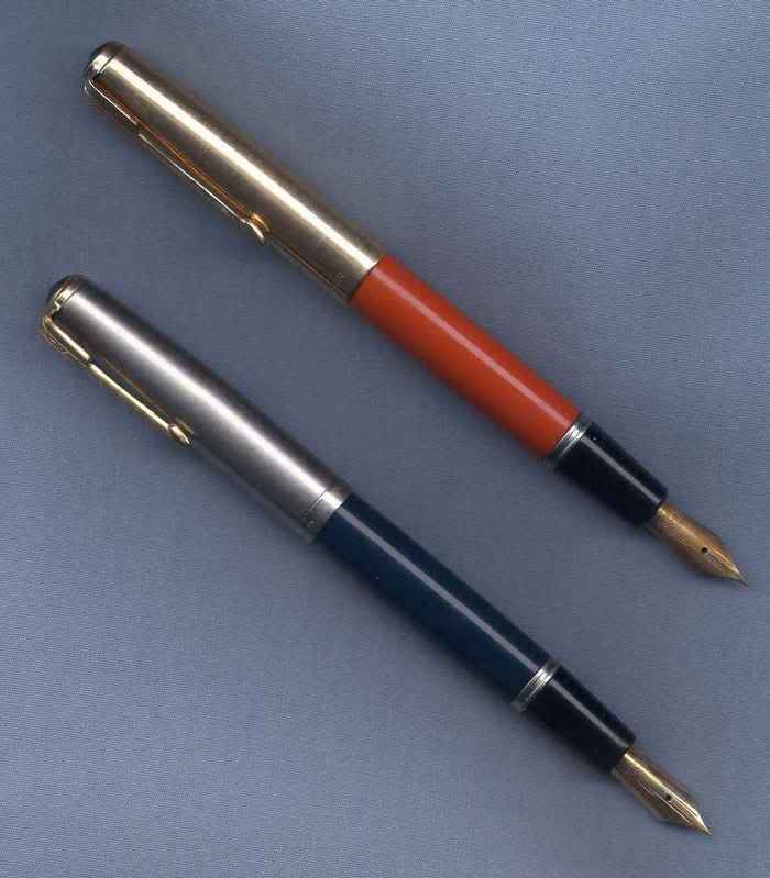
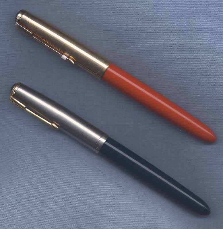
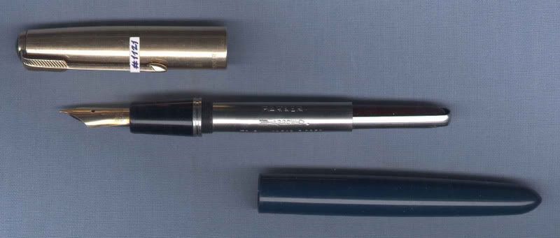
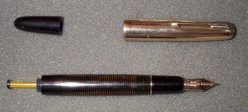
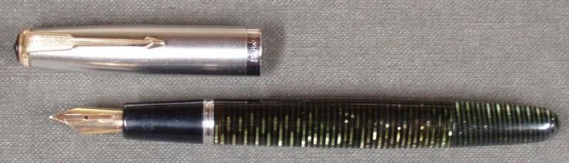
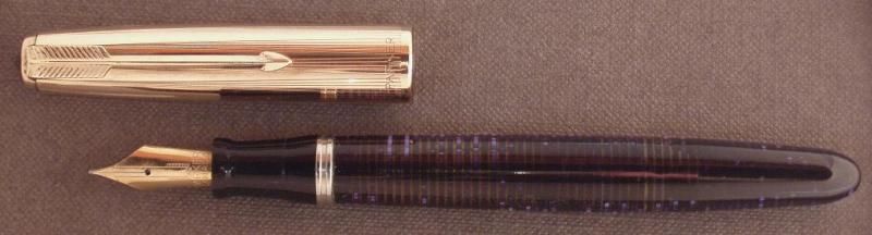
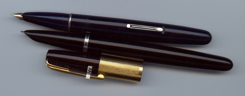
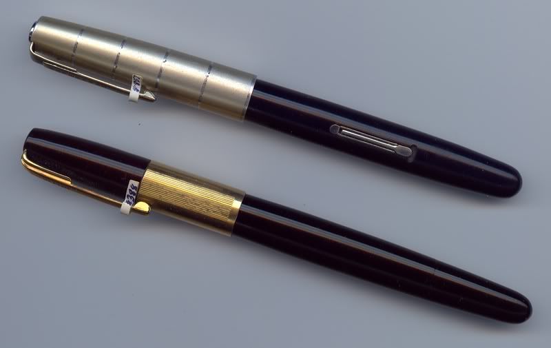
        On Nov 21, 2000, I wrote on Zoss, “Sorry Saul, but everything that Nathan writes is true.  You are right when you say that it was not a type of Parker 51 pen, but wrong when you say that it was not a Parker production pen in its own right, at least not up here in the Canadian Parker factory.  The pen was based upon the Parker 51 Special, and also the Parker 21, and it had its own name, the Parker “Arrow”.  It had a Vac nib with a Parker-21-type feed and aerometric unit set in a 21-type shroud, or hood.  The hood is cut back to make a section that allows the open nib and feed to protrude from the end, and the section is always black, no matter what the color of the barrel.  What probably happened was that Parker had an over-supply of Vac nibs in the 1950s, and they had the factory up in Canada use them up in this cost-effective way, using up old 51, 21, late-Duofold, and Vac parts.  I personally know of the existence of over 10 of these pens, including 3 pens that Max Stiedman owns.  I used to own one with a hunter green barrel and Parker 51 Heirloom-style Cap, and I currently own one with a blue barrel and a brushed-steel cap, and a much scarcer red-barreled one with a Heirloom-style cap.  Here are the above two pens
capped.
        “The “Arrow” was a very strange amalgam of pens and styles.  As well as the Vac nib and strange section and feed, the barrel is exactly the same as a Parker 21 barrel in length, diameter, and thread pitch.  The aerometric-filling unit is that of a Parker 21, but it is embossed with the name “Arrow” over top an embossed icon of an arrow.  The cap is the length of a Parker 51 Special cap, which is just a little shorter than the normal 51 cap, and it has the black jewel of the Special, but the diameter is that of a normal-sized 51 cap.  That means that you can exchange the “Arrow” cap with a normal 51 cap, but not with a 51 Special cap, because the metal bushing, or ring on the barrel that the cap slides on is the size of a normal 51 bushing.  I have seen various clips on the various caps, including Vacumatic 51 clips, Aerometric 51 clips, and the flat Challenger-style or 1940s-Duofold-style clips.  Here’s one taken apart.
        “The pens I have seen so far have had the Heirloom-style cap, but other styles of caps had been offered, including brushed steel.  I say Heirloom-style cap because it wasn’t exactly the same as the Heirloom.  The Heirloom is a gold-filled cap, with solid gold clip and barrel end trim, with widely-spaced horizontal and vertical lines forming large squares like a “window pane”, but the “Arrow” caps have gold-filled clips and have the horizontal lines only, not the vertical ones.  It’s sort of a half-Heirloom cap.
        “It’s truly an unusual pen, and the ones I have seen for sale at pen shows all sold for many hundreds of dollars, and I’m talking USD here, not Canadian.  One of these pens sold at the Chicago pen auction a while ago for $125-150, perhaps because no one except the buyer, Dan Zazove, and I knew what it really was.  I didn’t want another one, and there was no one else there to bid against Dan.”
        Someone, perhaps Len Provisor because he’s interested in airplanes, suggested that the pen might have been named after the Canadian fighter jet, the
Avro Arrow, because they both appeared about the same time, but I haven’t been able to find any corroborative evidence in advertisements that might confirm this connection, yet.  And to confuse the issue just a little more, here’s a true Parker 51 Vacumatic “Arrow” Frankenpen that someone made up.  And the real “Arrow” pen should not be confused with a new pen that Parker is calling the “Parker Arrow”, and another pen, a ballpoint they called the “Big Arrow”.  Also check out this page on Tony Fischier’s website on the “Arrow”, and this French Parker, “La Plume”, except it has a screw cap.
        Matt McColm wrote on Aug 18, 2007 that Ernesto Soler’s Parker 51 site had a Canadian green pearl vac w/ an Arrow section and 1956 nib, 51 clutch ring, and demi vac 51 cap w/ Parker clip. It was on his site updates page, but has since been removed. Not only was the pen he mentioned there on Ernesto’s site, the
“Arrowvac”, but there was also this pen, the “Vacarrow”. The first pen was the closest to an “Arrow” with its cut-back-shroud section, which was also why Ernesto called it an “Arrowvac”. But the second one had a more traditional Vac-like section, and he rightfully called it a “Vacarrow”. However, both pens are somewhere between prototypes and frankenpens. I don’t think either pen was a prototype, because that would mean that they were being considered for being put into production. I think they were pens made up by Parker employees for themselves. That makes them more than just frankenpens. It makes them legitimate one-offs, probably made in the Parker factory, but not “Made by Parker”, that is, made for Parker.
        But the pen with the brown Vac barrel looks like it has a traditional section with the stepped profile machined off. It also looks like it has a Waterman’s Taperite bushing, which just happens to be very close to the sizes of the two types of Parker 51 bushings. That means that the 51 and Taperite caps are interchangeable, if you ever need a frankencap for your 51 with a missing or damaged 51 cap. It also makes the brown Vac pen a true frankenpen, since it mixes parts from at least two pen companies. The two pens on Ernesto’s site are at least all-Parker. Here are some pictures of
a Taperite pen and a Parker 51 pen, and a Taperite cap on a Parker 51 frankenpen.

George Kovalenko.

. 


October 30, 2014

Caws and Effect


, the Caw’s Ink brochure poem.

        Back in 2003, I found a Caw’s Ink brochure that was reproduced in Ron Dutcher’s article about Francis Cashell Brown printed in the April 2004 issue of the hard-copy version of the Stylophiles magazine.  If you don’t have a copy of this magazine, you’re missing out on a real treat.  The brochure is a 7-panel, accordion-folding booklet printed on both sides, all done with a technique called white scratch card that yields images that look like engravings or intricate woodcuts.  Two of the panels on one side are the front and back covers.  Here are the two covers, but you’ll have to find the magazine to see the rest of the 14 panels.


        The other 5 panels on that side are taken up by cartoon advertisements for Caw’s Ink, all with racist and otherwise dubious and politically incorrect themes.  On the other side there are seven panels, each one dominated by one of these seven letters, C-A-W
’-S-I-N-K, ornately incorporated into images illustrating the text of the poem titled “Caws and Effect”, said to be written by Edgar Ape O., in imitation of the poem “The Raven” by Edgar A. Poe.  The only clue giving away the date of publication is the address of the company, which places it in the period between May 1884 and sometime in 1886.  Well, recently I ran across the same poem printed in The American Stationer, Apr 9, 1885, p.477, which could possibly help to put a more specific date, if not on the brochure, then at least on the poem.  There’s only one flaw in the rhyme scheme.  The word “accepted” has to be pronounced “axe-ape-ted”.  And ten years later, he was still using that title in the ad copy in his advertisements.
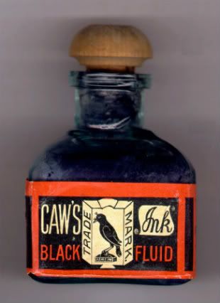
        I was also fortunate enough to have found about 8 or 9 Caw’s ink bottles.  Here’s a picture of one of my Caw’s ink bottles with the front side of the label prominently featured.  A while ago three Caw’s ink bottles showed up as one lot on Ebay.  This photo is interesting because it shows three distinctly different types of labels distinguished by the position of the crow’s beak, pointed up, straight level, and down.  I don’t know, yet, whether there is any chronological order to these 
three labels.
        And last of all, I
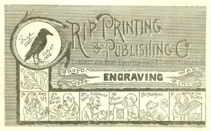
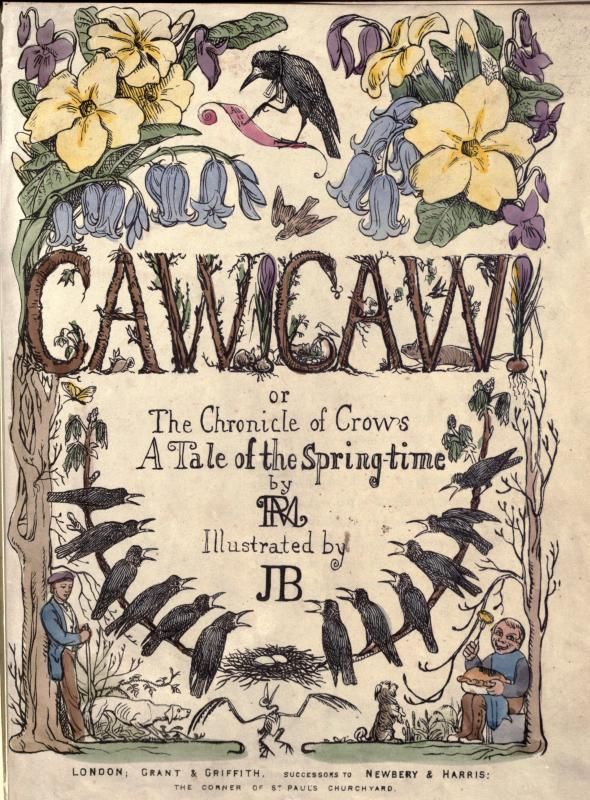
also found this publisher’s advertisement in an issue of The Illustrated War News, Apr 4, 1885, p.7, a newspaper that the Grip Printing & Publishing Co. put out.  The newspaper was started by this printing company solely to report on the second Metis Rebellion that happened in the early 1880’s in what was then still the North West Territories in the region surrounding the city where I now live.  A month later, Louis Riel, the leader of the Metis in their rebellion, was captured and brought to this city, or at least to the precursor of my city, to await transportation to prison and to his trial and to his execution.  As he waited, the English people of the small community came down to the river bank to gawk at the curiosity in their midst, the prisoner on the steamboat “The Northcote”.  He looked down at them and wrote in his diary very cryptically and with great poetic compression about the folly and the phoniness of their fancy clothes, fine carriages, canes, pipes of tobacco, and vain hair styles, such as Dundrearies and muttonchops, and their pretentious little houses with their Mansard roofs up on the river bank.  Basically he was saying, “L’enfer, c’est les Anglais”.  The Grip ad is done in almost the same style as the Caw’s brochure, and has a crow as the printer’s device, and is dated just a few days before the publication of the poem.  It’s just a coincidence.  And here’s an interesting children’s book from about 1848 also titled Caw! Caw!

George Kovalenko.

.
September 30, 2014

Hand & Pen

 
My hand holding Roger Cromwell’s Waterman’s #000 “Doll” pen and pretending to write the word “pen”,
photographed by Miroslav Tischler at the DC pen show in 2003.


        When Lion & Pen was suspended the first time, I had a bit of spare time on my hands, and I started playing with a possible list of new forums, but nothing came of it.  The second time it was suspended, I found myself playing with the site itself, as well as the list of forums.  I basically wanted to revise the whole board, but nothing came of it, and this time it was suspended for good.
        First of all, it would have needed
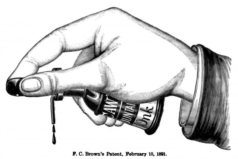
a new image.  Instead of Cross and his image of a lion-with-a-pen-in-its-mouth, the icon for the new board would have been, first of all, MacKinnon’s 1880 image of a pen-in-hand, a hand in the act of writing, or a writing hand, or a Hand Writing, and secondly, it would have been Livermore’s version of this same image of a hand writing, from later the same year.  And because Francis Cashel Brown and Caw’s continued the tradition of the MacKinnon stylograph under a new name, a couple of  tertiary icons would have been the images of the Caw’s ink-filler-in-hand, and the Caw’s Crow sitting atop a Caw’s ink bottle.  It’s an image of ‘a crow sitting on an ink bottle with a label with an image of ‘‘a crow sitting on an ink bottle with a label with an image of ‘‘‘a crow sitting on an ink bottle with a label with an . . .’’’, &c.
        And the new name would have been something like, “Hand & Pen”, or “Pen & Hand”, or “Pen in Hand”, or “Fountain Pen History”, or “Fountain Pen & Pencil History”, or “Fountain Pen & Mechanical Pencil History”.  So I settled on “Hand & Pen”, as an analogue of “Lion & Pen”.


        I preferred that name, but if I would have used it, it would have had to have been made clear from the start that it would have also included mechanical pencils.  And these would have been the forums the new message board would have had.
        Introduction
            Read this first
        Pens & Pencils
            Pen & Pencil History
            Repair and Restoration
            Buy, Sell, Trade
        That would have been it.  Those forums would have been visible to everyone.  Everything else, “All The Old Stuff”, would have been placed in a static forum, The Archived Forums, where a login would have been required for viewing.  The big change would have been that “Introduction”, “Pen History”, “Repair and Restoration”, and “Buy, Sell, Trade” would basically have been the only public forums left.  Old pens, new pens, who cares about the distinction.  Everything is history.  And to hell with all the rest of the forums.  I can’t do anything with them.  What can you do with a forum such as . . . “Chat”?  Everything else would have been bunged into the Archives.  The other big difference would have been that only the above four forums would have been visible to the public.  The rest would have required logging in to be viewed.  Nothing would have been deleted, no single posts, and no complete threads, but all the forums in the Archives would have been “Locked Topics” thereafter.  Nothing would have been lost, but nothing new would have been allowed to have been added to them.  All the forums would have been there for posterity, and as a document of the past version of the board, but that would have been it for “Chat”.
        So there it was, albeit cleaned up quite a bit, but of course, it was all wishful thinking and nothing came of it.  However, if such a message board were to have been placed online, would you have frequented and participated in a board that looked like that?  But then, instead of waiting for L&P to be revived, I created this blog to archive all my posts and threads from L&P and elsewhere on other pen message boards, and I used all of the above ideas to design this new, non-interactive website.  I had also saved a static, mirrored version of the complete L&P up to May 2011, so as it turned out, the whole L&P message board was now one great big “Locked Topic”, and I got to have my way after all.  End game.
        So why all the subjunctives?  This is why, and here it is.  Because nothing came of it.  And what do the above four images have in common?  They’re all Caw’s-related pictures that would have been effectively ghosted into the homepage background.
        Someone once said to me that fountain pen history was under appreciated, and was well worth the time and trouble to discover, but it was a “very tiny rain puddle” in “the flood of history”.  His meaning was that, “No matter what we do, it will never amount to anything more than a tiny puddle in a seemingly limitless ocean”.  In other words, it wasn’t the “true-true”.  But “what is an ocean but a multitude of puddles”?  And no matter how tiny, at least a puddle isn’t a fiction.  So “like Solzhenitsyn, labouring at his pond in Vermont”, I shall continue “beavering away” in my tiny puddle in “exile”, and saying such things as, “Only the facts, Ma’am”.

George Kovalenko.

.

P.S.  But take a look at my meta-blog,
Hand & Pen.
 

September 01, 2014

The Hand Writing


   , what do these four pics have in common?

For the answer, see below.


Three hands, two stylos, two ink bottles, two writing desks, and a crow?
Caw’s and effect.

 They would have been ghosted-in as background images
here.

P.S.
And this
blotter, too, is related to the top two.

    George Kovalenko.
 
.