collection1b

collection1b

November 25, 2015

Warren N. Lancaster on L. E. Waterman


  , and Hawkes and Madeheim, again.


[Posted on L&P on Aug 31, Sept 4, 5, 6, 2005, and Nov 1, 6, 2007.]
        Here’s an interesting article that adds another pen to the list of presidential pens on Ron Dutcher’s Kamakura Pens website, and adds an interesting footnote to David Nishimura’s article about Frank D. Waterman’s run for mayor of New York City, and also has an intriguing aside about H. P. & E. Day Rubber for Rob.  It’s from Time Magazine, Sept 28, 1925, in an article titled,

    “Luck”
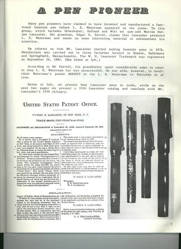
    In Manhattan, while Frank D. Waterman, nephew of L. E. Waterman, famed fountain pen maker, was being congratulated on having received the Republican nomination for Mayor, an old man sat in a vacant office on Madison Avenue staring at a fountain pen of antique design.  He, Warren N. Lancaster, onetime business rival of the famed Waterman, told reporters how luck had undone him.
    “That was a buster, that pen.  I called it the Idea, after a horse I owned.  Eugene Leigh, who brought that French horse over last year, trained him for me.
    “When I had a place at No. 212 Broadway I sent President Garfield a pen like that.  L. E. Waterman had a place a few doors down the street.  I used to get my rubber from H. P. & E. Day up at Seymour, Conn.  No one could make gutta percha like they could, on a big marble table, you know.  Well, one time Mr. Day said he couldn’t sell me any more rubber casings.  Said he’d made a contract with Waterman.  I put all my machinery on a boat and sailed it down to Baltimore.
    “I advertised on P. T. Barnum’s first circus program.
    “When they put up the Flatiron building, they flashed ‘The Lancaster Pen’ against it with a stereopticon machine.  Once I printed a Sunday paper to give away.
    “My wife and I traveled all over.  I introduced her to Mrs. Potter Palmer out in Chicago.
    “It all goes back to the Baltimore fire.”
    Old Mr. Lancaster pointed to a woodcut on a time-stained circular, which showed a Tennysonian gentleman with bushy brown whiskers, gold pince-nez.  “I looked like that once,” said he.  “It was always a fight.”
Driven out of New York by Waterman, he ended up in Baltimore, just in time to be undone by the great Baltimore fire of 1904.  That was his luck.

        David Nishimura wrote, “Great find, George.  Worth thinking about how much advertising expense back then went into ephemeral media.  We gauge penmakers’ promotional budgets by magazine ads even into the ’30s and ’40s, whereas by then serious money was being spent to advertise by radio.
        “I wonder, too, about how reliable Lancaster’s own reminiscences might have been.  Haven’t heard anything about an “Idea” pen before, and the Barnum program claim would put Lancaster’s activity pretty far back.  1871 was the founding of the “Greatest Show on Earth”.  And if he was still a player in 1902, the Flatiron Building date, why are so very few of his pens around?
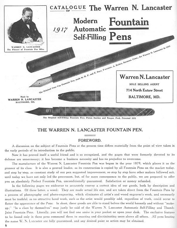
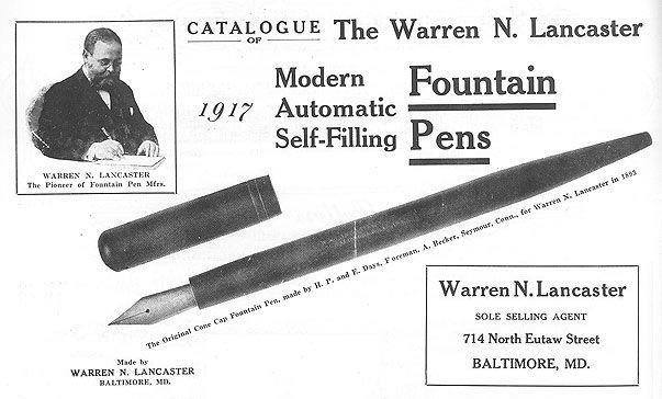
        “Cliff Lawrence published a bit on Lancaster several years ago.  The most interesting thing was his illustration of an actual pen, which appeared very similar to the sort of pen we were discussing in the recent Johnson-Prince-Hawkes-Madeheim thread, complete with under-feed ink valve.  Also, I was on the trail of a large ventless nib marked something like “LANCASTER / F. P. Co.” a few years back.”

        And I wrote, “David, did that piece appear in the PFC magazine?  The illustration of an actual pen like the one in the recent Madeheim thread, complete with under-feed ink-shutoff valve is probably the same photo, or advertising cut that appears in his 1992 Official P.F.C. Pen Guide, on p.36, item A.  The date for the pen given there is 1855, but that’s definitely a typo for at least 1866, if we’re talking about Madeheim, and more probably 1885, if we’re talking about Lancaster.  I think it’s time to start calling it the Madeheim pen.  What makes it a Madeheim pen is the ink-shutoff valve.
        “And I agree about the “Idea” pen.  He seems confused about what he’s saying.  He seems to be talking about one of his earliest eyedropper pens from the 1880s, but the horse wasn’t trained until “last year”, meaning 1924.  Maybe it was the other way round, and he named the horse after the pen.”

        David Nishimura wrote, “Yes, it’s in the PFC magazine.  June and October 1988 are the PFM Lancaster references.  The former has a
bio & trademark, a 1926 ad, and his obituary.  The latter has illustrations of pens supposedly from 1893 and 1855, and pages from the 1917 catalog.  And it is indeed the same picture.  I believe, from comparison with other similar images, that it is an nth generation photocopy of one of Lawrence’s own photos of an actual pen.
        “In all fairness, what he’s saying in the Time article appears to have been a transcription of a spoken interview, and what is more, it is clear that Lancaster was referring to a different horse trained by the same man who had trained the namesake horse way back when.
        “Nonetheless, one would be hard pressed to come up with a more stupid name than “Idea”.  Would the smaller version be a “Notion”, and the oversize a “Concept”?  Anyone who in that era would come up with such a name and not pause, scratch his head, and immediately tack on the final “L” was clearly destined for less-than-great things.”

        Rob Astyk wrote, “Or [maybe he couldn’t tack on the “L” because “Ideal” was already taken, and] perhaps that was the “Idea” all along.  Just like the “Waterson” and “Shaffner” pens in the 1930s, Lancaster was not above trying to cadge a bit of business from his competition.
        “Interestingly, the information supplied by Lancaster’s grandson seems to indicate that he started out in Baltimore and moved to New York, rather than the other way around as implied in the “Luck” piece.
        “Also, if Lancaster was primarily a contractor for large firms such as the Federal government and J. P. Morgan Co. that may explain why there are so few Lancaster pens in circulation today.”

        [The claim to factories in Boston, New York, and Baltimore is correct, but he started out in Boston and New York, then Washington, then moved to Boston in a joint venture with Colonial, then moved to Baltimore with the machinery he got from the dissolution of Colonial, just in time for the great Baltimore fire, and then finally moved to New York.]

        David Nishimura wrote, “Unfortunately, the first page from the October 1988 Lancaster coverage bears all the telltale signs of a Lawrence paste-up job, so we don’t know what this page actually looked like.  Cliff Lawrence would cut up original catalogues so as to fit everything into the magazine’s format, and no, he didn’t always cut up photocopies, as evidenced by a butchered, ex-PFC, A. A. Waterman catalog up for sale a while back [on Ebay].
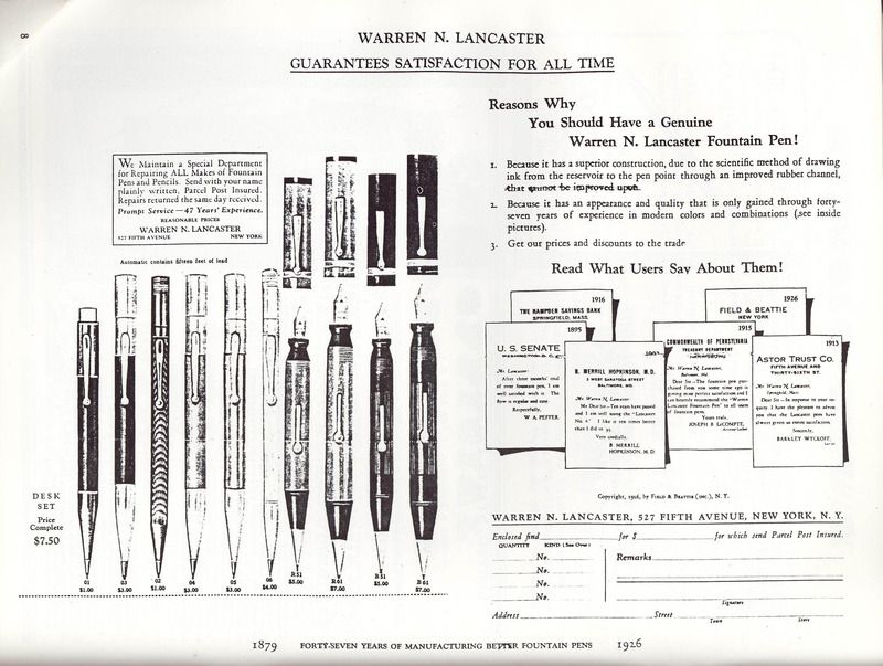
        “Note the fold marks on the images of the two early pens, and how they do not line up.  Note too that the catalog foreword claims manufacture beginning in 1879, but the image of what appears to be a Protean is dated to 1855.  This would appear to be a bit of misdirection, since the image is not labeled as a Lancaster pen!
        “As for Lancaster being a copycat, at least later on, just look at his trumpeting of the Modern Automatic pen, what would appear to be a clear infringement on A. A. Waterman’s trademarks, unless he were making or selling under license.  And on the second page, note the “IDEA” in a star logo.  Somehow I don’t think this goes back to before Waterman, especially given the nature of Lancaster’s trademark of 1882.  The illustrated pens bearing the “IDEA” imprint also carry a date of 1893.  Odd, since it doesn’t appear to be a regular patent date because only the year is imprinted, and the company apparently had a good claim to an earlier foundation date.
        “Finally, the list of pens for sale at the end of the issue shows the cone-cap desk pen illustrated at the beginning of the catalog paste-up selling at $650.”

        And I wrote, “David, I know what you mean about the telltale signs of a Lawrence paste-up job.  That butchered, ex-PFC, A. A. Waterman catalog on Ebay around 1999 was sold by Judy Lawrence, and was bought by Jim Heusinger.  He and I talked about it at a pen show, and Jim said many of the pen images had been cut out of it, and it looked like a child had been playing cutouts with the thing.  There’s another one for the “Hall Of Shame”.
        “The images of the two early pens with the fold marks on them are the same ones that appear in the PFC 1992 guide, but in a different relationship again.  And although the catalog foreword claims that manufacture began in 1879, the write-up in the June issue that Rob supplied gives that date as 1876.  I think the 1879 date is closer to being correct.
        “Now that you mention it, the same image of the pen with the logo with “IDEA” in a star also appears in the 1992 pen guide.  I remember seeing it a while ago but needed to have my memory jogged.  Maybe Lancaster was just rubbing it into Waterman’s face with his use of the “Idea” imprint.  It’s also just another one of the many hyperbolic names for pens, and exaggerated claims as to their abilities, names such as Acme, Climax, Eternal, Eveready, Forever, Genius, Ideal, King, Leader, Matchless, Modern, Neverbreak, Optima, Perfect, Premiere, Protean, Queen, Regent, Regina, Rex, Royal, Ultima, Unbreakable, Universal, Victory, Wearever, and Zenith, etc.  It’s a long-standing tradition in penmaking.”

        Dave Johannsen wrote, “[Looking at the patents in the 1880s, it’s interesting to see] just how many inventors were smitten with the idea of a valved feed.  In addition to the Madeheim pen, valved-feed patents were awarded to H. A. Walke, 1880 & 1883, Anson T. Cross, 1886, A. J. Kletzker, 1881, and W. B. Greene, 1880.  One wonders just how many of these ideas ever made it into produced fountain pens.  Probably not all that many.


        “The photo of the pen with the ink valve in the Lawrence article is captioned patented in 1855. Now, Newell Prince was awarded two patents in 1855, and poking around Google Patents didn’t turn up anything else that seemed even remotely plausible.  So, it’s possible that the pen in question is actually a Prince pen, Protean or otherwise.”

        And I wrote, “The earliest reference I have been able to find to Lancaster is his 1882 trademark, so I doubt that he had anything to do with Prince, who was active in pens in the 1850s and 60s.  And as for the two Newell Prince patents from 1855, you have to remember that neither of those patents had a valved feed.  That was Madeheim’s innovation.”


        “My guess, and it’s only an opinion, is that either Hawkes, or someone else started selling the Prince pen and took over his patent rights, and then later got licenses for, or otherwise acquired the Madeheim and Hawkes patents, and incorporated all those features into Prince’s pens.  So the Prince pens with shut-off valves are not simply Prince pens, but rather amalgams of a few different pen designs.  And that pen in the Lawrences’ book is probably one of these later Prince pens. Perhaps Lancaster made that type of pen in its last days in the 1880s, or sold it as an agent.”


George Kovalenko.


.
 

November 22, 2015

The Madeheim Fountain Pen


  , made by Hawkes, sold with an E. S. Johnson nib and box.


[Posted on L&P on July 17, 18, 28, Aug 13, 15, and Dec 1, 2, 3, 2005.]
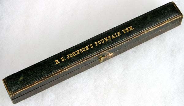
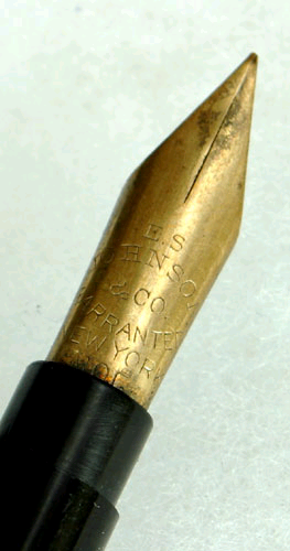
        Lex Villines found a pen with an E. S. Johnson nib in an E. S. Johnson box and posted some photos of the pen, the
box, the nib, and the shutoff valve on various pen message boards.  But I didn’t think the pen was an E. S. Johnson pen.  At first, I thought the pen was a George F. Hawkes pen that had been placed in an E. S. Johnson box.  See his US patent no. 50,470 from 1865.  It may have been sold in that box originally, but it wasn’t a Johnson pen.  It may have been made by Hawkes for Johnson, or Johnson may have merely been the agent for the pen company, or a dealer selling the pen brand.  Hawkes started off as a gold nib maker, and then branched out as a dealer of others’ fountain pens, but then went on to invent his own fountain pens.  He even received a medal for his gold nibs at the 1853 New York world’s fair.

        Rob Astyk wrote, “In the days when this pen was sold one could have the maker install any nib one pleased.  I would fully expect that Johnson, as a gold pen maker and vendor, would install his own nibs in the stock he sold”.  He then suggested that rather than a Hawkes pen it was a late-production Prince’s Protean by John S. Purdy.  And he was right, at first glance it looked like a Prince’s Protean outfitted with a Johnson nib.  But then there was that shutoff valve.

        David Nishimura wrote, “Note the pen is unmarked save for the nib, and the two-step section, and the very simple feed design.  Incidentally, I remain uncertain about the identity of the pen shown in Lex’s pictures.  I have a Hawkes flyer that shows a very Protean-like ink shutoff on the feed, even though such a feature doesn’t seem to appear in Hawkes’ patent drawings.  I’ve also been trying to figure out for some years why another very Protean-like pen is shown in the form of a drawing in the Pierre Haury book with the name “Johnson” and a date in the 1860s.  It does not appear to come from the Cantor Lectures, nor from any patent I’ve been able to find.  I also wonder if others may have stepped in and copied once the Prince patents expired, which would have taken place sometime in the 1870s.
        “I do have one other pen that is securely a Protean, as it is imprinted faintly on the hard rubber, and carries an original Prince nib.  But I also have yet another that is unmarked, though very similar in form and construction.”

        And I wrote, “David, thanks for the clue in the Pierre Haury book.  This pen is definitely not the Hawkes pen in patent 50,470, and neither is it one of the Prince pens in patents 8,399, 12,301, or 13,995.  I started looking in the 1860s patents right away, and within a few minutes found the answer, I think.  Lex’s pen is a Hermann Madeheim patent pen.  Madeheim had three US patents,
57,162, 220,483, and 293,759, all for various types of piston fillers with ink-shutoff valves in the feeds, and a slot in the end of the cap to facilitate turning the cock valve.  Neither the Hawkes patent nor any of the three Prince patents has this ink-shutoff-valve feature.  The Hawkes patent has a slot in the end of the cap to facilitate removing the feed for filling, and the Prince pen may have used the Madeheim valve through a licensing arrangement.  Depending upon what type of piston Lex’s pen has, it’s probably one of the two later Madeheim patents.  The first patent has a sleeve piston, the second patent has a hollow piston rod, and the third patent has a detachable piston rod.  I’d say Lex’s is based on the second Madeheim patent.

        “I then went to the Haury & Lacroux book and looked for your reference, but I didn’t find just one drawing with the caption “Johnson”.  I found two.  Just to make sure that we’re on the same page, I found the two drawings on p.33 of the English translation by Fred Gorstein.  Neither of them is dated in the 1860s, and neither of them is a Johnson patent, or Johnson assignment.  One is dated 1855, and the other 1856.  Luckily I didn’t see those dates first, and start looking in the 1850s to start off with, otherwise I might not have found the Madeheim patents.  I think the 1855 drawing is of the second Prince patent, and the 1856 drawing is the one to which you’re referring.  I think that date might be a misprint for 1866, the date of the first Madeheim patent, but the drawings are less-sophisticated versions of his third patent from 1884, the one with the detachable piston rod.  Also, the Prince patents may have expired sometime in the 1870s, but John S. Purdy was the agent for the pen from the 1870s up to at least the 1880s, and perhaps as late as the 1890s.
        “But here’s the best clue of all.  The second Madeheim patent was assigned to George F. Hawkes, so Hawkes may have been the maker of the hard rubber parts for your pen, and E. S. Johnson may have been the maker of the nib and the one who marketed the pen.  And most tantalizing of all, perhaps some of the so-called Prince pens are actually not Prince pens, if Prince didn’t license this ink-shutoff feature from Madeheim, or Hawkes.  The ones with ink-shutoff valves are either Madeheim, or Hawkes, or Johnson pens, and the only true Prince pens are the piston pens without any ink-shutoff valve at all.  However, the pen in
this earlier post probably, and almost certainly, was an early Prince’s Protean.  So, David, does your “Protean”-imprinted pen have an ink-shutoff valve?

        David wrote, “My marked Protean is not imprinted “Protean”, but rather “Prince’s patent”.  All of the Proteans I have seen have the ink shutoff valve under the nib, and so do my two pens”.
        “We’ll get this figured out yet!  A remaining question in my mind is how the Haury illustrations ended up with the Johnson caption.  Random error?  Or reflective of some source that brought together all these players?  I’ll have to get pics up of the Hawkes flyer I mentioned, and of the Prince’s patent pens.  If I recall correctly, both have the ink shutoff and matching slotted cap-top.  One is actually imprinted and has a Prince nib; the other is unmarked and came nibless.”

        And I wrote, “Could the 1856 drawing possibly be an illustration from a British, or French, or German patent for the pen, if there were one?
        “In the meantime, here’s another Hawkes and Madeheim connection, with the two of them as co-patentees on US patent no.
223,644 for a piston-filled stylograph.”
        “With all the online databases out there, it’s quickly becoming a golden age of research.  And good-quality, detailed pictures without any Photoshop bells-and-whistles enhancements are one of the best tools of the researcher in the age of the Web.”

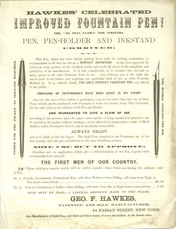
        Various participants in the thread posted pictures of Prince and Hawkes pens and ads.  Here’s a
Hawkes ad for his improved pen.  And here is the portion of another Hawkes flyer that lists Prince’s pens in two sizes, but not his own pen.

        And then I wrote, “Just rambling, but isn’t it curious how all pens from a certain era always resemble one another?  Look how similar the Prince, Hawkes, and Madeheim pens are.  It’s as if there were an unspoken agreement, or all the penmakers conspired and decided that was the form all pens should take.  Or maybe one style came along, and everyone else imitated it as a model, in order to compete with it.  Just look at the MacKinnon stylograph from the 1870s-80s, imitated exactly by the Cross, Livermore, Foley, and Dunlap stylos.  And the Frank Holland pen from the early 1880s, imitated by L. E. Waterman and by everyone else.  And the A. A. Waterman slip-cap eyedroppers from the 1890s, imitated by L. E. Waterman.  And all the Duofold look-alikes from the 1920s.  And the streamlined pens from the 1930s.  To take a much more recent example from 1985 to 1995, just look at the rings on the caps of the Pelikan 800, the Parker Centennial Duofold, and the Waterman Le Man 100, all desperately trying to imitate the
Montblanc configuration of three cap rings, but without infringing the two Montblanc trademarks.  Here are the US design patents for the Le Man 100 and the Centennial Duofold, D280,737 and D330,217.
        Ron Dutcher wrote, “My thinking was that the earliest fountain pens and stylos were trying to mimic the common, telescopic pen cases and magic pencils that preceded them.  I wonder what these early manufacturers would think, if you handed them a modern Krone?”
        And I wrote, “Yes, and it’s also the point of the taper cap on a pen like the Waterman’s #24.  It’s meant to make a fountain pen look and feel like a penholder, or dip pen, or straight pen.”
        David wrote, “Style, fashion, or whatever you want to call it, has its own considerable momentum.  Nor can one isolate pens, or other writing instruments.  Each time and place has its own formal preferences.  Think of how pen design correlates to automotive design, for example.”
        Rob Astyk wrote, “Much has to do with what sells in this look-alike syndrome.  Parker sales shot up after the Duofold was introduced, and suddenly, every penmaker had to have a red hard rubber pen with black ends.”

George Kovalenko.

.

 

November 19, 2015

A Cartridge Pen Precursor In 1853?


  , and an elephant-trunk feed.


[Posted on FPN on Oct 15-23, 2013, and Mar 31, & April 12, 2012.]
        The website for searching the early
French patents, which Simone Piccardi so kindly shared with us in this post on FPN, enabled me to find a French patent from 1853 that just might turn out to be the first patent for a cartridge pen.
        The patent number search field on that website doesn’t work, so use the other fields to search for the inventor’s surname, Faure, and the year, 1853, and you’ll find
French patent no. 15,936.  If this link doesn’t work, you may first have to open up the above search page in a separate tab.  I don’t know why, but that’s the only way to make it work, sometimes.
        Look at Fig. 3 on the illustration page, and the description of Fig. 3 in the specifications.  The barrel in Fig. 2 is described as “un tube principal en métal”, and Fig. 3 is “un tube plus-petit en verre”, and is said to be “destiné”, or “destined” to receive the ink.  It looks like a Bion-type fountain pen with a glass-tube cartridge as the reservoir.
        So what do you think?  Is this a patent for an early cartridge fountain pen?

        David Nishimura wrote, “I have no problem with the French translation, but transcription from that copy is a real pain.  I took a quick look and the resolution is awfully poor!  I may brace myself to tackle it when I have more time.
        “There is most certainly a glass reservoir being used in this design.  The big question is whether it should be considered a cartridge.  Even if it is intended to be filled before being inserted into the barrel, I’d argue that unless there is an express intention for multiple interchangeable pre-filled glass tubes to be used, it should be classified as a detachable reservoir rather than a cartridge, albeit a significant step towards a cartridge, as presently understood.

        Dan DeMaio posted this online definition of “cartridge” from
Oxford Learners Dictionaries.
“3. a [sealed] thin tube containing ink that you put inside a pen.”

        David wrote, “Plenty of substandard dictionaries out there.  The essential aspect of a cartridge in any form is that it is replaceable, multiple, and interchangeable.  Look at the pen shown at the bottom of
this page.  A thin tube which is filled with ink is inserted into the back of the barrel.  Is it a cartridge?  No.  It is not sealed at the mouth so it can be carried around and loaded at will, and each pen came with just one tube.  It is a detachable reservoir, not a cartridge.  By that lame online dictionary definition, a rubber ink sac is a cartridge.”

        And I wrote, “There, it’s official.  David has called the Oxford Advanced American Dictionary definition “lame”!
        “I can tackle the French translation as well, but as David said, the transcription is a killer.  It took me a whole day to figure out that the word before “petit” is “plu-”, and the word “verre” isn’t so obvious, either.  There are genealogical websites with tutorials on how to transcribe the styles of handwriting from various centuries past.  With some of the early French patents, which are all hand-written, you almost have to become a professional paleographer.
        “I agree, it all depends upon whether there are multiple, interchangeable, pre-filled glass tubes, but still, as you said, it’s a significant step towards a cartridge pen, perhaps an ur-cartridge, or a proto-cartridge pen.
        “But here are some corollaries.  A cartridge pen with only one refillable cartridge is not a cartridge pen.  A cartridge pen with a convertor replacing the cartridge is not a cartridge pen.  A cartridge pen with a squeezac, or self-refillable cartridge is not a cartridge pen.  They are all self-fillers.”

        [When someone wrote in another thread that “the earliest self filling combo is the glass cartridge Eagle combo”, David wrote, “Not to pick nits, but most people don’t regard cartridge pens as self-fillers.  The usual understanding is that a “self-filler” can fill from a bottle, without any extra devices.”
        And I wrote, “Okay.  I’ll pick that nit.  Some people try to be economical by refilling their cartridges with a syringe, from an ink bottle. But other more impatient people refill their cartridge pens by dipping the nib directly into an ink bottle and squeezing the cartridge.  Now, of course the cartridge never refills completely, but that’s not the point.  And the cartridges will eventually crack from all the stress, and leak, but they do last quite a long time.  Or one could alternatively use a convertor, or a squeezac instead of the cartridge.  So by your definition, cartridge pens can sometimes be self-fillers, that is, when they are not used as cartridge pens.  That’s why I moved the squeezac to the “Hybrids and Eccentrics” section in my revised
Taxonomy.”]

        Then Dan posted another online definition of “cartridge”, this time from
Dictionary.com.
“3. any small container for powder, liquid, or gas, made for ready insertion into some device or mechanism: an ink cartridge for a pen.”

        Daniel Kirchheimer wrote, “Another flawed definition.  The essence of an ink cartridge system is that it allows the user to carry a supply of liquid ink beyond what the pen can hold without needing to have a bottle of ink on hand.  A detachable, refillable reservoir fails that test.”

        David wrote, “Okay, I just put a bit of time into the transcription.  I’m still wrestling with some of the words, but the overall content is now clear.  The key elements are as follows.
1. Un tube principal en métal, fig. 2.
2. Un tube plus petit en verre, fig. 3, destiné à recevoir l’encre et introduisant à volonté dans le premier, fig. 1.
Note the “à volonté”.  The glass reservoir is intended to be removable, not fixed.  At the same time, there is no mention of other tubes, so we are talking about a removable reservoir rather than interchangeable, preloaded cartridges.
        “The rest of the description covers the feed system, which consists of three funnels,
entonnoirs, the most feed-like described as “en forme de trompe d’éléphant”.  This system is not designed to provide continuous ink flow, but is instead an ink-dispensing mechanism with a button-operated valve clef”, that releases a drop of ink laisser échapper une goutte d’encre”, into the nib with each press of the finger.”

        And I wrote, “I like the line about the tube feed shaped like an elephant’s trunk.  It’s a very accurate description.  You can see it clearly in the illustration.”

        David wrote, “I don’t want to have to pay the 30 Euro for a higher-resolution copy, so am still working on the online version.  Seems clear now, though, that the valve is called a “clef de flute”.  Rather nice, though the elephant’s trunk is still the best!”

        And I wrote, “I especially like the patents from the mid-1800’s for the early typewriters with keyboards and keys similar to those on Schroeder’s toy piano in the Peanuts cartoons, ones with quaint names such as “Le Clavier Imprimeur” and “Cembalo Scrivano”, printing
pianos and writing harpsicords, or rather harpsichord scribes!”

 George Kovalenko.

.
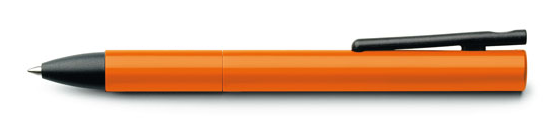
Pilot Vpen, so-called disposable, but still refillable as a jointless eyedropper pen.


November 16, 2015

The ‘Onoto’ name


  , the color red, and the “note”.


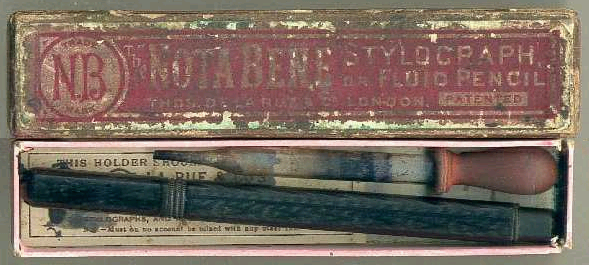
 A picture of “Onoto” stylograph.

[Posted on L&P on July 5-12, 2010 and Oct 5, 2011, and an email exchange on Aug 10, 2015.]
        Here’s another orange one, and I think I just may have found the source for the “Onoto” pen company name.  The most-often-quoted
explanation is that the name was chosen because it “sounded the same in any language”, but that sounds more like a rationalization after the fact.  Steve Hull was with the new Onoto pen company in it’s early days, and David Cooper joined in 2005.  Their online article, A Brief History of Onoto Pens, written by David from historical info provided by Steve, states that, “It is possible that it was named after Ono Tokusaburo, a Japanese watchmaker [who] registered a patent in 1885 for a stylographic pen whose features may have been incorporated in the Onostyle and other stylos made by Thomas De La Rue at the turn of the 20th Century”, stylos such as the De La Rue “Nota Bene”, before they started using the “Onoto” name.  The Onoto repair book, which also incorporates historical info provided by Steve, also suggests the pen might have been named after Japanese inventor, Ono Tokusaburo.  But here is the reference that got me thinking about the meaning of the name.  I was looking for pen company ads in the vast database of the Making of America website at Cornell University, and when I did a search for the word “Onoto” I found the phrase, “colored red with onoto, the pigment of the bixa orellana”.  It’s in the magazine The Living Age, Vol. 23, Issue 293, Dec 29, 1849, p.592, in the last paragraph in the first column.  The word is also spelled “arnatto” and “anotto” in other sources, and is now standardized to “annatto”, but it’s that particular spelling of the word in The Living Age that’s of interest here.  It is the only use of the word with that spelling in the whole website, almost making it a hapax legomenon, at least within the constraints of that enormous website.  Elsewhere, there are the more familiar modern uses of the word as the names of the English pen company, and French bicycle and motorcycle companies.
        Trademark
54,838, Thomas De La Rue & Co., July 31, 1906, used since 1904, is for “Certain Named Pens”, perhaps fountain pens.  There is no image on the USPTO website, so I don’t know whether this is the trademark for the word “Onoto”, and whether or not it is for fountain pens, although it is definitely the US equivalent of UK Registered No. 268,944.  Another of the boxes for   the Nota Bene stylo bares the trademark “N.B.”, so perhaps that’s it.  But trademark 74,488, Thomas De La Rue & Co., “Reservoir And Fountain Pens, &c.”, July 13, 1909, used since Sept 7, 1905, is definitely for the word “Onoto”.  Here, also, are the US trademarks for Onoto ink, and Onostyle ink.  But then I ran across that unique instance of the word “onoto”, the pigment of the Bixa orellana, so perhaps the name was taken from the favored color of their first red hard rubber fountain pens and ink-pencil stylographs.  Eureka!  There’s red in them there hills.  And it just might be the meaning of the pen company name, “Onoto”.
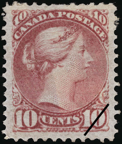
        Maybe it’s a stretch, but let me try to talk you through my reasoning.  Thomas De La Rue & Co. started out as a printing company that produced government stamps and decks of playing cards among many other printed items.  In that business they had to become familiar with and had to produce pigments for their printing inks.  There are various printing artifacts that are collected by philatelists as an extension of postal history collecting, an area called “Collateral Material”.  Thomas De La Rue & Co.’s in-house book of recipes for pigments and dyes for inks for printing postage stamps, their Ink Formulation Register, is an example of this kind of material.  A sheet from this book showed up at the June 17, 1995 auction of the Don Bowen collection of 10 cent Small Queen Canadian stamps.  Catalogue item number 2431 specifically is a page from the De La Rue book for the color “Permanent Violet 115B”, the color used to print that particular stamp, the
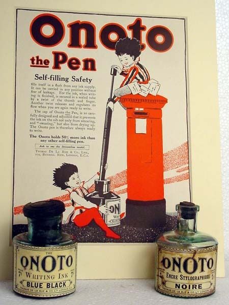
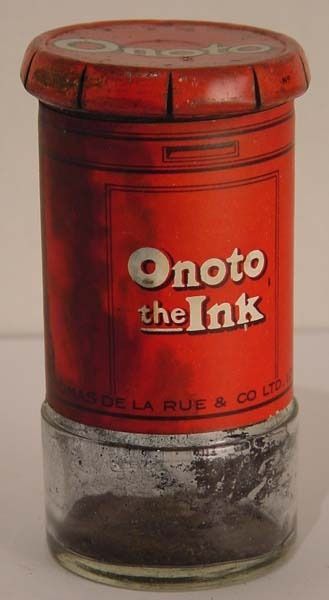
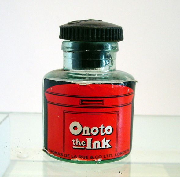
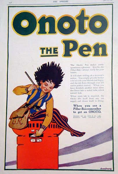
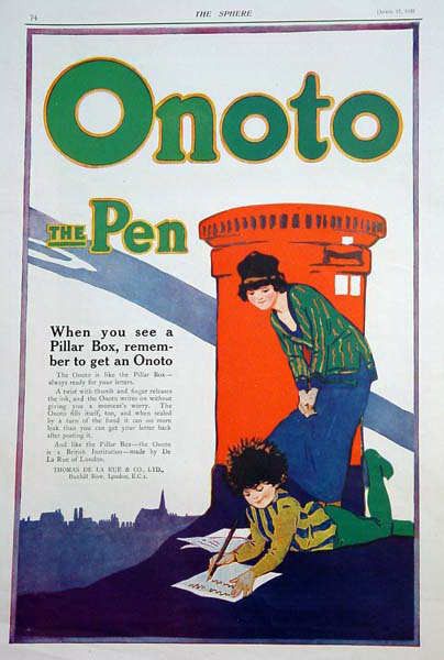
Canadian Scott #40, and here it is enlarged.  So it’s conceivable that Thomas De La Rue & Co. was familiar with onoto as a pigment.  They may have tried it out as a possible coloring agent in printing inks, and it may have been used by them in their business of producing other coloring, dyes, and pigments.  As well as the fact that a lot of their early Onoto fountain pens and stylographs, or ink pencils were made of red hard rubber, such as this pen, and this stylo, the Onoto company’s earliest identifying advertizing image was the familiar British red pillar mail box, used in their advertisements, catalogues, playing cards, and their ink bottle labels, along with the advertising character “Peter Pen”, as in these adverts, one, and two, and this pillar ink, and this ink label.  Now, I’m not saying onoto was used as a coloring agent in the making of red hard rubber, but only that it looks like the coloring agent in red hard rubber, and so the pen company may have been named after this “red matter”, the favorite color of this plant-based dye stuff.
        Onoto is, however, used as a food coloring agent, and as a dye for silk and wool.  See British patent no. 3,125 from Aug 1, 1879, W. McDonnell’s patent for abstracting color from “annatto or arnatto”.  There are various US patents for such things as extracting the coloring matter from annatto seeds,
2,815,287, for edible annatto coloring compositions, 2,831,775, for water dispersible carotenoid compositions, 2,861,891, for vegetable-base food coloring for oleo-
 margarine, 3,162,538, and for a method of removing pigment from annatto seed, 4,204,043.  By the way, some of my other favorite “red matters” include the color of koa, pernambuco, cocobolo, padouk, fox fur, turmeric, paprika, lily pollen, saffron, and other carotenoids and erythrisms,
“a morbid fondness for the color red”.

        I’ve seen the explanation that the word was chosen because it sounded the same in any language, but that seemed like a rationalization that was thought up after the fact.  The
Onoto website says that the name has no special meaning and that “it was chosen because it was easy to remember, easily pronounced, and sounded the same in any language”.  It goes on to say, “One source suggests that the name was chosen because De La Rue had a large market in the Far East”, but that’s all modern hearsay, and salesman’s puff.  If you do a search in Ebay for the word you find books written by Onoto Watanna.  In spite of the puffery, Masa Sunami believes that her name was one of the ones used to “promote the Onoto brand by using fictitious writers’ names to publicize the pen’s attributes”, except that she wasn’t fictitious.  She was very real.
 

        David Nishimura wrote, “I don’t find the connection with color very compelling.  Early Onoto pens are no more often found in RHR than any other brand of the era, which is to say, the great majority are plain black.”

        And I wrote, “Granted, most people opted for the more affordable BHR pens, but there’s also the corporate imaging and advertising that utilized
Peter Pen, along with the red Pillar Box, and the ad line, “When you see a Pillar Box, remember to get an Onoto”, which they used over a long period.  They wanted the buying public to identify the pen with the iconic red Pillar Box.  But as I said, maybe it’s a stretch.”


        David Cooper wrote, “Excellent information, brilliantly researched and presented by RHR. You certainly have a nose for sniffing out a story!
        “Of course, it’s a topic which has great significance to me, as a director of Onoto, and we have made efforts over the past 5 years to find something which we can say definitively is the reason why Onoto is Onoto.
        “Sadly, there doesn’t appear to be a definitive answer, just a series of suppositions.
        “Another one which came to light recently, is that there is a connection between the pen company and Onoto Watanna and that when Onoto opened its office in New York in 1909 it sought permission from the author to use her name.  Nice try, but as the Onoto name was first used in the UK in 1905, it’s another failed link in my eyes.
        “The simple fact is that many of the original company records went up in smoke in 1940 when the company’s Bunhill Row offices were hit in the London Blitz.  The Onoto archive retained by De La Rue in their Basingstoke, UK offices today is very small and contains mostly information from the 1950s, which I suspect were removed from the factory in Scotland when it closed in 1958.
        “Incidentally, you may be interested to see we are still using the red pillar box!  Here’s a
photo of it at the recent University of Cambridge graduation ceremony, where we were promoting our new 2010 Onoto Graduation pen.
        “Thanks for all your efforts to reveal the truth about the naming of Onoto.  It’s much appreciated.”

        And I wrote, “Thanks for your kind words. And thanks also for the photo and all the new information that you contributed here.  I was hoping to flush out one of the new Onotoists from the woodwork [wordwork] with my theory of red.  If you scratch an Onotoist, do they not bleed?


        “I’m glad to hear that the new Onoto Co. is maintaining the long-standing tradition of using the red pillar box!  You might also want to consider using some of the new RHR rodstock that is now available from the various hard rubber factories to remake one of the vintage Onoto pens, perhaps a streamlined Magna, or an old-style, straight-sided model, like a red pillar.
        “We might never know the true source of the Onoto name, but along the way, a lot of new information is being discovered.  Personally, I still think that if you scratch any Onoto pen it will bleed red.  Even that new pretty blue celluloid version of the pen.
        “And when I mentioned Onoto Watanna, I was just trying to discredit the notion that there was a tie between the origin of the name of the pen and the name of Canadian author Winifred Eaton, writing under the pseudonym, or pen name, Onoto Watanna.  She had apparently been using the name since her first published works in 1898, but I don’t believe there is any connection to the pen company, not until someone shows us an ad featuring her.  Has anyone ever seen an Onoto Pen Co. ad that features, or mentions Onoto Watanna?”

        Someone using the username Readymade wrote, “Interesting!  I’m wondering if all the theories so far might be, in their own way, correct.  It’s possible that someone in the De La Rue management thought, “Hey, it sounds like the red dye we printers use”.  Who knows?  By the way, ‘hapax legomenon’ is one of my favorite words.”

        Ian Donnachie wrote, “As one who served an apprenticeship with TDLR at the Strathendry Works in Leslie Fife, the name Onoto never came up in any discussions that I recall.  The factory was always known as ‘the pen factory’, or just DLR, the pen making facility was a minor part of production, most taken up by military parts.  There are not many of us left in Leslie, and at 75, 

I am probably one of the last to be involved.”

        And I wrote, “I fear that both you and I would have to be 125 years old for the name “Onoto” to have come up in any of our discussions, even if we could recall them.  By the time the factory was taken up with making military parts for WWII, the name was no longer an issue.  There are not many of us left at all who would even bother to be involved in a discussion of the etymology of the company’s name.”

        And then later I wrote, “It is often said that the name “Onoto” was chosen because it had no special meaning, and because it sounded the same in every language.  But before De La Rue had a fountain pen called the “Onoto”, it had a stylograph called the “Nota Bene”, and it occurred to me that “Nota” is just a few letters off from the name “Onoto”.  If you refer to the stylo using an indefinite article, as in “a Nota Bene”, then it sounds just like “Onoto Bene”.  Is “Onoto” another version of “Nota”?  It almost sounds like “a Nota”, but another Nota.  I always thought that the TDLR ad line “Onoto the Pen” didn’t make sense.  It seemed to be so stilted, and unnatural, and straining for effect.  The phrase “Onoto The Pen” is ungrammatical, and incomplete.  I rather like the phrase, but the comma is missing.  The phrase should be “Onoto, The Pen”, pronounced “thee”, or at least with a stress on “the”, but it needs that comma to give it a pause, which lends it that stress.  The phrase, which is just a rearrangement of the words “the Onoto Pen”, seems to be trying to avoid something, perhaps saying “an Onoto Pen”.

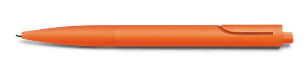
        Well, if the word “note” is implied in both names, then “Onoto” does have a special meaning, but only in English, and maybe some Italic and Romance languages, and it definitely does mean the same in those languages, so let’s stop saying it has no special meaning. It’s based on the words “Nota” and “note”.  I don’t know whether my red-color theory has credibility any more, but I think that this explanation has some merit, and I don’t think anyone, except a willful contrarian, or a mumpsimus, can deny that the word “note” is at the core of the names “Nota Bene” and “Onoto”.  It’s also the source of the name of the Lamy Noto, although I prefer my redesigned Lamy Tipo.

        More recently, Steve Hull, the author of an upcoming book on Onoto, and I corresponded about the name “Onoto”.  When I mentioned my theory that the name “Nota Bene” might just be the true source of the name “Onoto”, or that the two might have a common source in the word “note”, Steve wrote, “I quite like the idea of Onoto being a corruption or adaptation of the word ‘Nota’.  Sounds feasible”.  He countered that he also found a reference to a company ad that played on the phrase “saying no to other pens”.  He wrote, “It was part of a 1921 TDLR spoof question and answer piece, ‘Say O-NO-TO any other fountain pen which is offered to you’.  But I still like your idea of the corruption of ‘Nota’, though!”.  And I would say that it’s
the evolution of the word “Nota”.  It evolved from the name “Nota Bene”.  But absent some crucial note that didn’t survive the fire in the company records that went up in smoke in 1940”, we have to conclude that all the other explanations are after-the-fact rationalizations.

  By the way, Onoto The Pen is the main title of Steve’s book, and it makes great sense.  It’s the obvious and correct choice, seeing as the phrase was prominently used in Onoto ads and barrel imprints into the 1920s, but it should more obviously and more correctly be called Onoto The Book, or just simply The Onoto Book.


A picture of a “Nota Bene” stylograph.

  George Kovalenko.


.
 

November 13, 2015

The ‘St. George’ Pen


[Posted on L&P on Aug 13, 2010.]
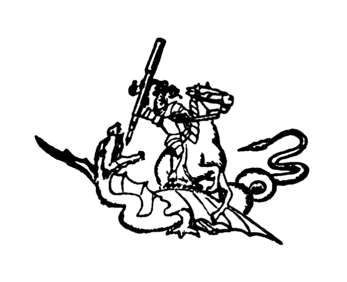
        US trademark no. 41,432 issued to Armeny & Marion for “Fountain-Pens” on Nov 10, 1903, used since Oct 1, 1903, is for the name “St. George”, and not for the familiar image of St. George as a knight in armor on horseback fighting a dragon with a fountain pen as a lance, an image that they printed on the barrels of their pens.  You can see it
here in the PDF of the Trade-Marks of the Jewelry and Kindred Trades, 1904, on p.143.  Does anyone have any pictures of the pens made by Armeny & Marion?  Change the letter “b” in the URL for the PDF to the letter “a” to find the first half of the text of the book.

George Kovalenko.

.
 

P.S.  Did you notice that the lead trademarks in the last two posts had consecutive numbers?
 

November 10, 2015

The ‘Mercantile’ Trademarks


[Posted on L&P on Aug 13, 2010.]
        US trademark no.
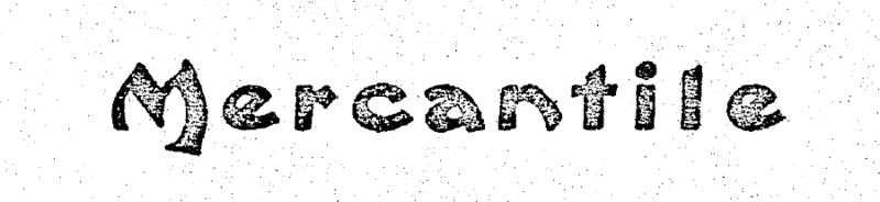
41,433 issued to Aikin, Lambert & Co. for “Fountain-Pens” on Nov 10, 1903, and used since July 1, 1895, is for the word “Mercantile”.  US trademark no. 44,919 issued to Eagle Pencil Co. for “Lead-Pencils” on Aug 1, 1905, and used since 1880, is also for the word “Mercantile”.  And US trademark no. 69,667 issued L. E. Waterman Co. for “Safety-Holder [Clip] For Pencils And Penholders” on June 23, 1908, and used since Mar 1, 1908, is also for the word “Mercantile”.  This is the trademark for Francis R. Baker’s US patent no. 908,537 from Jan 5, 1909 for a fountain pen and mechanical pencil clip, assigned to the L. E. Waterman Co., and also called the “Mercantile” clip.  But what about the sliding, slip-on “Pen And Pencil Clip” in Joseph H. Pilkington’s US patent no. 955,430 from Apr 19, 1910 for a clip also found imprinted with that patent date and the name “Mercantile”?  Pen collectors have always wondered whether this patent had anything to do with Waterman’s.  Well, Canadian patent no. 130,226 is Joseph Pilkington’s Canadian version of the US patent for his sliding, slip-on “Pen And Pencil Clip” from Jan 3, 1911, and this one is assigned to L. E. Waterman Co.  The US patent was not assigned to anyone else at the time of issuing, but this later Canadian patent was assigned to Waterman’s, thus definitely making it a Waterman’s accommodation clip.  This is a perfect example of the benefits of going beyond the US patent system to consult the patent systems of other countries.  Also see the discussion of the “Mercantile” clip in my post about the Kharkiv pen on this blog.

George Kovalenko.

.