collection1b

collection1b

March 31, 2016

The Parker ‘Thrift-time’


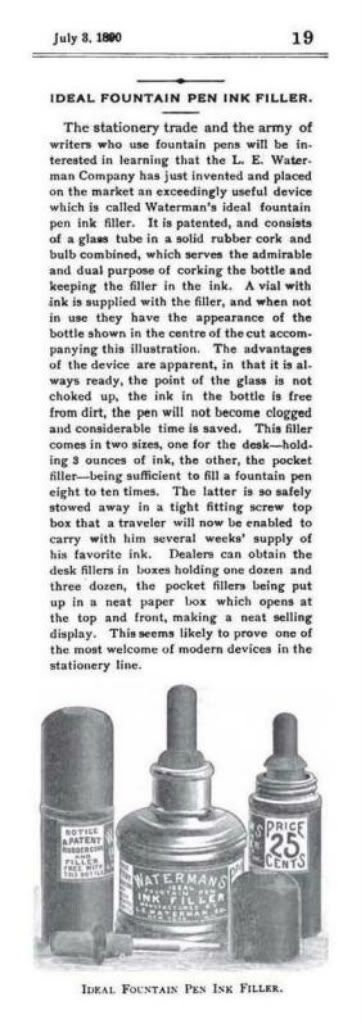
  , and the Parker Duofold Family.


        In an earlier post I hinted that, “While I was looking at the 1930-35 Eaton’s catalogues, I had found some Canadian listings for the Parker depression pens, including one for the ‘Thrift-time’, which got me thinking about those pens as well, and I thought maybe I’d take up that topic again in a post here, later”.  Well, here it is, and again, I hope these are just the facts.
        Something has been bothering me for years, now, and I have to make my apologies for it.  In September 2004, there was a discussion on Pentrace about various Parker depression pens.  In the years since then, I noticed a curious thing in the listings for depression pens on Ebay and on other pen websites.  There has been a rash of misuse of the word “Thrift-time pens”, everywhere I look.  That name, or some variation of the spelling, is being used as a synonym for “depression pens”.  I hate to say it, but some of the well-respected dealers on Ebay are some of the guilty ones.  In an Ebay auction for a “Premiere” set, Henry Gostony used the name “Thrift Time”.  He’s not the only one, though, just one I don’t mind teasing a bit.  But that misuse of the word was not my intended end result, so let me revisit the whole issue again, and reappraise, and revise, and restate my stand on these types of pens.  A few of the people on Pentrace took me too task about this, but I don’t want to name names because I don’t want to rattle their chains, and pick a fight, and wage that war all over again.
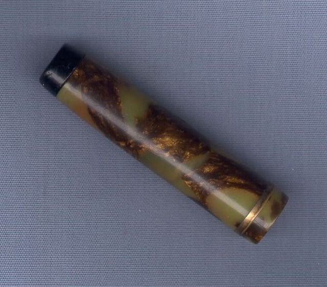
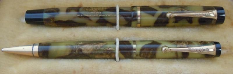
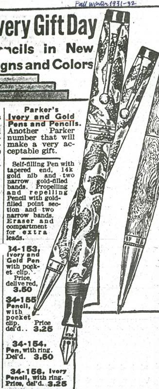
        I asked whether a pen I bought at an auction was a Duofold, or a depression pen, in spite of the fact that it had the BHR tips and washer clip of a typical Parker Duofold, or such lesser models as the Moire, Pastel, and True Blue.  Vance Koven called these latter pens “Sub-Duofoldoids”, an appropriate name.  The grey pearl with red flecks color is the same as Waterman’s “Steel Quartz”.  Parker and Waterman were both members of a cartel that purchased, cured, and provided plastic stock to the industry, so the color was commonly used by quite a few pen companies.  The color is also seen on US-made pens, so the pen is not an exclusive Canadian variant.  My pen has a single cap band, but there are ads that show the same pen with split cap bands as well.  It’s probably the first in the series of what we now call depression pens, and cannot be equated with such pens as the True Blue, or the Challenger, because those were considered Student Pens and carried the Lucky Curve imprint.  They are in the same vein, though.  Here’s another picture of just a
pen cap without a clip, but it’s in the ivory-and-gold color.  The cap is slightly longer than the cap on my Steel Quartz pen, but its diameter and thread are compatible. Here’s a Thrift-time pen and pencil set, another good example of the ivory-and-gold color.
        One participant wrote that he believed this pen had nothing to do with the Duofolds, which is going a bit far because they are related in style.  He meant that they were not Duofolds “anymore than we might wish to say the Modernistic Blue, seen first as a Lucky Curve flattop, later a non- Lucky-Curve streamline, was a Duofold.  They are different pens for different niche markets, i.e., the low-price-point pens from after 1930, or whenever streamlining and loss of Lucky Curve logo occurred, with pens marked just “Parker” without a model name, including at least the Raven, the various Modernistic Blue models, the pens we might with some accuracy label “Thrift Time” pens, the “$3 Pen”, the
Moderne and Premiere, the Televisor, the “Three-Fifty”, or True Blue, and the mutated Challenger”.  My list also includes the Parcos, Parkettes, Parkette Deluxes, DuoTones, Deluxe Challengers, Zephyrs, $5.00 Pens, and $3.00 Pens, or the Thrift-times.  I hope I didn’t leave any out.  If so, it was not intentional.  The Thrift-time is not a Duofold, but it’s based on the Duofold streamline series, and it’s the closest thing to a Duofold in style within the depression line.  They could, however, be described as “Depression era pens”, as Alex Zipperer called them.


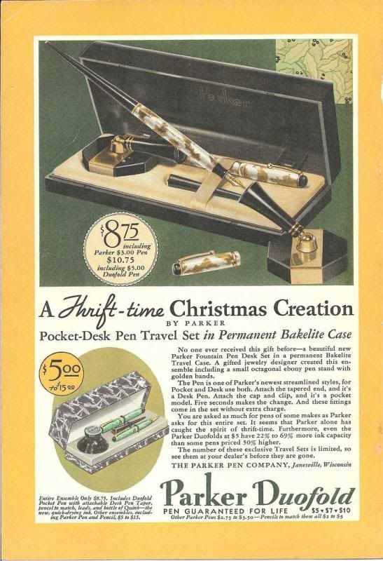
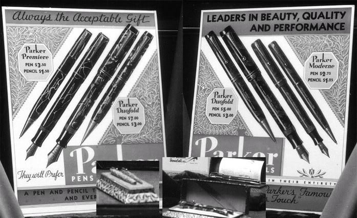
        The above ad from the National Geographic from December 1931, and another from the Eaton’s Fall-Winter 1931-32 catalogue, call it “one of Parker’s newest streamlined styles”, and a “Pen with tapered end”.  But nowhere is it called a Duofold.  Even the Parker “D.Q.”, or so-called “Duofold Quality” pen, was not considered as part of the Duofold line.  They were said to be only “like [the] Parker Duofold in everything save size and [pen]point”, the massive, guaranteed nib of the Duofold.  In Glen Bowen’s book Collectible Fountain Pens, p.63, there is a reproduction of the Nat. Geo. ad, said to be from December 1932, but actually from 1931.  Although it isn’t called a Duofold pen in the ad copy, still, it’s definitely within the Duofold type, and the Duofold logo is prominently featured on the page.  The comprehensive list of all Duofold models by Fultz and Zazove in the Spring 1999 issue of The Pennant does not mention these Thrift-time pens.  There are two sizes of pen in the ad, one called the “Parker $3.00 Pen”, and another pen included with the $5.00 set.  The “$3.00 Pen”, also called a “new Parker Fountain Pen Desk Set”, was sold as a boxed set with both a cap, and a taper, and a desk base.  The price information for the set reads “$8.75” in very large type followed by “including Parker $3.00 Pen”, and in much smaller type “$10.75” followed by “including $5.00 Duofold Pen”.  There was also another “Ensemble” with a taper, a cap, a pencil, and a bottle of Quink ink, “the new quick-drying ink”.  The pen included with the $5.00 set was said to be a Duofold, probably in the Ladies size.  This set was listed with the price range “$5.00 to $15.00”, so it was probably also available with Jr. and Sr. sized pens.
        The main body of the ad copy does not call the Thrift-time pen a Duofold as such, but neither does it make a clear distinction between it and the Duofold line, nor does the ad copy imply that it is not a Duofold.  It’s the inclusion of both pen models in the same ad, the $3.00 Thrift-time pen, and the $5.00 Duofold pen, that causes all the confusion.  This ad is plainly selling the Thrift-time under the main banner, but the Duofold logo also appears prominently on the same page, in its usual place at the bottom of the ad.  I would argue that it is a Duofold ad first of all, and the model name is either the $3.00 Pen, or the Thrift-time, but that’s just my opinion.
        This ad is almost unique among Parker ads in this respect.  It is the only ad for a non-Duofold pen to have the Duofold banner.  The ads for the Pastel pens, and the Moires, and the Three-Fifty pen, the pen also known as the “True Blue”, don’t have the Duofold banner.  It seems to me that the name “Parker $3.00 Pen” is an extension of the type of reasoning being used when naming the Duofold Jr. as the “$5.00 Duofold Pen”, and therein my identification of this pen with the Duofold lies, and, some would say, the confusion with the Duofold arises.  Perhaps the term “Parker $3.00 Pen” now has to be adopted for these unmarked Thrift-time pens.  They are at least in the same tradition and styling of the Duofold, and an outgrowth of the Duofold.  That is exactly why Parker choose to advertise these two pens together in the first place.  It just seems to me that the Thrift-time pen is one of the first extensions of the Duofold line in an economy version.  Perhaps we can agree to call it the “Parker $3.00 Pen”, if not the “Thrift-time” pen.
        We need to differentiate between “Depression era pens” and the “Thrift-time” pens because several separate models can be identified within the group of pens often lumped together as such.  First of all, before the “Thrift-time” came along, there were the “Pastel” and the “Moire” and the “True Blue”, also known as the “Three-Fifty”, at first straight-sided and then streamlined.  Then came the “Thrift-time”.  Now, having reviewed all of that, let me tell you about my theory.  As the Depression set in, Parker responded to the downturn in sales of their more expensive pen line, the streamlined Duofold, with the introduction of a small version of the streamlined Duofold.  After having seen and heard about all the different versions of these depression pens, a certain progression suggested itself to me.  My original list of models in the evolution of the “Thrift-time” pen that I proposed consisted of four different models, all named “Thrift-time”, and numbered “Thrift-time #1” to “Thrift-time #4”.  And that’s where that misuse of the word “Thrift-time”, used to lump all those pens together, might have originated.  Thank goodness there’s no archive on Pentrace.  Now, I have revised that list, and this is what I propose instead, with apologies.
        At first, I postulated the existence of depression pen #1, which I called the Thrift-time #1, a small, streamlined pen in the strange depression colors that was otherwise known as the “$3.00 pen” in the December 1931 ad, but definitely imprinted as a Duofold.  They have the black tips and section, and in all other respects look like Duofolds, except for those unusual, unfamiliar colors.  Parker made its own Duofold-lookalike.  What gives me hope that there might be a “Duofold-imprinted-Thrift-time” is the fact that when Michael Fultz learned of this exchange on Pentrace, he invited me to visit him at his pen vault in Chicago to view all his depression pens, but sadly, that didn’t happen.  I retain the Thrift-time #1 imprinted as a Duofold in my model list because a major collector intimated that such a pen might exist, so I’m leaving my options open.  As I said, it’s just a theory, so it’s not written in stone, yet.
        Then soon after, the depression pen #2 appeared, Thrift-time #2, the exact same pen, the “$3.00 pen”, but minus the Duofold imprint.  If no Duofold-imprinted versions show up, this pen becomes the Thrift-time #1.
        Next comes the depression pen #3, the “Premiere”, the familiar depression pen with the metal rivet holding the washer clip, and the blind cap made of the same plastic material as the barrel, and the “Moderne”, with the plastic rivet holding the washer clip.  Only their sections are black hard rubber.  The black tips were eliminated, either as an economizing measure, or as a style change.  There is no Thrift-time #3.
        Last of all, there is the depression pen #4, or the “$5.00 pen”, a slightly upscale version of #3 with three cap bands, and stepped, plastic blind cap on the barrel end, and cap rivet holding the washer clip.  This makes it look somewhat like a smaller cousin to the Challenger, and Parkette, but it cannot be mistaken for either of these.  There is no Thrift-time #4.  We now know that #3 and #4 are known models with their own model names, the Premiere, the Moderne, and the $5.00 Pen, and we should use those names instead.
        So this is the progression, and all of these pens can be called depression pens.  Although others believe that the Thrift-time has nothing to do with the Duofold, I still say this pen started off as the last iteration of the Duofold style, the swan song, so to speak, of the pen that used to rival the beauty of the Scarlet Tanager.  And it ended up as a pen with its own proprietary model name after the fact, the “Thrift-time”, only because the Duofold imprimatur was denied to it, and not bestowed upon this economy line.  There, now, you can get out your long knives.
        Another participant wrote that he believed that we must have a common understanding, or we can’t move on, and by definition, and in accordance with a standard widely-held by vintage pen collectors, only pens imprinted “Duofold”, and called “Duofold” by Parker, are Duofolds.  Once we accept this, the ad in question is crystal clear.  There can be no question that the pen referred to as the “Parker $3.00 Pen” is not a Duofold pen.  It may well be an outgrowth of the Duofold in some respects, just as the majority of pen models are outgrowths of whatever models preceded them, but that question has no bearing on what the pens are properly called.  He was open as to what was the proper term for the specific pen in question, but was not, however, open to the term “Duofold”.

        There is a serious lack of formal data in this area, except maybe in the collections of a few serious Parker collectors.  The problem is that we haven’t seen enough examples of these pens.  Only access to large numbers of pens, or images of them, will solve problems such as this one, of the Thrift-time pen.  We also need to standardize our nomenclature.  I do not wish to see pens labeled thrift-time pens, or depression pens, if they have real model names.  We should always use the correct model names whenever they are known.  But what we’re talking about, and what’s at issue here, are the nameless, or no-name, or unnamed, or insufficiently marked Parker models.  If the term “depression pen” can be used for any and all pens made in that decade, then that term becomes debased and is useless in its inclusiveness.  I realize, now, that I also often use the term “depression pen” when I mean to use a specific term, or model name, such as “Thrift-time” pen, and don’t mean to invoke the full stable of depression pens.  What we have to find out is whether the “Thrift-time” pen qualifies, at least, as a Duofold-type pen, a pen in the Duofold family.
        The “Thrift-time” pens represent the continuity of the old style.  They were also a last gasp of the Duofold style, or look, and a pronouncement of the impending death of the Duofold line, figuratively speaking.  In the same metaphoric sense, it was also a pronouncement that heralded the coming of something totally new, the “Vacuum Filler”, soon to be renamed the “Vacumatic”.  “Thrift-time” is not the official Parker model name for the pen, but it’s the best we have in order to distinguish this particular model.  This was the beginning of the retraction of the Duofold “Guarantee For Life”.  It remained nameless because it was the victim of this retraction of the lifetime guarantee.
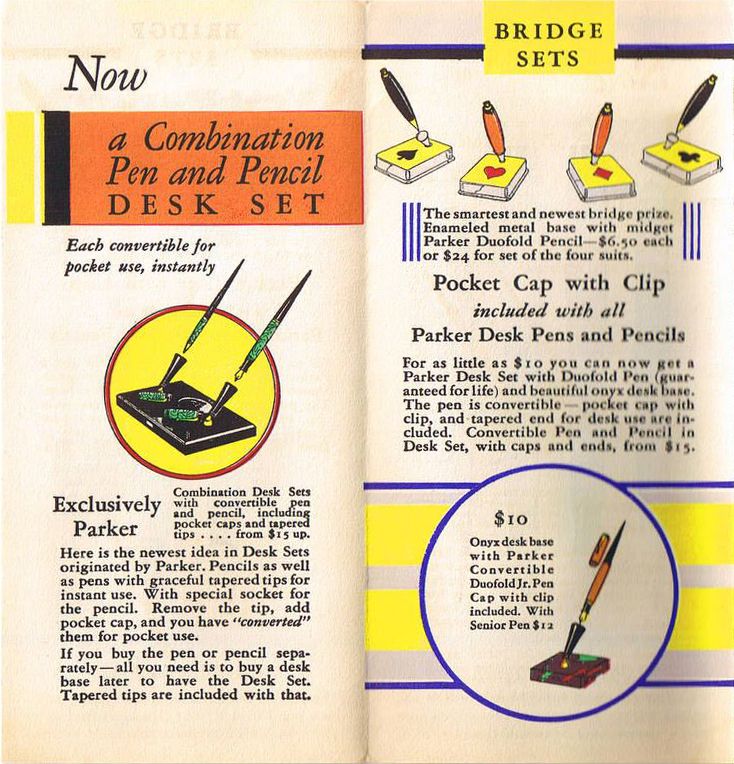
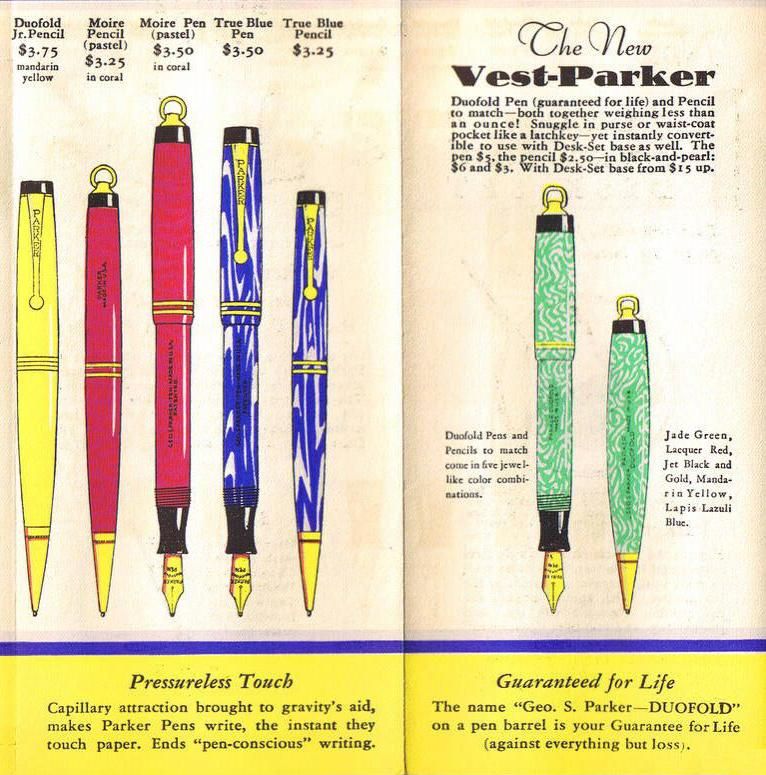
        I found a curious little Parker Duofold catalogue dating from 1930 titled “New members of the Parker Duofold family”.  The brochure has eight pages and four folds arranged in two-page spreads, the
front & back cover, spread 2, spread 3, and spread 4.  The back cover also uses the ad lines “Note the Streamlined Shape”, and “Pen [Nib] Guaranteed For Life”, and makes a big deal of the fact that each pen and pencil is “instantly convertible for pocket or desk use” by slipping on the taper or removing it.  For the most part, all the pens and pencils in the catalogue are indeed Duofolds, but take a look at the pens and pencils on spread 4.  The Moire and the True Blue were also included as new members of the Parker Duofold family, even though, if you look closely at the barrel imprints, they are not called, or marked, or imprinted as Duofolds.  Now, the catalogue was published in 1930, just a year too early to include the “Thrift-time”, which was also said to be “instantly convertible”, but if a catalogue similar to this one were published in 1931, it’s a distinct possibility that the Thrift-time would also have been included in the “Parker Duofold family”.
        I propose that we call this model of Parker depression pen the Parker “Thrift-time”, with a capitol “T”, exclusively.  We can still call the other depression pens “thrift-time pens”, with a small “t”, the same way that we call the other pens depression pens, with a small “d”.  In fact, the Parker “Thrift-time” is a “depression pen” and a “thrift-time pen”.  The Parker “Thrift-time” may not be a legitimate Duofold, but it is part of the extended “Parker Duofold Family”.  It’s just a thrift-time version of the Duofold line without a guaranteed nib.


George Kovalenko.

.
 

March 25, 2016

Index of US patents, 1842-1969


  , and designs and trademarks, in Hathitrust.


From “The Progress Of Invention During The Past Fifty Years”, in The Scientific American,
July 25, 1896, pp.82-83, and 91-94, a graph of inventions-per-year from 1846 to 1896.


        Here’s another table with the yearly USPTO patent and design statistics for the years 1836 to 1919 from the Annual Report of the Commissioner of Patents for the year 1919, pp.v, vi, which could be used to extend the graph to 1919, and draw graphs of the designs and trademarks. But all the volumes for the years 1842-1973 are on Hathi in a few different sets.  The primary set covers the years 1842-1973, a secondary set covers 1842-1921, and a tertiary set covers 1842-1922, but you’ll have to add ;view=1up;seq=1 to the URLs of the individual volumes for full view.  If I had access to these volumes in hard copy in the 1990s, I would have finished the two volumes of my patent book a lot sooner.  Shame on all of us, all you Americans and me, for not having found them a lot sooner.  Y’all know what happened.  We had to wait for them to be placed online.
         I posted a list of patents for a pen company on L&P on Aug 8, 2005, and Dave Johannsen wrote, “I was going through your list when I hatched my theory”.  And I wrote, “One reason why I try to get as much patent information out there as possible is so that I can watch others do their research and hatch their theories.  Think of it as a forward pass, a long bomb, maybe even a “Hail Mary”.  I throw it out there, and then watch other people run with it.  Everyone has a different take, or viewpoint, or perspective, and it’s very gratifying to see what theories other people will hatch from all the information”.
        I will place my own distilled, chronologically-arranged list of links for the online, searchable annual indexes of issued patents here eventually, once I finish it off, so keep checking back.

George Kovalenko.

.
  
Annual Reports Of The Commissioner Of Patents, 1842-1919.


Index Of Patents Issued From The United States Patent Office, 1920-69.


March 23, 2016

The Waterman’s Travel Ink


[Posted on L&P and FPN on July 10, 2007, and Mar 31, 2012.]
        The first Waterman’s traveling inkwells have the patent date for Joshua Barnes’s US patent no.
474,940 printed on the label.  It is called a “Pocket-Case For Bottles”, and was applied for in 1891, but not issued until May 17, 1892.  In the patent illustration, the wooden case has both ends rounded off, thus making it impossible for the bottle case to stand up, so it was obviously meant to be carried in a suitcase.  Although pictured with rounded ends, it was produced with a flat bottom, so that it could stand up on flat surfaces.  It’s a wooden case with a spring-loaded top to hold an eyedropper-stoppered bottle inside for traveling safely and cleanly.  It has “a cushioning spring for securing bottles with a stopper having an elastic bulb”, an eyedropper built into a rubber stopper, and the first traveling ink bottle in a protective wooden case, or traveling ink pot.  This was the patent used by L. E. Waterman’s on their first traveling ink bottles, the ones with the green ink bottle labels, and in both wooden and metal versions.  Also see UK Reg. No. 244,092, and Canadian patent no. 114,114.
        The first Waterman’s ad in American Stationer made its appearance on
July 3, 1890, p.31, but it was not for their pens.  It was for their traveling ink bottles with eyedropper stoppers, what they called the “Waterman’s Ideal Fountain Pen Ink Filler”.  Two types were available, one for the desk top, and one for the pocket, or the suitcase of a traveler.  Their pens are mentioned only peripherally in a short line at the bottom of the ad, “Manufacturers of Waterman’s Ideal Fountain Pens”.  It’s very strange that they didn’t place an image of their pen in this ad, let alone place any ads for their pens in this magazine until this late.  And here’s a Waterman’s advertising article in Am. Stat. on July 3, 1890, p.19, where they claim that they had “just invented” the ink filler, even though the application for the Barnes patent wasn’t filed until June 8, 1891.  They also go on to say, “It is patented, and consists of a glass tube in a solid cork and bulb combined, which serves the admirable and dual purpose of corking the bottle and keeping the filler in the ink”, always ready to fill a pen.  It almost seems like they are claiming only the filler, the eyedropper stopper, and not the container for the traveling case.  It was, however, not the first traveling inkwell of this type because William Rodger’s US patent no. 463,215 for a “Fountain-Pen Filler” was filed on Nov 25, 1890, and issued on Nov 17, 1891.  There is also Hermann Esser’s US patent no. 384,899 for an “Ink-Supplying Device” issued on June 19, 1888.  It’s just an eyedropper stopper designed to fit any size of opening in any existing ink bottle, and it’s intended specifically for applying India ink to the two-bladed drafting pens, although it also could be used as a fountain-pen filler.  I couldn’t find the patent for the Waterman’s invention, although I might not be using the correct obscure search term, so if they applied for their own pen-filler patent, it was probably disallowed because of the Esser patent, or maybe patent no. 376,385 from Jan 10, 1888, and then they licensed, or bought the rights to the Barnes patent when it came out.

George Kovalenko.

.
 

March 19, 2016

The Waterman’s ‘Hat Pin’ Pen


  , the #62 and #63 pens.


[Posted on L&P on May 8, 16, 2012.]
        In an article in The American Stationer on
Sept 26, 1895, p.550, about the 1895 “Cotton States Exposition” in Atlanta, the Waterman’s exhibit is described as comprising of “fountain 
pens in gold, silver, and jewel mountings, and there are also several novelties, such as cane and hairpin fountain pens”.  Well, there’s another silly idea that didn’t catch on.  The Am. Stat. article on Sept 3, 1896, p.393, bemoans the fact that women’s attire has “so little provision for carrying pens”.  In other words, their clothing has very few pockets, something that’s true today as well.  But this silly pen-notion is just as fashion driven, and requires that a woman’s hair style should never change.  She should always have a full, thick, long chevelure done up in a mound on the top of her head in order to hold the pen-pin, or it could be used to pin her hat in placeThe pen does, however, have a nice, curved quill-shape that would fit well into the crook of the hand, between the thumb and the index finger.  In order for a woman to wear the pen-pin in her hair, she would have to have hair such as this, or this.  The pen-pin was even said to be made in two different sizes, the #62 and #63 pens, numbers that were later re-assigned to their lever fillers with slip caps.  I wonder what the “cane fountain pen” looked like.

George Kovalenko.

.
 

March 16, 2016

The Waterman’s Ideal Globe


Waterman’s pen without Ideal globe trademark, Am. Stat., Dec 17, 1896, p.1032.


[Posted on L&P on Dec 21, 2005, and Apr 24, 2012.]
        Rob Astyk wrote that the Ideal Globe originated from the logo that was used in the 1893 Columbian Exposition in Chicago.  Does anyone out there have any pictures or illustrations of the Ideal Globe logo being used in the 1893 Exposition?  Perhaps someone who has researched the 1893 exhibition might be able to find some pictures of the Waterman’s exhibit.  In a quick look at the
“World’s Columbian Exposition of 1893” website, I found at least one photo called “Inks And Pens”.  The photo is from Hubert Howe Bancroft’s book The Book Of The Fair, and it appears on page 175 of Chapter 8, “Manufactures Of The United States”.  In another digitized version of the photo in the book A history of the World’s Columbian Exposition, the pens seem to be Esterbrook nibs, and the inks turn out to be Pomeroy’s.  There are no other identifiable logos that jump out of the photo.  One seemingly promising book turned up by the title Waterman’s Illustrated Album of the World’s Columbian Exposition, but it was published by the C. E. Waterman Co. of Chicago, and had pictures only of the buildings and pavilions and architecture.  There was even a souvenir photo by the Waterman Co. of the ferris wheel at the exposition, but no photos of the Waterman’s fountain pen exhibit.
        Looking at the Waterman’s trademarks, however, yields some clues. Although the trademarks for the words and phrases “Ideal”, “Waterman’s”, and “Waterman’s Ideal Fountain Pen N.Y.” were not applied for and issued till the early 1900s, they all claim that the first use of the words was on July 1, 1883 for pens(1), and 1888 for inks(2).  The latter date makes Waterman’s inks in the 1893 exhibit at least a possible item.  The two trademarks for the “Ideal baseball” logo weren’t issued till 1908, and were said to be first used on Sept 1, 1904(3).  By the way, I really like the term “Ideal baseball” for that logo ever since I saw it being used by an inexperienced seller on Ebay.  There are three versions of the “pen and globe” logo.  There’s an earlier logo, which I refer to as the “pierced globe” logo because it looks as if the pen is going through the globe instead of merely sitting behind the globe.  It was not used as much, and was quickly superseded by the more familiar “Makes Its Mark All Around The World” logo.  This logo appears in two versions, with the words, and without.  The earlier logo is distinguished by the pen slanting obliquely down from the left, whereas the two later logos have the pen slanting down from the right.  There is also no ink flourish surrounding the globe in the earlier logo.  Now, here’s a further clue.  All three of the “pen and globe” logos were said to be in use since January 1896(4).

Am. Stat., Sept 29, 1900, p.6.

Am. Stat., Aug 15, 1903, p.23.
 
        Maybe we should start looking sometime in the late 1890s for ads that might incorporate 

the logo, maybe even the earlier version of the logo.  The first Waterman’s catalogue in the PCA library to show the logo is the 1901 catalogue that was subtitled “Makes Its Mark All Around The World”.  Perhaps Rob mistook the 1893 Expo for the 1903 Expo, a more likely candidate.  Another clue as to why their logo might have made a much later entry into the market is that there was a major depression in the early 1890s that was brought on by volcanic eruptions that caused a  “year without a summer”, with accompanying crop failures and food shortages and local famines around the world.  Waterman’s had won a medal at the Columbian Exposition in Chicago in 1893, so I kept expecting some ad announcing the win, but nothing showed up, so the depression must have taken precedence.  As well, the lawsuit against the Shipmans must have preoccupied them.  Here’s one of the first ads to feature the “Makes Its Mark All Around The World” logo, in New England Stationer, January 1903, p.1, and here’s one of the first ads to feature the “Waterman’s [Ideal-in-a-globe image] Fountain Pen” ad line, in Geyer’s Stationer, Jan 19, 1905, p.7, and later used as an imprint on their pens, in Geyer’s Stationer, Mar 3o, 1905, p.11, and Apr 13, 1905, p.64And the earliest ads I have found so far that feature the “Makes Its Mark All Around The World” logo are two ads from Olle Hjort’s website in The Century Magazine, June 1898, and in Munsey Magazine, June 1897, but none, yet, as early as 1893.

1. US trademark nos. 35,048, 35,849, 49,478, 49,715.
2. US trademark nos. 72,285, 72,286.
3. US trademark nos. 69,612, 71,855.
4. US trademark nos. 37,762, 48,230, 51,993.


Waterman’s RHR pen with Ideal globe trademark, Am. Stat., Mar 23, 1907, p.29.

George Kovalenko.

.

Addendum, Mar 21, 2016.
        David Nishimura just published an article on his
Vintage Pen News blog about “A notable early Waterman ad” from Our Society Journal, April 1886, p.17, featuring a globe in its layout.  It’s just a single, one-off occurrence, so far, but quite an early one, as David notes.  The design 
 of the globe is not close to any of the various trademark designs, since it’s just a simple globe 
with lines of longitude and latitude, without the word “Ideal” at the equator, and no outlines of any continents.  Instead, it has the words “The Best Fountain Pen” overlaid on it, and the words “Waterman’s Ideal” in a semi-circle above.  But best of all is the endorsement from W. L. Alden 
of the New York Times, who is quoted as having said that it is, “The best pen in the world”.  This together with the image of the globe shows the early origins and the literal meaning of the globe trademark.  The company name was still The Ideal Pen Co., so the trademark was simply a visual metaphor, or rebus for the phrase, “Waterman’s Ideal, The Best Fountain Pen In The World”.  
I guess I should have surmised that it was more than just a design element in the ad.  It was the early beginnings of a trademark.


Addendum, Oct 7, 2017. 
        Finally, we can settle the matter of when exactly the Waterman’s Ideal globe logo, the one I call the baseball logo, was introduced in Waterman’s advertising.  Google Books finally released a few more volumes of Am. Stat. from the years 1900 to 1904, just the ones needed here, but not the ones from 1898 and 1899, and from 1905.  I don’t have access to Google Books up here in Canada, so I can’t make hyperlinks to the ads & pics cited below, but here are the links to the volumes from 1900 to 1904 in Google Books.
        The ad on the cover of The American Stationer, on Apr 14, 1900, p.1, is the first use of the “Makes Its Mark All Around The World” logo.  It was used to announce Waterman’s participation in the Paris Exposition.  In the ad on the cover of Am. Stat., Sept 15, 1900, p.1, there is no globe logo in the company name on the pen, and in the same issue, on p.8, the photo of the Paris Expo booth, with its four pen posts, shows that there are no globe logos anywhere in the display, and that the display has no crowning globe cupola over the booth.  The article on Sept 29, 1900, p.6, shows a display card in the shape of an open book that makes use of the “makes its mark” logo, with the globe and pen and flourish, but not the baseball logo.  The ad on Jan 5, 1901, p.1, makes use of the “makes its mark” logo, with the globe and pen and flourish, but without the phrase, and the pen name has no baseball logo.  The cover ad on Apr 27, 1901, p.1, advertises Waterman’s new 1901 catalogue that featured the full “makes its mark” logo along with the phrase, but the ad on May 4, 1901, p.12a, does not have any globe logos of any type, and there is no globe logo in the company name on the display case.  There are no globe logos on the pens and in their pen names in any of the ads for the rest of 1901 and early 1902, as witnessed by the ads on Sept 14, 1901, p.1, Sept 28, 1901, p.1, and Dec 21, 1901, p.1.  The Waterman’s ad on Mar 8, 1902, p.69, makes use of a picture of the book-shaped display card with the “makes its mark” logo, but there is no baseball logo in the company name on the display case in the ad.
        Then on Mar 15, 1902, p.1, the baseball logo makes its first appearance on the pen and in the company name, finally!  And the cover ad on Mar 29, 1902, p.1, shows a filigree sign that makes use of a stylized version of the “makes its mark” logo.  The baseball logo in the company name makes its return in the ads on June 21, 1902, p.1, and July 5, 1902, p.1.  In the photo in the ad on Aug 16, 1902, p.33,  you can just barely make out the baseball logo on the plain #12 Waterman’s pen, but the baseball logo can be plainly seen on the two pens illustrated in the line drawing in the ad on Dec 6, 1902, p.1.  The baseball logo is also featured prominently in the illustration on the cover of the first issue of The Pen Prophet, March 1903.  The cover is also shown in the ad on Mar 14, 1903, p.19.  The baseball logo can be seen clearly in the company name in the ad on Aug 8, 1903, p.15, and the picture of the book-shaped display card with the “makes its mark” logo is used again in the ad on Aug 15, 1903, p.23, but this time there is a baseball logo in the company name on the display case that is also included in the ad.
        All the cover ads in the two volumes from 1904, except for the covers on the first issues, have been stripped off for binding, but there are just enough ads left from the internal pages to help us out here.  The ad on Jan 9, 1904, p.27, announces the move of the company’s Chicago branch to a new address, and makes use of the “makes its mark” logo with the globe and pen and flourish, but without the phrase, and the pen name has no baseball logo.  But best of all, the article on Apr 30, 1904, p.4, about the Waterman’s display at the St. Louis Fair also has a photo of a model of their booth at the fair.  The display booth looks just like the Paris Expo booth with its four pen posts, but this one has an Ideal globe dome on top as a cupola, making it look like a crown.  Almost as good is the ad on
Aug 20, 1904, p.23,  with an illustration of the booth, the globe cupola, and the earth in full, living color, and the second page of the ad, p.24, has both the “makes its mark” logo in the signs in the window display, and the baseball globe logo in the company name on the pen display case.


        And here, finally, in Waterman’s iconic, color X-mas ad on Nov 12, 1904, p.19, is the Ideal globe baseball logo, partially, and not wholly ghosted in as a halo over St. Nick’s head.  There was also an article on Dec 24, 1904, p.8, about this color ad, which was said by the “advertising men and others interested in advertising…to be one of the most elaborate ever [printed]”.
        [It was also always there in Hathi Trust all along, in Geyer’s Stationer, Nov 10, 1904, p.59.  During the period when there was a gap in the Google Books holdings of Am. Stat. from the years 1898 to 1905, Google placed some stray volumes of Geyer’s Stationer, Walden’s Stationer, and New England Stationer online to fill in the gap, as a consolation prize.]


March 13, 2016

The early Waterman’s ads


  , an Internet project.


Ad from David Nishimura’s “Waterman’s First Advertisement?” on his Vintage Pens website.


[Posted on L&P on Feb 11, 18, June 27, 28, 29, July 1, 2013.]
        Whenever I get a new volume of The American Stationer from Google Books, the first thing I do is strip off the pages at the beginning and end of the PDF and save the new version.  That way, page 1 of the text is the same as page 1 of the PDF, and unless the pagination gets screwed up by missing pages, or missing whole issues, the page numbering of the two is exactly the same.  It makes it very easy to navigate the text.  And since the ads for certain manufacturers are always located on the same pages in all the issues, or in every second issue, or once every month, etc., it makes it very easy to establish an algorithm for finding all the ads by a certain pen company.
        I recently used this method to look for all the Waterman’s ads.  The ads don’t start until the mid-1890s, so I filled in the 1880s and early 1890s with the Shipman’s ads, which in the early period used the “Waterman’s” name.  It took 3-4 days altogether, but I ended up with a PDF consisting of 703 images that I called “Wat Ads In Am Stat”.  I’m still missing the ads from the volumes that haven’t been digitized, yet, but even so, it’s already a great research aid for a history of the company.  The only thing better than this would be
a complete run of The Pen Prophet!  
I wonder whether Google Books will ever digitize that.  Over the years, I also collected about 61 images of 1880s, 1890s, and 1900s Waterman’s ads from Ebay, Google Books, and elsewhere on the Internet, so I added those as well.  That’s 764 pages altogether, now, contained in three 2-inch binders.  This has helped a little to fill in this early period, but we still need more images to fill in the gaps created by the missing volumes.  I added some articles, and some ads from other magazines, and the number of pages now stands at 1,167.
        Other people have found early images of Waterman’s ads.  Rob Astyk and Len Provisor posted images of four of the Waterman’s “Dapper Dandy” trade cards from 1883-84.  David Nishimura posted a
picture of the “Oldest Waterman’s Advertisement” in an article on his website, and a page from Waterman’s “Circular No.7” in a related article on the “Oldest Surviving Waterman’s Pen”.  Olle Hjort has over 50 Waterman’s ads in his Pennarkivet website.  And Simone has 200 Waterman’s ads on his Fountain Pen Wiki website, but most of them are in the modern period, after 1900.  Here’s the specific link to the Waterman’s page.  And Cliff & Judy Lawrence’s 1986 book of pen ads and their PFC magazines have hundreds of Waterman’s ads.
        Does anyone have any more Waterman’s ads to share, ads from 1883 to 1906 from magazines such as Harper’s, McClure’s, Atlantic, and the other stationers’ magazines, but especially The Century Magazine, etc.?  With Google Books placing more and more online, someone should be checking these magazines online, and especially this Ebay listing for a DVD of all the issues of
Century Magazine.  That’s the magazine for which Edward T. Howard worked as an advertising agent at the time when he became one of the directors in Waterman’s company in the early 1880s.  I am willing to share my images with anyone who is willing to share theirs.

        David Nishimura wrote, “Since there are so few of us actively working on this, we really should put our heads together to figure out how best we can work together.  We don’t want to duplicate efforts, but at the same time we don’t want to introduce corrupt information, such as images of ads that are misdated.  We might want to consider setting up a private blog for working purposes.  That would avoid copyright issues that might arise if the blog were public.  The information could be made public in due time, after being arranged and checked.”

        Simone Piccardi wrote, “I’ll be glad to help, and you can use the ads I scanned.  Almost 99% were directly scanned by me using original publications, some of them are my property, others were borrowed from collectors.  Only a few are scans given to me by other people, but I always got publication permission under the Wiki license, so copyright should not be an issue.  None come from archives, or other on-line publications.  But you have to take it into account that dating of these ads could be wrong.  I did my best to track down dates, but some are just guess, and others were just given by the ad seller, and some later proved to be plain wrong.  But every one of them brings a little explanation about dating, specifying where it comes from.”

        David Nishimura wrote, “That is a very kind offer.  The problem of unreliable dating is not trivial.  The great thing about digitized publications such as The American Stationer is not just the ads themselves, but that they can be dated precisely and securely.  If I were compiling an archive of pen ads myself, I would give an exact date and source for each ad that could be securely dated, and for all the rest make it clear that the date was an estimate, using either “circa” before, or “?” after.  Over the years, I’ve repeatedly seen cases of circular logic, where a feature has been dated by reference to ads, whose dating was based upon the appearance of that feature.”

        And I wrote, “Also, Simone, your website is already a great resource, so I don’t want to duplicate your effort, but thanks for the offer.  I can only add my stress to David’s council that you try to give as precise a date and source for each ad as possible.  And for the rest, make it clear that the dates are guesstimates by using David’s suggestions.  I really intended the list that I proposed to be one that covered the early Waterman’s years, the 1880s, 1890s, and early 1900s.  The ads from 1906 to the present should be relatively easy to find, compared to the early ads.”

        Simone Piccardi wrote, “Thanks for the appreciation.  Unfortunately I have just few ads dated before 1906, just five for Waterman, so my contribution will be very small.  But for the dating I already did something like what you are suggesting, thanks to the semantic features of the Wiki software.  If you look at the “Information” section of each ad page, you can find a short summary about it, and that’s where the source of the date is explained.  Unfortunately in Italy the fountain pen started to appear later than 1906, and the early ads I have all came from the US.”

        And I wrote, “That’s very thorough, Simone.  I think David and I were looking at the early Waterman’s ads only, and our sample was too small.  I really wish that someone with full access to Google Books in the US would check the online issues of such early magazines as Harper’s, McClure’s, Atlantic, and the other stationers’ magazines, but especially The Century Magazine.  There are Waterman’s ads every month in those magazines.  Above I mentioned the DVD of all The Century Magazine issues on Ebay, but I don’t know whether all the ads
have been stripped out of them.”

        David Nishimura wrote, “A number of us have already done extensive searching across Google Books, restricting by date, so I don’t think there’s as much out there as you imagine, at least, not yet.  Most of the issues of the magazines you name aren’t available online, and many have been scanned from copies stripped of their ads.”

George Kovalenko.

.
 

March 10, 2016

Waterman’s v. Shipmans


  , the Ideal pen war of 1888, the second fountain pen war.


[Posted on L&P in September 2005, August 2007, March-April-May 2012, and January 2013.]
        The “Sheaffer v. Barrett” case is important because it involves so many of the penmakers at the time.  Dennis Bowden wrote that Jim Lobb told him he found the original “Sheaffer v. Barrett” transcript in the files of the Circuit Court for the Northern District of Illinois, Chicago.
        Here’s another seminal pen battle, the second fountain pen war, covered by two court cases that involved many of the early penmakers.  The earlier-decided “Waterman v. MacKenzie[sic]”, case,
138 U.S. 252, 11 S. Ct. 334, was argued on Nov 19, 1890 and decided on Feb 2, 1891.  The defendant’s name was misspelled in the title.  It’s actually McKenzie.  And the complete list of defendants included James A. McKenzie & Samuel R. Murphy, owners of Harvard Pen Co. and Siphon Pen Co., but also included the Yale Pen Co., Rowley Pen Co., and Lapham & Bogart, the distributors of the Rowley.  But the major lawsuit, “Waterman v. Shipman”, was started in 1888, and not decided until Apr 18, 1893.  The summary of the case appears in The Federal Reporter, vol. 55, pp.982-987, but the original court file may still exist in the original circuit court.  The report even cites the earlier-decided case, but of special note is an 1886 pamphlet, which is called “scandalous” on p.987 of the case report.  The author of this 25-page exposé, a rival of Waterman, is unnamed in the report, but is revealed in the transcript.  That rival was the Yale Pen Co.  Now, get this.  The full title of the booklet is “Penthemis, An Exposé of the Assumptions and Business Methods of a Dealer and Reputed Inventor”.  The fairly long synopsis of the case in The Federal Reporter makes for some interesting reading, but it’s only a summary, and the best evidence of all is contained in the transcript of this case.  The transcript of the “Waterman v. Shipman” court case is obviously the whole basis for the Bob Tefft article “The Stormy Birth of Waterman”, in Pen World, vol. 2, no. 4, Summer 1989, pp.19-22, although the court case isn’t mentioned specifically by title in the article.  Tefft covers the court case fairly well, but I wish he had dealt with certain aspects of the case in more detail, especially the booklet that was filed as an exhibit in the case.  Tefft also covers another aspect of the case that is almost glossed over in the report.  The Shipman lawyers rested part of their defense on “the prior invention of Fisher”, see p.987 of the report, but Tefft tells us on p.19 of his article that on May 24, 1883, Waterman placed an order for “hard rubber feeds based on his new design” with machinist and model maker Herbert Fisher.  And then on p.20 he writes, “It was not until June 28, 1883, that Waterman finally got around to filing an application for a U.S. patent on his new feed.  When he did, he discovered a [prior] competing application had already been filed by none other than Herbert Fisher, the craftsman hired by Waterman to produce his feeds.  [Fisher] had claimed the design for his own!  To compound the situation, Waterman’s lawyers failed to respond to the Patent Office’s request for testimony, and the question of priority was decided in favor of Fisher.  The matter would not be finally settled for over [a year].  In August of 1884, Fisher finally agreed to give up any competing claims in return for a payment of $250”.  I want to see the transcript!  And it’s absolutely imperative to find a copy of “Penthemis”! But I’m more interested in the incidentals and circumstantials than the essentials and fundamentals of the case.  And here are three look-a-like pens, the Shipman, Waterman, and Holland pens.


Now, all we need is an example of a fourth one, the Fisher pen, if there is a surviving example.  Don’t worry, the image of the Fisher Pen below exists only in Photoshop.


        Rob Astyk wrote, “I believe that the court in the Shipman suit originally was the Southern District of Manhattan and the state, not Federal, court.  That case meandered through the state and Federal courts because one of the issues was the contract between Waterman and Shipman that transferred ownership of both Waterman 1884 patents to Shipman.  Key to the Shipman suit was a prior ruling of the U.S. Supreme Court in “Waterman v. McKenzie”, handed down on Feb 2, 1891.  Lewis Waterman lost his patent infringement suit against James A. McKenzie and Samuel R. Murphy because he was not the owner of his patents, and therefore, had no standing to sue McKenzie and Murphy.  The court ruled that Waterman had transferred ownership of the patents to his wife Sarah, and from Sarah had mortgaged them to Asa L. Shipman.  When the mortgage was not redeemed as agreed, the collateral for the mortgage, the patents, became Shipman’s property.  The U.S. Supreme Court determined that Shipman was, in fact and in law, the owner of those patents and that Lewis E. Waterman’s only interest in those patents was an exclusive and unrevoked license to manufacture pens under those patents.  That license became the crux of the Shipman suit.  Justice Gray, writing for the majority in “Waterman v. MacKenzie”, held that the only circumstance that could void Shipman’s ownership interest would be a clear violation of Waterman’s license to manufacture.  In the suit of “Waterman v. Shipman” (130 N.Y. 301; 29 N.E. 111), James D. & Edward L. Shipman, his sons, co-partners, and heirs were named because Asa Shipman had died in 1888.  Waterman appealed an earlier, unfavorable decision in the light of the McKenzie decision on Dec 8, 1891.  The New York Court of Appeals found that Asa L. Shipman’s brief foray into manufacturing pens under the Waterman patents in April and May 1888 had violated Lewis Waterman’s exclusive license to manufacture, thereby voiding the mortgage that had transferred ownership to Shipman and returning patent ownership to Waterman.  The U.S. Second Circuit Court of Appeals issued an affirming decision on April 18, 1893, 55 F. 982, finally closing the issue.
        “We definitely need to examine the transcripts.  Of even greater interest is the pamphlet and its contents.  Scurrilous attack or not, I think most of us would love to hear his fellow penmaker contemporaries dish the dirt on L. E. Waterman.  Let me also suggest that there is an opportunity for great research here for anyone who might be interested.  In most major cities, especially those in which a U.S. Circuit Court of Appeals sits, there are going to be court records of suits like the ones above.  Digging into those files going back into the 1870s-to-1920s, and copying transcripts, and even getting lists of suits will give us all a clearer picture of the early pen business in the U.S.”

        David Nishimura wrote, “The underlying material [in the “Waterman v. Shipman” case] was not found in any public institution, but rather in a flea market, so likely was a copy belonging to one of the parties in the trial.  It was reportedly quite voluminous, and was being lent around between a handful of older collectors.  Take note, this does not mean that another copy of the full transcript might not be on file somewhere else, so it would still be well worth tracking down.  Ever since that article was published, I’ve wanted to get my eyes on the documentation behind it.  It seems that it has changed hands many times, including some long loans.”

        And I wrote, “One of the biggest disappointments in The American Stationer is the lack of any Waterman’s pen ads in the 1883, 1884, 1885, and 1886 volumes.  In fact, the first time the name “Waterman’s” appears in an ad in the magazine is in an Asa L. Shipman’s Sons ad that starts appearing on
July 14, 1887, p.50.  This was after Waterman parted ways with this wholesale stationer who was an early partner with and investor in Waterman’s penmaking venture.  It’s a simple text-only ad, and the name “Waterman’s Ideal Fountain Pens” appears last in a list of products that Shipman dealt in.  The Shipman company continued having the pen made for them, and continued selling the pens, even while Waterman was taking them to court over it, so these ads are, technically speaking, not Waterman’s ads.
        “A few months later a second type of Asa L. Shipman’s Sons ad, this time with some imagery, starts appearing on
Sept 8, 1887, p.550.  But the image is of some of their other products, and the size of the type for the line about pens is smaller than the type for the other products in the ad.
        “Then the phrase “Waterman’s Ideal Fountain Pens” disappears altogether in the third type of ad that starts appearing on
July 26, 1888, p.206.
        “And this is why.  A fourth distinctly different ad starts appearing on
Oct 18, 1888, p.973, and this one finally has a picture of a pen in it.  This pen looks exactly like a Waterman’s pen, but this pen has the name “Shipman’s Fountain Pen” on the barrel.
        “And an advertising article on
Nov 8, 1888, p.1123, has the same picture and an explanation.  It’s not a pen with the Waterman’s three-fissure feed. Instead it has the spiral-groove feed in US patent no. 397,413.
        “Then finally this ad started appearing on
Nov 15, 1888, p.1176.  The Waterman’s company was finally free of the Shipman Co. even though the court case wasn’t settled until the early 1890s.
        “This article from
May 3, 1888, p.899, is about the appointment of a receiver to take charge of the estate of L. E. Waterman.
        “More elaborate ads for the Shipman’s pen with the spiral feed also appeared in The Century Magazine,
January 1890, and October 1890.
        “At last, the first Waterman’s ad makes its late appearance in Am. Stat.,
July 3, 1890, p.31, but it’s not for their pens.  It’s for their traveling ink bottles with their eyedropper stoppers.  Two types were available, one for the desk top, and one for the pocket, or suitcase of a traveler.  Their pens are mentioned only peripherally in a short line at the bottom of the ad, “Manufacturers of Waterman’s Ideal Fountain Pens”.  It’s strange that they didn’t place any images of their pens in this ad, let alone place any ads for their pens in this magazine this late.


        “And here’s an article about the “Waterman’s Ideal Fountain Pen Ink Filler” from Am. Stat., July 3, 1890, p.19.  It refers to a patent, even though the Barnes patent wasn’t applied for until 1891, and not issued until 1892, which is to be discussed in this later blog topic.
        “The first images of Waterman’s pens in Am. Stat. don’t show up until
Oct 23, 1891, p.890, and Dec 3, 1891, p.1174.  What a shame that they are so late, since that means that we are robbed of any images of the early pens, but what makes up for it, somewhat, is that we are shown the large variety of models available just 7-to-8 years after Waterman’s started manufacture.
        “So even in 1893, there are no Waterman’s ads in Am. Stat., but here’s a curious coincidence.  In
the 1892 Shipman’s Sons ads, they still featured a fountain pen, but in the 1893 Shipman’s Sons ads, they switched to advertising their stylograph.
        “And this may be the reason why.  The Shipmans lost the court case initiated by Waterman’s in
1893, and had to stop infringing on Waterman’s fountain pen patent, and that Waterman’s was “entitled to an accounting”, and that’s the coincidence.
        “This is what the Shipman’s Sons ads had dwindled down to in the first half of
1894, an ad for their “Common Sense Binders”.  It was their staple before they got into pens, and it was still there to fall back on after the pen market had dried up for them.
        “It’s because in
1894 they were “burning the midnight oil” while creatively “balancing” their books, and probably trying to figure out the entitled accounting that they owed Waterman’s in the above mentioned infringement lawsuit that they lost.
        “Finally! a Waterman’s pen ad shows up in Am. Stat. on
Nov 1, 1894, p.815.  It’s only 10, or 11 years late.  It’s ten years, if you use the November 1884 Century ad as a starting point, and eleven, if you use the December 1883 ad that David Nishimura found.  It almost looked like they were avoiding placing ads in Am. Stat. as long as the Shipman’s Sons ads were still in the same magazine.  They wanted the Am. Stat. roost all to themselves, or else they wouldn’t play.  The ad says that the two-kerf feed “has been proved by ten years’ use”, and it shows the two types of pen styles in one ad, the old straight-cap type made since 1883, and the “new style of holder” since 1894.  The ad appeared at about the time of the introduction of the new cone-cap style, which Waterman’s stole unrepentantly from A. A. Waterman without attribution and without giving him his due credit, his entitled accounting. But the appearance of the new type didn’t mean the demise of the old type, which was kept in production by the old fogeys well into the self-filler era.”


  George Kovalenko.

.