

[Posted on L&P on June 24, 26, 2012.]
[My thanks to Max Davis for the image of three of the Waterman’s globe inks formerly in his collection, also shown in his and Gary Lehrer’s Waterman’s book, p.175. And thanks to the New York Public Library, Smithsonian Institute, The Wayback Machine, Google Books, and the Hathi Trust for placing the volumes of The American Stationer online, and to Antonios Zavaliangos for downloading all of them for me. –June 24, 2012.]

Three versions of the bottle.
I have always been intrigued by the Waterman’s globe-shaped ink bottles. Or cardioid, or heart-shaped, or cone-shaped, or urn-shaped ink bottles. Holding one is like cupping a little ball in the palm(1a) of your hand. It’s just a little handful of an ink bottle that just barely fits into the fist. You can see where Waterman’s got their inspiration for the shape of the bottle when you look at the Waterman’s “Ideal” Globe trademark, but it was also born of necessity because of all the new self-filling fountain pens that were proliferating at the time. Waterman’s also had pump fillers, coin fillers, and sleeve fillers before they had their famous lever fillers. This bottle was literally the first ink bottle that was intended to be used exclusively for replenishing self-filling fountain pens. The reservoirs of these bottles came to a rounded point at the bottom to form a well from which self-filling pens could be filled, right down to the last few drops of ink. I haven’t been able to find a patent or design for it yet, but that doesn’t necessarily mean that there isn’t one. It just seems like a very patentable idea, if not for its function and utility, then at least for its shape and design. Perhaps it couldn’t be patented because of prior similar designs such as US design no. 36,764 from Feb 2, 1904, the Bustanoby(1b) design for the bottle for their “Forbidden Fruit” grapefruit liqueur. It is also shaped sort of like the globus cruciger design of the Chambord framboise liqueur bottle. There was also the 1880’s design(1c) for a bottle used by G. T. Rogers Mfg. Co. for their “Bengal” powdered laundry bluing,(1d) a product a little closer to ink. There are a few different types of Waterman’s globe inks, and I have always wondered about which one came first. I always thought that these Waterman’s bottles came in at least three different types, and with at least two different labels, but I have recently found a fourth distinct type and a possible fifth variant, and have come to a conclusion about the complete phylogeny of the various types and shapes of bottles and labels, which I have deduced from various sources that I have collected over the years. But the thing that cinches it all is the ads in The American Stationer featuring all the different styles and shapes of Waterman’s ink bottles, ads that are geared toward stationers and dealers. Here is the bottle’s phylogenetic progression.

The first version of the bottle.
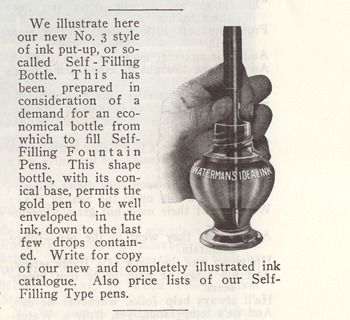
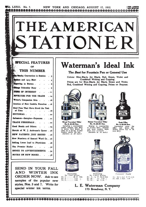
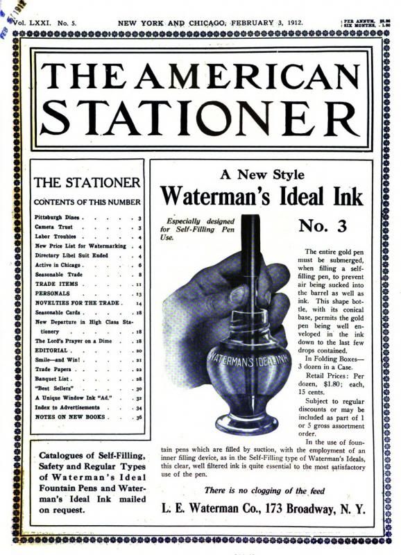
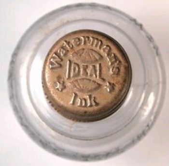
Initially I thought the first version of the bottle, ca.1912-15, made its first appearance in an illustration in The Pen Prophet, September 1912,(2) where it was called “our new No. 3 style of…so-called Self-Filling Bottle…from which to fill Self-Filling Fountain Pens…with its conical base”. I also thought that the bottle was first mentioned, although not illustrated, in an ad in Am. Stat. on Aug 17, 1912, p.1,(3) before they had prepared a cut of the bottle for their ads, and where it was also called the “new style No. 3”. The bottle is also mentioned in an article in Geyer’s Stationer, Mar 14, 1912, p.24,(4) about the new price-list booklet of Waterman’s inks, including “the new bottle especially designed for self-filling pens”. But then Volume 71 of Am. Stat. and some volumes of Geyer’s were finally placed online by the Hathi Trust, and in those volumes I found the introductory ad for the bottle. It appears the first time on the cover of the Feb 3, 1912 issue of Am. Stat.(5) Essentially the same ad, just formatted a little differently, appears in Geyer’s, Feb 8, 1912, p.21.(6) These two ads show the bottle being used to fill the new Waterman’s Self-Filling Pen, sometimes called the Sleeve Filler by pen collectors. The same illustration also appears in the ad for the Waterman’s Sleeve Filler in Geyer’s, Aug 8, 1912, p.17.(7) In all these ads it is again called “A New Style” ink bottle “with its conical base”, “Especially designed for Self-Filling Pens” that allows the nib to be submerged even when the ink is used up, “down to the last few drops contained”. The bottle is a cardioid, or heart-shaped cone, or little footed urn, and not a true globe shape. It has a metal cap(8) embossed with the globe symbol, the words “Waterman’s Ink”, and two stars,(9) and it has steeply-pitched, quick-sealing threads. The caps are compatible with the Waterman’s ink bottles with the tall, eyedropper-covering screw caps. The phrases “Waterman’s Ideal Ink” and “New York” are embossed on opposing shoulders, and it has no mark on the bottom. The bottle is illustrated without a label in the above ads and in The Pen Prophet, but it may have had one. The label may have been eliminated from the cut for the purpose of allowing the nib of the fountain pen to be seen through the glass, dipping into the last dregs of ink. At first the bottle was released in purple glass, but after the First World War started, and the manganese required to make the glass could no longer be procured from the German colonies that supplied it, the bottle was made of selenium glass. The papers that came in the boxes with the sleeve-filling pens from 1912-13(10) show the pen being filled from this type of bottle. It’s another version of the same cut in The Pen Prophet. But the pen shown being filled in the ca.1914-15 streetcar ad(11) is already a lever filler.

The second version of the bottle.
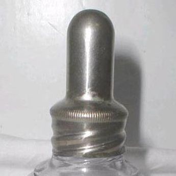
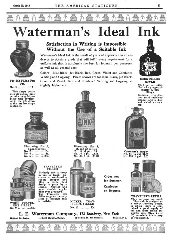
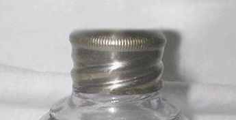
There is a possible variant of the bottle with an eyedropper under a tall, metal eyedropper cap.(12) I found one on Ebay, but it may have been a marriage, since it contradicted the original stated purpose of the bottle, that is, for use with self-filling fountain pens, and not for filling eyedropper pens. Maybe someone realized that the two types of caps were compatible and inter-changeable, and the caps were exchanged aftermarket. However, there may be another true variant of the metal cap, and I am calling this one the second version, at least until someone disproves it. The first ad for the bottle in Am. Stat., Mar 29, 1913, p.57,(13) shows this second type.(14) The same cut appears in the ads on Aug 2, 1913, p.1, Oct 25, 1913, p.20, and Apr 18, 1914, p.69. An article on May 3, 1913, p.35, announces the new “‘Ideal’ Ink Price List”, a “very artistic little folder gotten up by the L. E. Waterman Company” to be distributed and supplied to all stationers and other dealers, and the ad on Nov 7, 1914, p.1, doesn’t have pictures of all the different bottles, but it does offer a “Catalogue On Request”. The difference between the first two metal caps might best be explained by the license taken by the illustrator who drew the picture of the bottle in the ads. I photoshopped one of the eyedropper caps(15) to show what the cap may have really looked like, that is, with a rounded, knurled top edge rather than the straight, square-cut edge it has in the cut. The difference, however, may also be explained by the fact that the cap on the first round type is on a bottle found in Canada, since Waterman’s did have their own factory in Canada, and the square type of cap may be found only on bottles in the US. The one thing these early ads prove conclusively, though, is that the earliest bottles had no label.

The Stafford’s version of the bottle.
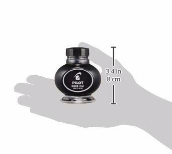
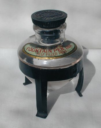
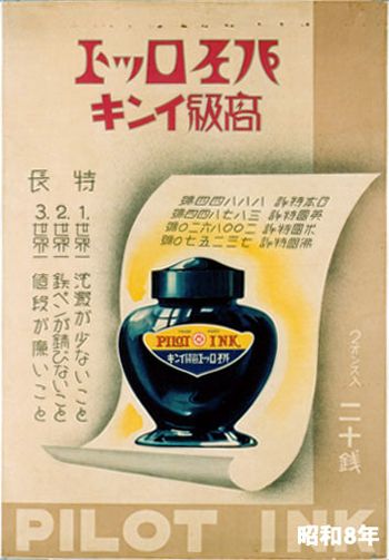
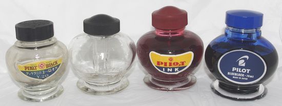
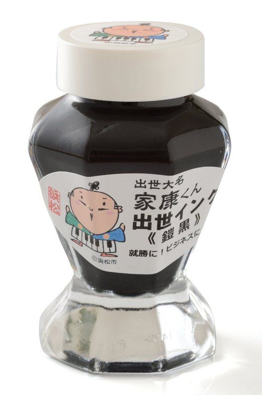
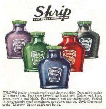
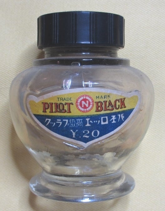
There is also a Stafford’s Fountain Pen Ink bottle in a square-globe version of the first bottle, or an upside-down-pyramid-shaped bottle with rounded and chamfered corners. Its threads are compatible with the Waterman’s heart-shaped ink bottle, so their caps are interchangeable. This one is quite rare because it may have been forced out of production early on by a cease-and-desist letter, and threats of litigation by Waterman’s, and consequently very few of them survive. I have only ever seen one of these bottles in all the years I have been collecting and researching inks. That’s one for every 20-25 of the Waterman’s bottles I’ve seen so far in over 35 years of collecting. Some other similar ink bottles include the Canadian Carter’s cardioid ink on its 3-legged, metal stand,(16) the Japanese Pilot urn-shaped ink,(17a) (17b) the modern Italian Visconti mushroom-shaped ink,(18a) and Sailor also used an octagonal-globe(18b) version of the bottle in 2014 for their limited edition inks, like the ones sold by Bungubox, which went viral until they were finally discontinued in 2015.(18c) The Waterman’s bottle also somewhat resembles the Sheaffer’s “Library” ink bottle(19) in US design no. 71,330, featured in a topic by Roger Wooten on FPN.(20)

The third version of the bottle.
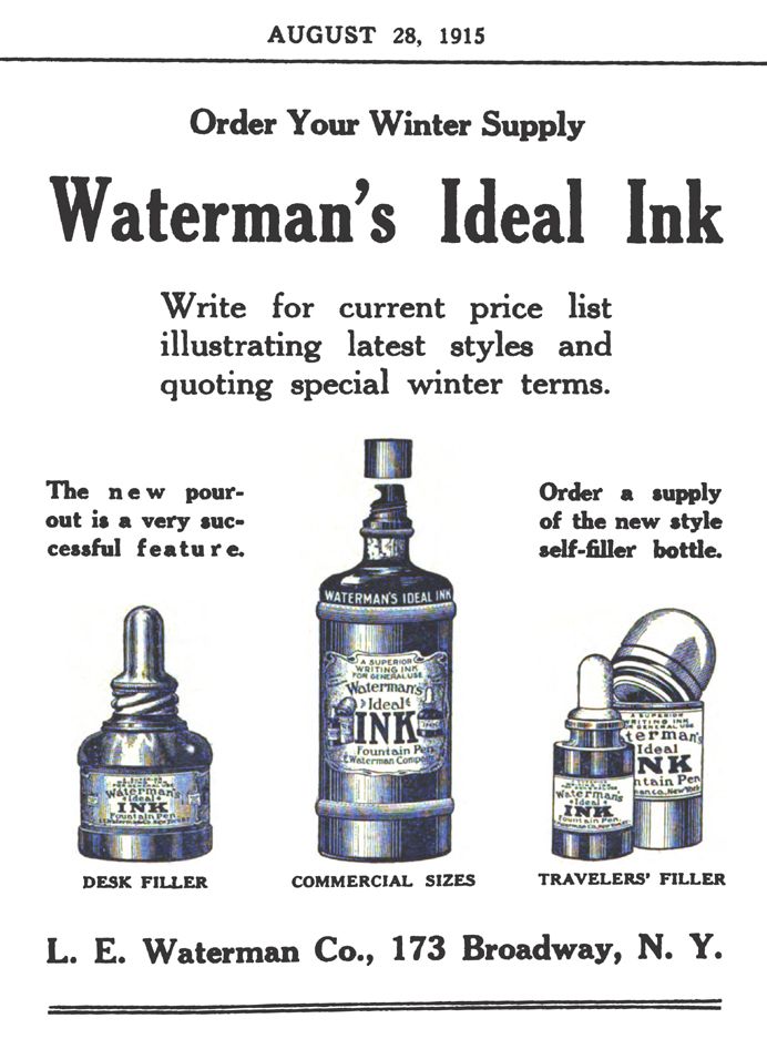
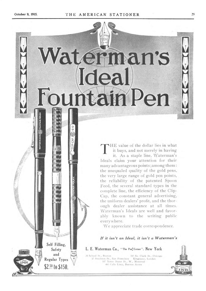
The third bottle is another version of the first type of bottle, ca.1914-15 to the early 1920s. It appears in the early-1920s brochure titled Waterman Ideal Ink where it is described as a “Desk Style vase shaped bottle, our new container designed especially for self-filling pens”, and in the early-1920s brochure titled A Vacation Necessity where it is described as “For Desk Use”. It has the same cardioid shape, but it now has short, shallow threads, and a black bakelite cap, which has the same words and imagery as the metal cap, but with more refined embossing, and it is not interchangeable with the metal cap because the threads are not compatible with those of the first bottle. It has the same embossing on the shoulders, and no mark on the bottom. It may not have had a label at first, but then it had the squat, horizontal, diamond-shaped label with the double-globe, and the black line inset from the edge of the paper. The transition to the next type of bottle is well-documented in an article in Am. Stat. The article titled “New Waterman Ink Receptacles” on Apr 17, 1915, p.32,(21) is the first time the bottle appears with a label, and it also has the bakelite cap. Two bottles are presented, the globe ink, and a new, patented pouring spout for their master inks. Both are called “newly patented receptacles”, but the pour-spout is the only patented item. The globe ink is still called “the new 2-oz. bottle”, but then the article goes on to say that it is only “the result of careful planning”, but no more. This article would have been the perfect opportunity to crow about any patent for the globe ink, if there were one, but since one isn’t mentioned, I think we can safely say that there probably wasn’t one, maybe. So call me “Maybe”. The Am. Stat. ad on Aug 28, 1915, p.1, only mentions and doesn’t show the globe ink, calling it “the new style self-filler bottle”,(22) even though it does show the bottle with the patented pour-spout. The mention appears above a picture of a “Travelers’ Filler”, which only serves to add strength to my conviction that the globe ink wasn’t patented. Otherwise, they’d have been prouder of it. The next ad showing the globe ink appears on Oct 9, 1915, p.29, but it gives equal time to both self-filler and eyedropper-filler fountain pens and the respective ink bottles from which they were to be filled.(23)

The Filling Station.
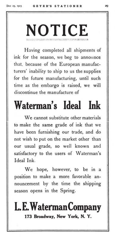
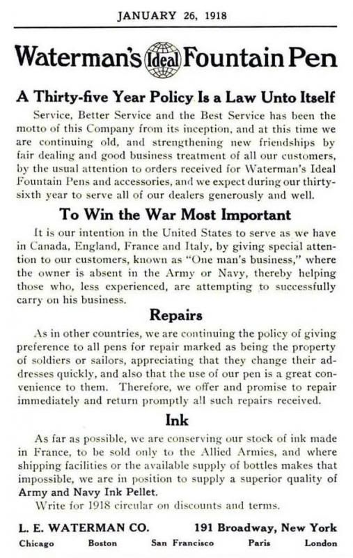
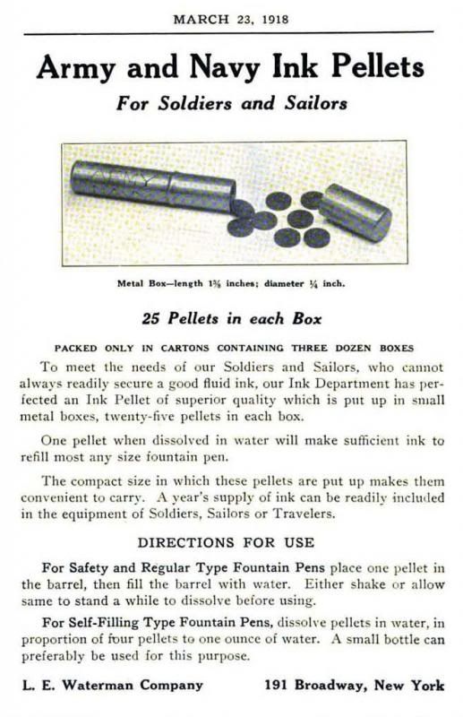
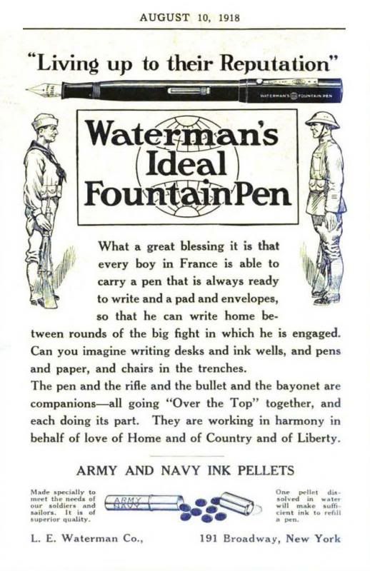
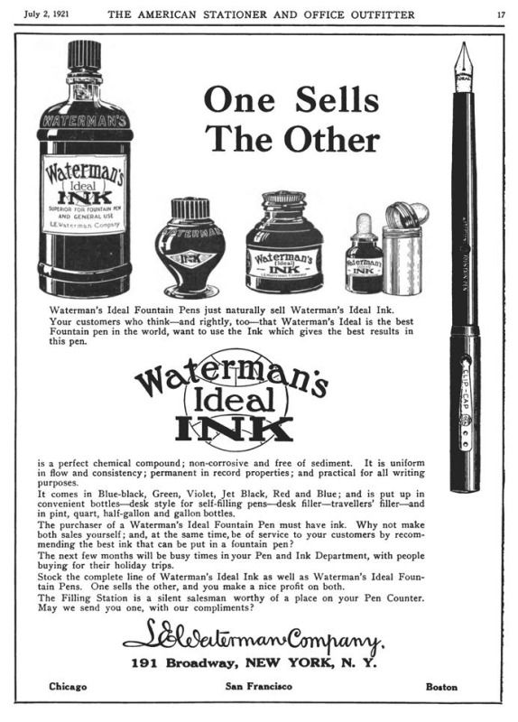
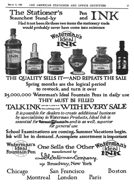
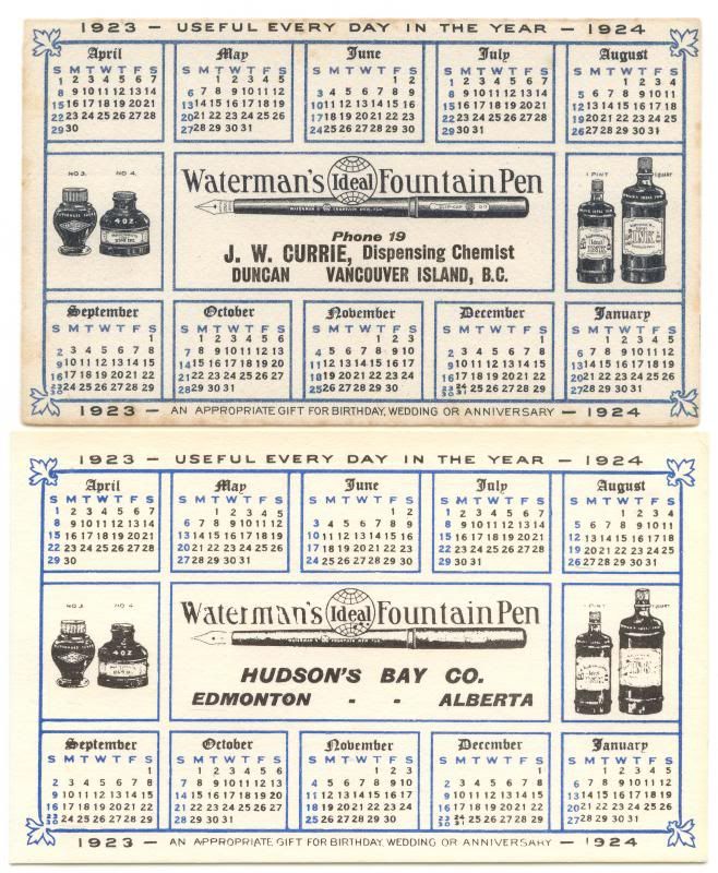
The next ad in Am. Stat. that features the Waterman’s globe ink doesn’t appear until well after the war, in 1919, so it’s not so obvious what happened in the intervening 3-4 years. But there is one last tantalizing clue in an ad for Waterman’s ink in 1915 that helps to explain the dearth of ink ads during the remainder of WWI. I don’t know whether the ad appears in Am. Stat. because the last issue from that year, no. 26 from Dec 25, 1915, is missing from the volume in Google Books. It’s okay, because a copy of the ad appears in Geyer’s Stationer, on Dec 23, 1915, p.29.(24) The ad has no illustrations at all, but the ad copy states quite revealingly, “Notice. We beg to announce that, because the European manufacturers’ inability to ship to us the supplies for future manufacturing, we will discontinue the manufacture of “Waterman’s Ideal Ink” until such time as the embargo is raised. We cannot substitute other materials to make the same grade of ink that we have been furnishing our trade, and do not wish to put on the market other than our usual grade”. It is not known when they resumed making ink, but not one of the ads during the period 1916-18 even mentions Waterman’s ink. Ads that mention dry ink pellets appear on Jan 26, 1918, p.1,(25) Mar 23, 1918, p.1,(26) and Aug 10, 1918, p.1.(27) The Jan 26th ad also states, “As far as possible, we are conserving our stock of ink made in France, to be sold only to the Allied Armies, and where shipping facilities or the available supply of bottles makes that impossible, we are in position to supply a superior quality of Army and Navy Ink Pellets”. So that’s what happened to the ink ads during the war, and the globe ink bottle didn’t make its reappearance until the full-page ads in Am. Stat., Apr 26, 1919, p.33,(28) July 2, 1921, p.17,(29) and Mar 11, 1922, p.17,(30) all showing the bottle with a double-globe label. It’s really a shame that there are no Waterman’s ads at all in Bookseller & Stationer between Dec 1912 and Oct 1919. Maybe the lack of Waterman’s ads can be blamed on the depression before the war, and then the war itself. In any case, the Waterman’s ads started reappearing regularly in Book. & Stat. in the early 1920s, and totally new globe ink ads appeared in the April 1920, p.3,(31) and May 1921, p.11,(32) issues. I’d love to find one of the “Filling Stations” pictured in the latter ad. I’ve got the bottles for it, and a space for it in one of my Waterman’s display cases, now that I know it exists. But until you see an item in an ad like this one, or find the actual artifact, how can you even guess that something like this exists? The ads in the August 1921, p.45,(33) and March 1922, p.80,(34) issues have the same image, but with different ad copy, and the ad on July 1922, p.12,(35) is similar to these two, but it’s a new ad. A British instruction sheet from around 1922-23, the type that was inserted into pen boxes, also shows the double-globe label.(36) This label also appears on the bottles in the 1922 Waterman’s US catalogues and on the Waterman’s “Apr 1923-Jan 1924” advertising calendar blotters.(37)

The fourth version of the bottle.
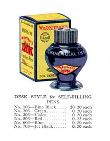
The fourth bottle is yet another version of the first type of bottle, early-to-mid-1920s, but this is the cross-over bottle. It has the same bakelite cap, and shallow threads, and cardioid shape, but with a wider filling cone-tip at the bottom that almost makes the bottle spherical, a steeper foot at the base, and the single-globe label with “Copyright” and “1920” at the extreme left and right angles of the diamond, and a black border at the edge of the paper. The one big difference is that although it has the same embossing on the shoulders, it also has the phrase “This container made in U.S.A.” and a mold-number mark embossed on the pedestal, or base, which on some bottles is smaller in circumference and steeper than the earlier bases, almost in preparation for the next version of the bottle. And by the time the Waterman’s 1925 catalogue comes along, the bottle is called the No. 103,(38) or 203, 303, etc., depending upon the color of the ink.

The fifth version of the bottle.
The fifth version of the bottle is a totally new design, mid-to-late-1920s, possibly into the 1930s. It is essentially the second style of bottle because it is so radically different from the other four in that it is truly globe-shaped. The other ones were all cone-shaped, and just had different caps and threads. The fifth one makes its first appearance in the 1925 brochure titled Wherever a pen or pencil is used,(39) where it is described as, “Waterman’s new desk style bottle for self-filling pens.…Note the extra deep ‘well’ extending to the bottom of [the] bottle–assuring easy access to the very last drop of ink”. It has the same bakelite cap, and the same shallow threads, but a new globe shape with a column-tip that extends into the footed base, much like a little tube stem. There is no “New York” embossed on the shoulder, and only “Waterman’s Ink” on the shoulder opposite the single-globe label. The phrase “This container made in U.S.A.” is on the base, but there is no embossed mold mark on the bottom because of the protruding cone tip, or the nipple of the tube-shaped well, which is in the way. The latest it appears is on the border of a Waterman’s letterhead dated and sent in 1929, but the design of the letterhead dates to an earlier time. Production of the globe bottle may have been discontinued in the late 1920s, or the bottle may have been available a little later into the early 1930s. What we need are some more issues of The American Stationer from 1923 to the 1930s. The new “Tip-Fil” bottles in US design no. 98,958 filed July 29, 1935 and issued on Mar 17, 1936(40) replaced it and made it redundant. What a shame that it’s gone.
George Kovalenko.
.
Addendum, June 11, 2015, June 16, 2016, and Aug 13, 2017.
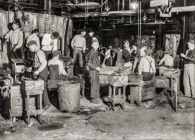
This was what the bottle factory in the Cumberland Glass Works in Bridgeton, N. J., looked like in 1909. There are some more photographs in the US Library of Congress from 1909, and in the US National Archives from 1912-13, from the time of the Waterman’s globe ink. These photos showing night scenes of children working the midnight shift were taken by Lewis Hine for the National Child Labor Committee as documentation of child labor, so these ink bottles may have been produced through the exploitation of the labor of children. And here’s a 1908 photo of a baseball team composed mainly of glass bottle factory boys.

Footnotes.
1a. New Pilot urn-shaped ink, http://img.photobucket.com/albums/v71/rhrpen/PalmPilot_zpslg1mjaio.jpg.
1b. US design no. 36,764, Feb 2, 1904, https://www.google.com/patents/USD36764.
1c. US design no. 11,965, Sept 14, 1880, https://www.google.com/patents/USD11965.
1d. G. T. Rogers Mfg. Co. “Bengal” bluing, http://img.photobucket.com/albums/v71/rhrpen/Bengal_zpsf628369b.png.
2. The Pen Prophet, Sept 1912, p.11, reprinted in Pen Fancier’s Magazine, Mar 1982, p.23, http://img.photobucket.com/albums/v71/rhrpen/8800bda0.jpg.
3. American Stationer, Aug 17, 1912, p.1, http://img.photobucket.com/albums/v71/rhrpen/db4aad1f.jpg.
4. Geyer’s Stationer, Mar 14, 1912, p.24, http://babel.hathitrust.org/cgi/pt?id=nyp.33433108135793;view=1up;seq=446.
5. Am. Stat., Feb 3, 1912, p.1, http://img.photobucket.com/albums/v71/rhrpen/WatGlobeInk_zps4b5680df.jpg.
6. Geyer’s, Feb 8, 1912, p.21, http://babel.hathitrust.org/cgi/pt?id=nyp.33433108135793;view=1up;seq=249.
7. Geyer’s, Aug 8, 1912, p.17, http://babel.hathitrust.org/cgi/pt?id=nyp.33433108135884;view=1up;seq=243.
8. Waterman’s first globe cap oblique, http://img.photobucket.com/albums/v71/rhrpen/5fd0ff90.jpg.
9. Waterman’s first globe cap top, http://img.photobucket.com/albums/v71/rhrpen/c940ecf4.jpg.
10. Waterman’s box insert paper ca.1912-13, http://img.photobucket.com/albums/v71/rhrpen/94f150cd.jpg.
11. Waterman’s streetcar ad ca.1914-15, http://img.photobucket.com/albums/v71/rhrpen/2e404aa8.jpg.
12. Waterman’s eyedropper cap, http://img.photobucket.com/albums/v71/rhrpen/a21a5a7a.jpg.
13. Am. Stat., Mar 29, 1913, p.57, http://img.photobucket.com/albums/v71/rhrpen/1db93e65.jpg.
14. Ibid., p.57, detail from the ad, http://img.photobucket.com/albums/v71/rhrpen/83f6aee4.jpg.
15. Waterman’s eyedropper cap photoshopped, http://img.photobucket.com/albums/v71/rhrpen/0315a294.jpg.
16. Canadian Carter’s cardioid ink, http://img.photobucket.com/albums/v71/rhrpen/6addfc03.jpg.
17a. Vintage Pilot urn-shaped ink, http://img.photobucket.com/albums/v71/rhrpen/a91efa24.jpg, and http://stat.ameba.jp/user_images/20160708/20/kamisama-samasama/2d/b6/j/o0528067413692557973.jpg.
17b. And the four different types of Pilot ink bottles, http://stat.ameba.jp/user_images/20130211/20/kamisama-samasama/5b/ad/j/o0550020712415403948.jpg.
18a. Visconti mushroom-shaped ink, http://img.photobucket.com/albums/v71/rhrpen/a9346ced.jpg.
18b. Sailor octagonal globe ink, http://img.photobucket.com/albums/v71/rhrpen/SailorBunguBox1_zps2ptysbso.jpg.
18c. FPN topic #272272, http://www.fountainpennetwork.com/forum/topic/272272-sailors-full-ink-lines-including-shop-exclusives-compiled-in-a-post/.
19. Sheaffer’s “Library” Skrip ink, http://img.photobucket.com/albums/v71/rhrpen/2c96078e.jpg.
20. FPN topic #191982, http://www.fountainpennetwork.com/forum/index.php/topic/191982-the-first-bottle-for-skrip/.
21. Am. Stat., Apr 17, 1915, p.32, http://img.photobucket.com/albums/v71/rhrpen/93ebd861.jpg.
22. Am. Stat., Aug 28, 1915, p.1, http://img.photobucket.com/albums/v71/rhrpen/WatadsAug281915_zpsc16d198a.jpg.
23. Am. Stat., Oct 9, 1915, p.29, http://img.photobucket.com/albums/v71/rhrpen/1915bWatglobe_zpsae5e7aa0.jpg.
24. Geyer’s, on Dec 23, 1915, p.29, http://img.photobucket.com/albums/v71/rhrpen/Watglobeink1915b_zpse03d11c0.jpg.
25. Am. Stat., Jan 26, 1918, p.1, http://img.photobucket.com/albums/v71/rhrpen/Watglobeink1918a_zpsf5953a57.jpg.
26. Am. Stat., Mar 23, 1918, p.1, http://img.photobucket.com/albums/v71/rhrpen/Watglobeink1918b_zps731512b8.jpg.
27. Am. Stat., Aug 10, 1918, p.1, http://img.photobucket.com/albums/v71/rhrpen/Watglobeink1918c_zps0e1e10e9.jpg.
28. Am. Stat., Apr 26, 1919, p.33, http://img.photobucket.com/albums/v71/rhrpen/dfc7761c.jpg.
29. Am. Stat., July 2, 1921, p.17, http://img.photobucket.com/albums/v71/rhrpen/3cc5eaa5.jpg.
30. Am. Stat., Mar 11, 1922, p.17, http://img.photobucket.com/albums/v71/rhrpen/2a9fda73.jpg.
31. Bookseller & Stationer, Apr 1920, p.3, a totally new ad, http://archive.org/stream/stationeryoffice1920toro#page/n236/mode/1up.
32. Book. & Stat., May 1921, p.11, a totally new ad, http://archive.org/stream/stationeryoffice1921toro#page/n340/mode/1up.
33. Book. & Stat., Aug 1921, p.45, the same image as 4, but a totally new ad, http://archive.org/stream/stationeryoffice1921toro#page/n582/mode/1up.
34. Book. & Stat., Mar 1922, p.80, same image as 3, but with new text, http://archive.org/stream/stationeryoffice1922toro#page/n239/mode/1up.
35. Book. & Stat., July 1922, p.12, similar to 3 and 4, but a totally new ad, http://archive.org/stream/stationeryoffice1922toro#page/n479/mode/1up.
36. Waterman’s box insert sheet ca.1922-23, http://img.photobucket.com/albums/v71/rhrpen/2699f938.jpg.
37. Waterman’s “Apr 1923-Jan 1924” advertising calendar blotters, http://img.photobucket.com/albums/v71/rhrpen/Watglobeink1923-24blotters_zps4b0590ac.jpg.
38. Waterman’s 1925 catalogue, http://img.photobucket.com/albums/v71/rhrpen/f2ce0d1d.jpg.
39. Waterman’s 1925 brochure, http://img.photobucket.com/albums/v71/rhrpen/668e8927.jpg.
40. US design no. 98,958, Mar 17, 1936, https://www.google.com/patents/USD98958.

And here’s a parting shot of a Waterman’s globe ink with a photo-repro label and a Rawleigh’s floor polish coin-slot screw cap.
It is the bottle I usually use to fill all my fountain pens, but I cleaned it up for this occasion.
