


[On Pentrace and Zoss in August 2007, there was some confused talk about oblique italic nibs.]
Andre Bouthillette, a pen user here in my city, said of an oblique italic nib, “It has a certain tilt”. But is there a tilt suitable for each hand, and which tilt is correct for which hand? Stanton posted on Pentrace in August 2007 about the book The Dangerous Book For Boys (2006) by Conn Iggulden & Hal Iggulden. In a chapter on “Grinding an Italic Nib”, the writers suggest that right-handers would prefer a right-foot oblique and left-handers a left-foot oblique. The authors also include pictures of four nibs with the caption, “Picture 1 shows a standard nib. Picture 2 would be best suited to a left-handed writer [an oblique nib with more material removed from the left tine]. Picture 3 [a straight italic, straight as opposed to tilted] is suitable for both, and Picture 4 is best suited for right-handers [an oblique nib with more material removed from the right tine]”. It’s an oblique stub, or rather an eased oblique italic. Stanton later added, “To clarify, or further obfuscate, I was under the impression that, generally speaking, lefties would prefer ‘Picture 4’, which I referred to as a ‘right-foot oblique’. As to terminology, I thought the utilization of ‘left-foot’ and ‘right-foot’ arose within the pen collecting community because of a lack of standardization among the industry. What one fountain pen manufacturer called a left oblique another might call a right oblique and another might call a reverse oblique”. Another anonymous poster wrote, “See what duelling this subject hath wrought? Left, right, left, right! It is a dangerous book!”.
There are still some pen collectors and users out there who insist that it is the opposite, right oblique equals left foot, and left oblique equals right foot, and they even try to justify their claims by saying that calligraphers use this convention. Well, Edward Johnston was a calligraphy expert, and he and most other calligraphers do not use this convention. For once and for all, right oblique equals right foot, and left oblique equals left foot. Perhaps a better way to put it is to say that the right oblique is cut like a back slash, like this \, and a left oblique is cut like a forward slash, like this /. The above picture from Johnston’s book Formal Penmanship (1971), p.71 [re-arranged], illustrates this rule. All this talk of left-hand and right-hand, and left-foot and right-foot is obfuscation and obscurantism.
Vivek Narayanan wrote that the usage “left oblique” for a nib for lefties is, however, still strongly present in pen collecting. “Johnston is clear enough to say ‘left-cut oblique’, but is left-cut meant for lefties, or for righties?” Later he added, “We are talking apples and oranges here. Johnston is discussing the obliqueness of nibs, and I am referring to the usage in some calligraphy manuals and some pen collectors saying ‘right oblique’ to refer to pens meant for righties, and ‘left oblique’ to refer to pens meant for lefties. Perhaps they should start using righty oblique and lefty oblique to refer to humans. ;-] I completely concur with Johnston’s terminology. His “cut” notation is identical to the “foot” notation. But show me where he says left cut oblique is meant for left-handed people and right cut obliques are meant for right-handed people”.
And I replied, “No, we are talking right foot and left foot here, not apples and oranges. Don’t change the metaphor. Anyone who wants to talk about italic or oblique nibs should first have to read both of Johnston’s classic works on calligraphy and lettering. Read them first, and then we’ll talk. Before you make demands of others to show you whether he says this or that about left-handed and right-handed writers, perhaps you should try to show us whether he says anything at all about this or that.
“Before I give my interpretation of the above image, let’s make one assumption. Since most people are right-handed, let’s assume that Johnston is talking about right-handed writers, and that the left-handed writer is the exception. So the square-cut and right-cut oblique nibs are both intended for right-handed writers. All this attention to left-cut and right-cut fails to mention what’s written beneath the nibs. The two on the right are meant for “Western” writing, and the nib on the left is said to be for “Eastern” writing. So the left-oblique is also meant to be used by the right-handed writer, but only to aid the writer in executing the reverse italic of Eastern scripts such as Hebrew and Arabic, with their narrow vertical strokes and broad horizontal strokes. I would add, and it is only my interpretation, until I get a chance to reread Johnston’s two works as well, that the left-cut oblique could also pass as a serviceable nib for the left-handed writer. Also to the same purpose, Charles Kitchens wrote on Zoss in August 2007 that, “Sheaffer made a No Nonsense calligraphy set for, as they put it, ‘the left-handed, or Arabic calligrapher’, meaning, of course, a right-handed Arabic calligrapher”.
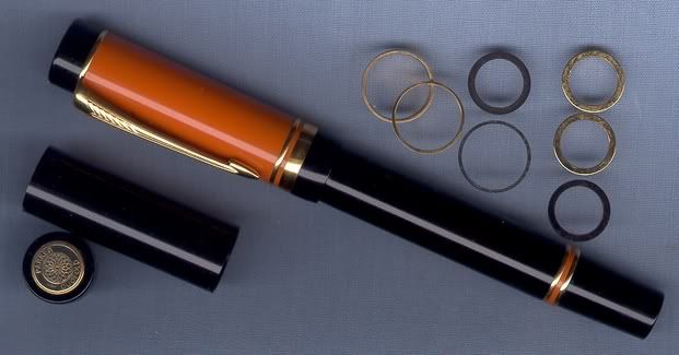
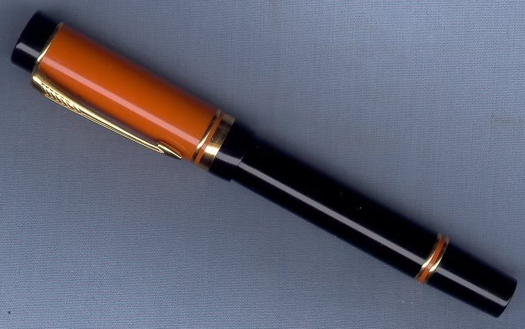
By the way, between 1978 and 1990, I almost exclusively used a series of Osmiroid 65 fountain pens with Extra Fine Straight Italic interchangeable nib units. I wore out those cheap steel nibs every 9-12 months, and the fountain pens every few years, and almost every one of the nibs ended up worn down to a right-foot angle. When I replaced that pen with a black Parker Centennial Duofold, I chose a #77 Fine Reverse Oblique Italic, or Left Oblique Italic nib, which happens to have, you guessed it, a right-foot angle. And this is what I did with that pen. I turned it into a Limited Edition Frankenpen.
Rob Astyk wrote, “This information specifically applies to “The Western Hand”. The cut of the nib doesn’t equate with the handedness of the writer, but rather with the angle of attack of the pen on the paper, or the way the writer holds the pen, the type of script one is reproducing, and where you want to place thick and thin lines. The simplification ‘Left Oblique for right-handers, Right Oblique for left-handers’ is no less right or wrong than ‘Left Oblique for left-handers, Right Obliques for right-handers’ ”. Vivek countered that, “The discussion here is merely an academic exercise”. And Jim Kukula wrote, “To continue in the academic spirit, Tibetan script is also written left-to-right, and seems to like thicker horizontals, although it involves a fair amount of pen manipulation, that is, rotating the pen as one writes”.
All these things, the angle of attack, the way the writer holds the pen, the type of script, and pen manipulation, all predispose which nib should be used to get the desired effect. Handwriting of any type, whether Roman, Tibetan, Hebrew, Sanskrit, Copperplate, etc., involves the type of nib, the flow of the ink, the drag of the paper, and the angle at which the pen is held. Given that all those factors affect one’s handwriting, I still contend that a specific nib alone can improve a person’s handwriting, but it’s the height of folly to assert that handedness alone determines the suitability of a given nib for one’s hand.
Pen companies and nibmeisters can say whatever they want about handedness and “customary oblique nibs with tipping almost always being left obliques”, but that doesn’t necessarily make them right. Pens with those kinds of tipping will produce a reverse-italic script, not an italic script. Here are some extracts from Johnston’s two books on pen lettering. Johnston never refers to handedness in either of his penmanship books. He does refer to “the right shoulder”, though, but that’s as close as he gets. He just assumes that the writer is right-handed to start off with, but he does say these two things about the “slanted shaft” and the “formal pen”.
In Writing & Illuminating & Lettering, on p.65, re “Slanted Shafts”, he says, “Most people are accustomed to holding a pen slanted away from the right shoulder. The nib therefore is cut at an oblique angle to the shaft, so that, while the shaft is slanted, the edge of the nib is still parallel with the horizontal line of the paper, and will therefore produce a horizontal thin stroke and a vertical thick stroke.”
In Formal Penmanship, on pp.71-72, re “Formal Pens”, he says, “The whole value and force and worth-doing-ness of formal penmanship comes from the fact that it is the product of this special tool, the formal pen as above defined. I have ventured to distinguish these differently cut pens of figure I, as ‘Western’ and ‘Eastern’ pens, because square-cut and right-oblique nibs seem to me to have been chiefly used in the development of Western writing, and left-oblique nibs to have been used--perhaps exclusively--in the development of Eastern writing. The term ‘formal pen’ in this book will commonly mean a Western pen, with a broad nib that is either square-cut or one that has some degree of right-obliquity.”
Very few modern pen companies ask their buyers how they hold their pens in order to fine-tune the nib to their style of writing. Two companies that do this, however, are Sailor and the Nakaya Pen Co. in Japan, and all the others should take their cue from them and emulate this practice. Nobuyoshi Nagahara is the pensmith who customizes the nibs at Sailor, and Sadao Watanabe is the pensmith at Nakaya, the craftsman-made-pen division of Platinum. On Feb 17, 2003, “Robert Grossman” wrote on Zoss that there is a lot of variation in the ways that people hold their pens, and that there is nothing wrong or uncommon in this. He found this out when he took the opportunity to have a nib smoothed by Nagahara at a pen show. “He asked me to write something, and he watched how I held the pen. That explained everything. He could emulate the way I held it, find the sticking point, and eliminate it. He also solicits information along these lines in nib order forms, which seems like a mighty good idea to me. Again, there is no right or wrong in this regard, it is just necessary to know how you hold the pen when you write. Therefore, a nib could feel very smooth to one person, but feel a little scratchy to another. On examination, I bet there is no real disagreement. It’s just a matter of how you hold the pen. If you hold the pen differently, a different part of the nib glides across the paper. The same nib could be very smooth for one and be scratchy for another.”
Although it was quite common in the vintage pen era, it was a real eye-opener to see modern pen companies spending so much time trying to suit the pen to the customer’s needs. This is quite heartening to pen users and collectors, especially after hearing all the horror stories concerning Montblanc, which treats its pens like investments that shouldn’t be written with, and its customers like second-class citizens, if they expect their pens to actually write well. Some members of the pen community and pen manufacturers such as Parker and a few others were the ones responsible for the confusion in the terminology, with terms such as “reverse oblique”, and “right hand” and “left hand”.
If you look closely at the form of the tip of the nib and how it touches the paper, it becomes obvious that it’s all about “how you hold the pen”. And the customer is always right. There is no disagreement there. Well, that realization can also be used to shine a little light on the constantly recurring oblique nib controversy.
The oblique italic nib controversy goes back a long time. But how far back do you want to go? Maybe we should look at the patents. The controversy goes back at least as far as US patent no. 178,951, an “Improvement In Writing-Pens” issued on June 20, 1876. The patent is for oblique nibs “turned to left or right, according to the necessity of the writer”, but it is not about left-handed or right-handed nibs, nor is it about left-foot or right-foot. He is biased toward right-handed writers exclusively, and talks about how right-handed writers commonly hold the shaft of the penholder or fountain pen toward the left, and then he designs another nib in which “the arrangement of the nib is reversed” for the “writers who point the upper extremity of the pen holder or handle toward the right”. It is because of this interpretation of how people commonly hold a penholder that his nibs are slanted opposite to the way Johnston has them slanted in his drawing. We won’t get into whether his interpretation is right or wrong, but his idea of suiting the nib to the way the writer holds the penholder is correct. That’s what Johnston is referring to when he talks about the slant of the shaft.
And here’s one last quote from the past. This is from the Parker Duofold ad that introduced their new oblique nib, placed in The Saturday Evening Post, July 25, 1925, p.93. “The new Oblique|When held this way [with the pen shaft slanted to the left], it writes like this [wide down stroke, narrow side stroke].|Note the shading on the down strokes—accenting the thin curves top and bottom.|When held this way [with the pen shaft slanted to the right], it writes like this [narrow down stroke, wide side stroke].|Note here that the down strokes are slender, and the shading appears in the curves”. And if the tip of the nib were angled the other way, then everything in that statement would be reversed, mutatis mutandis, and it would all still be correct. What the ad is saying is that it all depends upon how you hold the fountain pen, something that we, today, seem to have forgotten. Even the modern Parker Pen Co., with its current nib designations, seems to have forgotten it.
It can almost be reduced to the rule that there is no rule. An oblique nib should be slanted down toward the direction that you’re writing. What Johnston calls a “Western Pen”, one meant for English and other scripts written with Roman letters, are written both right-handed and left-handed from left to right. What Johnston calls an “Eastern Pen”, one meant for Hebrew and Arabic and Oriental scripts, are written both right-handed and left-handed from right to left. That should cover everyone. It all depends upon how you hold the pen, and whatever works for you is okay. I hope the oblique is, now, a little less obscure.
George Kovalenko.
.