

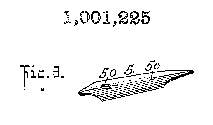
The illustration in this patent shows a double-ended nib, both a stubby italic and a long-pointed flex, all in one.
Italic writing originated in Renaissance Italy as the script used in the papal chancery for writing official Vatican correspondence and documents. The scribes found the Carolingian Minuscule script too cumbersome and slow, because the pen had to be lifted from the paper after each letter. They were looking for a truly cursive script where the pen needed to be lifted only at the end of a word. One could even tease the Caroline script by saying, “That’s not writing, that’s printing and lettering”. Italic script is by definition cursive, and this style of script came to be called “cancellaresca corsiva”, or the chancery cursive, but later it came to be known as “italic”, meaning “from Italy”. And by extension, the word “italic” also came to be applied to the type of nib that produced these distinctive shaded effects.
Well, I might be taking a “chancellorisk” by broaching the topic, but there has been some talk recently on the fountain pen collecting websites and message boards, a lot of positing about the putative distinction between italic nibs and stubs. They claim that a stub is inherently different from an italic, that a stub has an iridium tip or point with rounded edges and corners, so that it writes smoothly, as opposed to an italic with its sharp, chisel-pointed edge, which makes it more italicky and scratchy. So, let’s look at the patent record and see whether there is any merit to this modern claim, and whether there are any historic precedents for such a distinction.

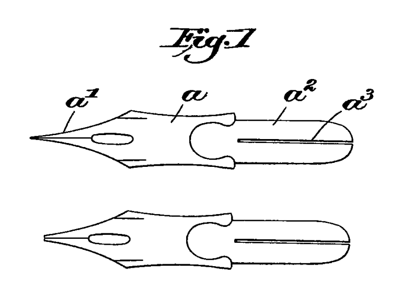
Henry A. Walke received US patent no. 274,679 for a “Fountain-Pen” on Mar 27, 1883. This patent is not for a complete fountain pen, but the special nibs that are designed to work with the tubular feed of his earlier pen, US patent no. 235,396 from 1880. Fig. 5 in the 1883 patent, an illustration of “a stub-point pen”, shows exactly what was meant originally by a “stub” nib, and Fig. 7 shows a long-pointed shading nib. Now, here is the correct distinction, that between the stub-point and the long-point. I don’t think it’s possible to make this difference more graphic.
It has the look of a cut quill. One of the objectives stated in the specification is “to increase the elasticity of the ordinary stub-pen without making it a shading pen”. It makes it obvious that it refers to a nib with very short, shallow shoulders and stubby points, traditionally used for italic nibs, and that’s all. An italic nib gives shading to one’s handwriting without the on-off pressure required with a flexible nib. And a modern stub nib is just an italic nib that’s afraid of being too ethnic. In other words, it’s afraid of being a true chisel-point, so it gets a neb job. And what’s a “neb”? Simply “nose”, or “point”, or an archaic version of the word “nib”.

Frank H. Burdsall received US design no. 32,730 for a “Design For A Stub-Pen”, on May 29, 1900. The specification reads in part, “The leading or material feature of my design consists in... the abruptly-divergent concave curved point edges a”. That’s a perfect description, and the picture is a perfect illustration, of a stub nib. If you want to see a long-pointed nib that nicely contrasts with this illustration, take a look at US patent no. 506,853. The nib in the original illustration is a fine flex, but the nib could easily be worn down and altered into an italic flex.

Joseph L. Petit’s US patent no. 663,782 for “Metallic Pens”, Dec 11, 1900, is for a nib described as having a “narrow stem-like point” projecting abruptly from the main body of the nib, thus giving it “an elasticity more or less resembling that of the goose-quill”. Now, here is an extreme stub-italic nib, although it isn’t designated as such in the specification. It almost looks as if it were giving the finger to the whole stub-or-italic controversy.
And here are some more textual references. Abraham L. Baer’s US patent no. 704,691 from 1902 is for a fountain pen in which “any form of steel pen, sharply-pointed or stub-pointed, can be used”, which shows the original meaning of the word “stub”. Warren N. Lancaster’s 1906 US patent no. 816,344 for a “Fountain-Pen” was actually for a specific design for a feed, which “makes it perfectly feasible to use the ordinary long-point pen as well as a stub”, and again shows the original meaning of the word “stub”. The specification goes on to say, “It is my purpose to provide a feed for fountain-pens which will make it possible to use any style of pen, quantities of which are at present a drag on the market, because they cannot be utilized on any known form of fountain-pen, it being the custom almost exclusively to use the so-called ‘stub-pen’ ”. A stub nib is obviously one with short, stubby tines, the type most often used for italic nibs because they didn’t need to be flexy to yield shaded effects in writing. That’s all. Walter King’s “Penholder” from 1910, US patent no. 964,650, is said to be “arranged as to hold a plurality of nibs or pen-points... whereby the pen-man may have at hand with the one pen-holder, say, a sharp pointed pen and a stub pen”. That’s the only distinction that needs to be made, the one between a pointed, flexible nib and a rigid, stub-italic nib, not between stub and italic.
Nowhere in Edward Johnston’s Writing & Illuminating & Lettering does he ever mention a stub nib, let alone a stub nib as distinct from an italic. He does, however, make a distinction between a long nib and a short nib when he writes, “The pen may be made more pliant by scrapping it till it is thinner, or by cutting the ‘shoulder’ longer, or stiffer by cutting the nib back until the ‘shoulder’ is short”. He then goes on to say, “A gold pen is probably the best substitute for a quill, and if it were possible to have a sharp, ‘chisel-edged’ iridium tip on the gold nib, it would be an extremely convenient form of pen”. Johnston, in his Formal Penmanship, defines the italic nib as, “The typical nib...must be stiffly springy...a broad nib, sharp edged and sharp cornered”, but a nib with eased edge and rounded corners would do just as well. He goes on, “Such a nib in normal use will make its own thick and thin strokes naturally (without pressure)”. And among the list of “tools” used in penmanship, along with “all other instruments and substances used”, he includes “our hands”.
And what do the patents say about the stub-or-italic distinction? Zip, Nada, Rien, Nichts, Gornisht! I’m sick and tired of this totally specious modern distinction between stub and italic, this recent construct that has no basis whatsoever in fact, this modern fiction created out of ignorance of the real past, the true past. There is no historic record of any pen company having these two separate nibs, one called an “italic” and another called a “stub”, both at the same time. Take two classic pens, for example. The May 24, 1922 ad for the Duofold in the Chicago Tribune offers the pen with five different nibs, among them a “Stub”, but no nib called an “Italic”, because the stub is an italic. In the Duofold ad in the Saturday Evening Post, Aug 22, 1925, the stub is said to be a nib that “gives a hand distinctive character and interest—shaded, bold, and free”. The Waterman’s No. 7 pen was offered with color-coded nibs, and the “Blue” one was at first called a “Blunt—An improved stub...[that] makes thick or thin characteristic stub strokes as desired”, and later it was called solely a “Stub”. There is simply no basis in historic fact for this modern claim. You can posit all you want, but that doesn’t make it so. “Do not posit! Either it is, or it is not. There is no posit.” So don’t be a mumpsimus.
Now, there is this notion of the “etymological fallacy”, which says that it’s a fallacy to think that the “true” meaning of a word is its historically “original” meaning, but I say that it’s a fallacy to say that the “true” meaning of a word is not based on its historically “original” meaning. Actually, all the different meanings of a word are there together in a dictionary definition. You just choose the one that suits your purposes, and you might not like some of the other meanings. In fact, the true meaning of a word encompasses all its meanings. This isn’t exactly forensic linguistics, which is all about looking for the smoking gun in a text, but it is etymological diagnostics, or diagnosis of problems in etymology. I guess that makes me a sumpsimus.
If you still want to retain the distinction between stub and italic in the modern sense, then at least don’t use an old, established word for a new, arriviste concept. Don’t call it a “stub”, but rather a “blunted italic”, or an “eased italic”, or a “rounded italic”, or an “ovalic”. Anyone who wants to keep making the distinction between stub and italic, go ahead and dig your grave, but dig it deep, so that this modern misconception will stay buried this time. Quick, give me a wooden stake! No, the big stake! I want it to stay dead this time. It’s not that we have on the one hand a stub, and on the other an italic. A stub is an italic, and an italic is a stub. You’ll notice that the title of this piece is not “Stub Or Italic”. This type of nib is both. It’s a “stub-and-italic”!
George Kovalenko.
.
[This article was first posted in 1999 on Bruce Marshall’s website. It was also posted a little later on Richard Binder’s website, but somehow the crucial sentence with the “m” word got cut out of the text, so I am posting this here to restore it.]