


[First posted on L&P on Dec 21, 2011.]
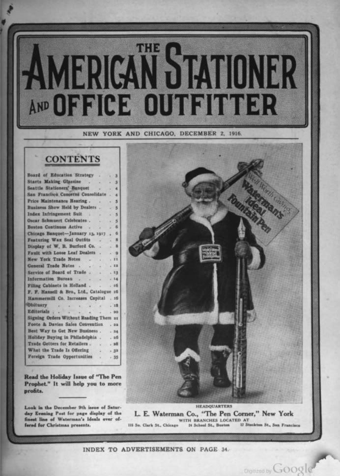
I’m not a Christmas person, so I’m going to post this Santa image one last time. I follow the solstices and equinoxes, and the hibernal solstice is a good marker for the beginning of the year, so at most I will say Happy Yuletide to everyone with this b&w ad, which was colorized by moi, yours truly. I thought I also found a use of the word “fountpen” by a pen company other than Mabie Todd Co., in the imprint on the buckle holding the belt around Santa’s fat girth society. I thought it read “Waterman’s Ideal Fountpen”, shortened because there wasn’t enough room for the full word, but the full word “Fountain Pen” is there, just like in the big sign over his shoulder.
Here’s the original Waterman’s ad on the cover of The American Stationer. This image was first used 99 years ago in the cover ad on Dec 18, 1915, p.1, but I used the version from a year later, Dec 2, 1916, p.1, because the digitization was cleaner. Also, there is an illustrated article in the earlier issue, on p.5, in which the globe-shaped model for the rotund and orotund Santa is identified as Charles N. Bellman, the then-current president of the National Assoc. of Stationers.
And here’s a color version of this ad image used as part of a Waterman’s brochure, which I found on Luiz Leite’s blog, and where it is said to be from 1919. But all the pens they hold in their left hands have cap bands, and some of the pens are Ripples, and all the Santas are holding pencils over their right shoulders, all of which place it after 1923. The earlier version of the ad came from an era when the colors in Santa’s costume could still have been the non-standard, or unusual colors, but by the time of the later brochure, the colors had been standardized to what is commonly thought to be the corporate Coca-Cola red-and-white color scheme, which Coca-Cola merely popularized with its Santa ads.
George Kovalenko.
.