

, the original “Longshort” pen.

[Posted on L&P on Feb 28, 29, Mar 7, 2012.]
Here’s a picture of what was probably the first attempt at a long-short, or short-long pen, the MacKinnon “Sovereign” stylo. The above cut appears in an article in The American Stationer, Dec 2, 1880, p.8, which shows that it preceded the Mabie Todd “Longshort” by about 31 years. It is described as being one that’s “made to close in a very compact manner”. It was “about an inch shorter than the shortest pen” made by any other penmakers when capped, and almost as long as “the longest pen” when opened for use and with the cap posted. Has anyone found any earlier examples? Here’s one of the first ads, Jan 13, 1881, p.42.
And David Nishimura wrote, “Sorry George, but I don’t buy it. The distinctive thing about a real longshort design is that the overall length when closed is only slightly more than the length of the cap. Put another way, the cap, when the pen is closed, covers nearly all of the barrel—which is not the case with the MacKinnon design”.
And I wrote, “Well, it is a precursor, even though the transformation is not as dramatic as that of the later pens. I put it in the plural because there are other pens, not just the Mabie Todd. If we want to quibble over numbers, in the case of the “Sovereign”, the ratio of the length of the pen capped to the length with the cap posted is a little over 1:1.3, whereas the “Longshort” is a little over 1:1.85, almost 1:2. It’s just a difference in the degree of compression. The MacKinnon is not as short as the MTCo when capped, but the bonus with the “Sovereign” is that, when the cap is posted, it is almost as long as a normal pen. What’s important is the stated principle of a pen shortened for compactness and portability when capped.
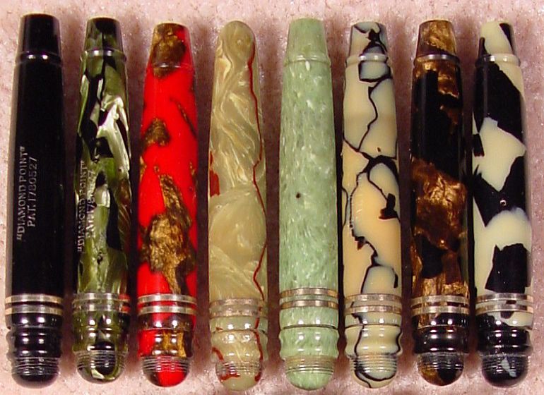
“Livermore came out with his version of the “Sovereign”, but he called his the “Monarch”, which he advertized on Nov 23, 1882, p.802, as “closing up short for the vest pocket”. And just for good measure, here are a few later Diamond Point “Barrel In The Cap” pens from the 1930s.”
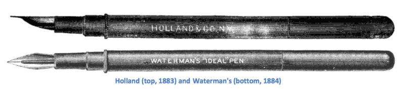
“It’s also the first stylo to look like it has a regular fountain pen cap and barrel. Its design almost looks like a precursor to the Frank Holland pen, and the first Waterman’s “Ideal” pens, and the Thomas De La Rue “Anti-Stylograph”, all of which came after it. And almost two years later, in this ad, Sept 21, 1882, p.460, Cross finally stole that idea as well, but then, in his defense, all the pen companies had to imitate one another in order to compete, but MacKinnon was first.

It looks very much like the Holland-Waterman double picture in “Blotting Out The Truth”, p.38.”
George Kovalenko.
.