collection1b

collection1b

December 31, 2014

Arrow Trademark Pointers


[Posted on L&P on May 1, 2010, July 7, 2010, and Aug 13, 2010.]
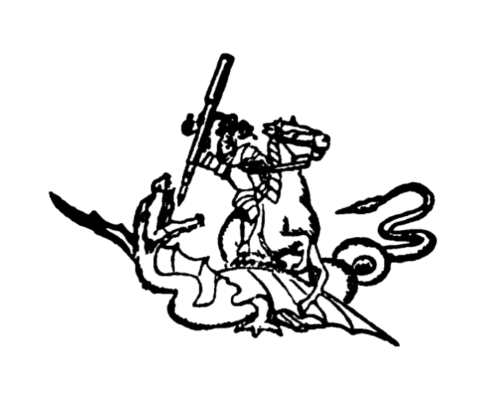
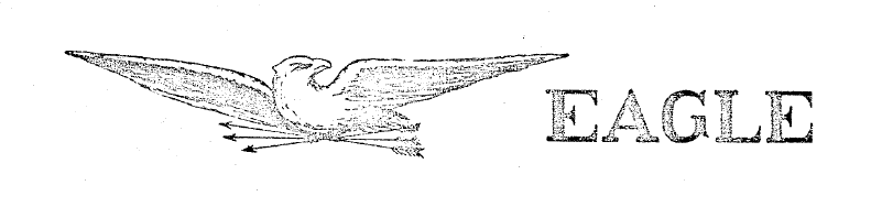
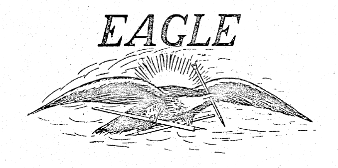
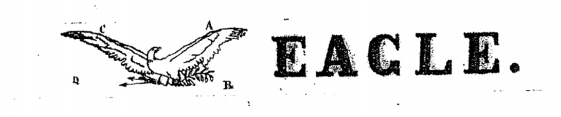
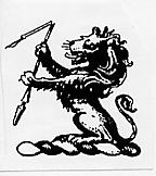
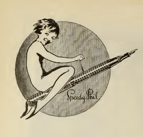
        Almost all of the Eagle Pencil Co. trademarks include these tantalizing little images of eagles with outstretched wings, and holding
spears or arrows in their beaks or talons, and other pointy sticks such as pencils and penholdersSome of the images show the eagle holding spears on one side and an olive branch on the other, perhaps their version of the pencil being mightier than the sword.  The Eagle Pencil Co. seems to be implying that, when writing with their pens and pencils, you will shake spears with your written words. But here are a few slightly different pointed marks.
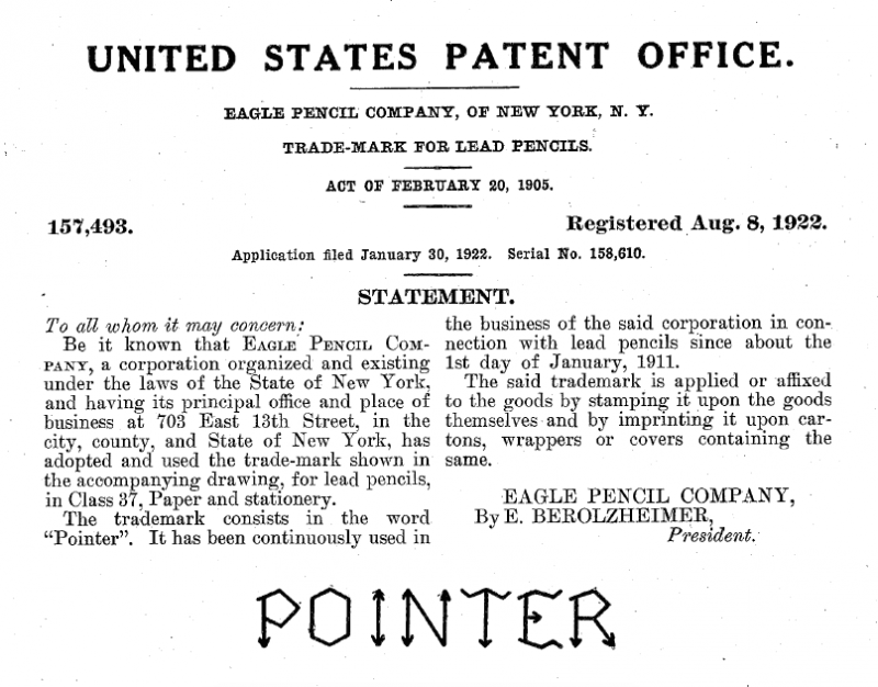
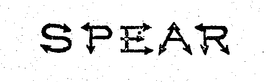
        US trademark no. 71,047 from 1908, but said to be used since 1890, is for the word “Spear”, but with the letters constructed of little spearheads, or arrowheads, so that the letters look like they have little arrowhead-shaped serifs.  And US trademark no. 157,493 from 1922, is for the word “Pointer”, but with the letters a little more crudely formed, and the serifs shaped like simply drawn arrows.  Also let me also point you to US trademark no. 69,248 from 1908, but used since 1882, for the word “Arrow” along with a stylized picture of an arrow.
        The long-standing tradition of the use of figurative arrows in pen trademarks and designs continues with these two feather designs, US no. D88,821 from 1932 for the Parker “Vacumatic” pen and pencil arrow clip, and US no. D93,444 from 1934 for the “Quill Feather” pen and pencil arrow clip assigned to the Spencerian Pen Co.  US trademark no.
323,266 by A. W. Faber for “Rubber Erasers” from 1935, but used since 1924, is for the word “Arrowhead” for wooden-pencil erasers shaped like, you guessed it, arrowheads.  US trademark no. 419,077 from 1946, but used since 1932, is for the Parker Pen Co. symbol of an arrow.  It was registered by Kenneth S. Parker, but Ivan D. Tefft was appointed as attorney “to prosecute this application for registration”.  US trademark no. 628,281 by Parker from 1956 is for the name “Golden Arrow”, and US trademark no. 628,282 is for the name “Silver Arrow”.  US trademark no. 659,068 by Parker from 1958 is for a heraldic crest, or shield with two quills, an arrow, and the letter “P”, for Parker.  US trademark no. 774,545 by Parker from 1964, but used since 1955, is for the word “Arrow”.  US trademark no. 779,075 by Parker from 1964, but used since 1958, is for an earlier version of the familiar Parker arrow-and-oval symbol.  US trademark no. 904,691 by Parker from 1970, but used since 1965, is for another version of the Parker arrow-and-oval symbol.  US trademark no. 1,178,088 by Parker from 1981, but used since 1932, is for an arrow-shaped clip illustrated on the short, Minim-sized Jotter ballpoint in US trademark no. 811,716.  US trademark no. 1,301,611 by Parker from 1984, used since 1955, is for a clip that preceded, but which later became the tasteful, early “Centennial Duofold” arrow clip, also shown in US design no. D330,217, in Figs. 3 and 4 in the illustrations.  The later “Centennial Duofold” arrow clip was redesigned in a bulbous, bloated, garish, and ungainly version of the clip, designed for a more crass buying public interested only in limited editions and pens as investments.  They are more interested in being seen carrying a fountain 
pen than actually using a fountain pen.  But life is too short to write with an ugly pen.


George Kovalenko.

. 


December 28, 2014

Jewelry Trademarks 1922


, and 1904.


        Here is the 1922 volume of the Trademarks of the Jewelry and Kindred Trades, the hardest volume to find.  I was just looking through the statistics for my blog, and I found a curious “Referring URL” in the “Traffic Sources” in my “Blogger Dashboard”.  The URL was for the Hathi Trust, which I use a lot for making references to specific issues of stationery magazines.  I prefer the Hathi Trust online references, which are universally clickable, to the Google Books online references, which are clickable only within the US.  Well, as I was looking through the list of featured databases in the above Hathi reference, I stumbled upon this one, the complete volume of the 1922 jewelry trademarks.

http://babel.hathitrust.org/cgi/pt?id=hvd.hb9jsx;view=1up;seq=1

As well, here’s a short version of the 1922 marks from the “Chicago Silver” website.  [Thanks to Cheryl Bynum, a jewelry collector, for the link.]

http://chicagosilver.com/jmarks1.htm

        The original volume of the long version is from the Harvard University library, and it is downloadable only by logging in with a partner institution, but you can always view it online, anytime.  Alternatively, Hathi allows downloading of PDFs of individual pages one at a time, and the website facilitates easy online citations of the whole volume, or individual pages.  Here’s the first page of the pen section within the context of the whole volume.

http://babel.hathitrust.org/cgi/pt?id=hvd.hb9jsx;view=1up;seq=314

And here’s the individual image of page 288, or pageview 316.

http://babel.hathitrust.org/cgi/imgsrv/image?id=hvd.hb9jsx;seq=316;width=1250


The fountain pen and mechanical pencil company section begins on page 286 of the hardcopy and goes to page 295, but the online version in Hathi goes from pageview 314 to pageview 323.
        There were various editions published in 1896, 1904, 1915, 1922, 1943, and 1950.  Cheryl tells me there is also a 1909 supplement to the 1904 edition.  The PDFs of the 1904 edition can be found online at the following two links.  The pen and pencil section starts near the beginning of the second part, on hardcopy page 142, and pageview 13.

http://www.ipmall.info/hosted_resources/ip_antique_library/Trademark/Jewelers_1904_a.pdf
http://www.ipmall.info/hosted_resources/ip_antique_library/Trademark/Jewelers_1904_b.pdf


        Paolo Demuro, a pen collector in Italy, also sent me these alternate links to the 1904 trademarks.  –July 2, 2017.

https://ipmall.law.unh.edu/sites/default/files/hosted_resources/ip_antique_library/Trademark/Jewelers_1904_a.pdf
https://ipmall.law.unh.edu/sites/default/files/hosted_resources/ip_antique_library/Trademark/Jewelers_1904_b.pdf

        Does anyone know of any other online editions for the other years?

   George Kovalenko.

.
 

December 20, 2014

A. A. Waterman obituary


         In my Waterman’s v. Waterman” blogpost below, I mentioned that in the genealogical history of The Waterman Family, by Edgar F. Waterman & Donald L. Jacobus, there is a listing for Arthur A. Waterman in vol. 2, pp. 82-84.  At the end of the entry there is a citation for the source of the information.  The obituary is said to be in the Mar 13, 1939, issue of The New York Times, with no page number given, but it’s actually from Mar 12, 1939, on p. 61.  I found the obituary at my local university library in “ProQuest Historical Newspapers: The New York Times (1851-2010)”.  The Waterman book also cites a “news item” in the May 4, 1939 issue, but I can’t find that reference at all.  Given that the other date was incorrectly cited, perhaps this one might have been incorrectly cited as well.  The genealogical listing in the book follows the obituary quite closely.  Here it is.
 

“ARTHUR WATERMAN DIES IN BROOKLYN”

Retired Inventor of ‘Middle
  Joint’ Fountain Pen, Rival
    of L. E. Waterman Co.
————————
 
FIRMS’ HEADS UNRELATED
————————
 
Manufacturer, 79, First Head
  of Harvard Cooperative
    Society in 1880s

       
Arthur A. Waterman of 37-46 Seventy-sixth Street, Jackson Heights, Queens, a retired fountain pen manufacturer, died yesterday in the Kings County Hospital, Brooklyn, of uremic poisoning after an illness of two years.  He was born seventy-nine years ago at Arcadi, near Troy, N.Y.
       
After attending Harvard College, where he was a member of the class of ’85 and was the first superintendent of the Harvard Cooperative Society, Mr. Waterman established his home in this city.  He was the first inventor and manufacturer of a “middle joint” fountain pen.
       
For some years he manufactured pens here under the name of the A. A. Waterman Fountain Pen Company, with headquarters at 22 Thames Street, later moving to Chicago, where he carried on the business until his retirement about twenty years ago [my rubrication and italic emphasis].
       
At one time his company was engaged in litigation with the L. E. Waterman Company, rival manufacturers of fountain pens, as a result of the similarity in name.  The fact that two unrelated Watermans were making fountain pens at the same time was said last night by a member of Mr. Waterman’s family to have been purely a coincidence.
       
Surviving are his widow, the former Emma Fuller; a son, John F. Waterman, and two daughters, both high school teachers, the Misses Dorothy W. and Emma F. Waterman, all of New York.

        So, as “more recent research has shown”, he was only ostensibly forced out of his own pen company in 1905, but instead carried on until his retirement around 1919-20.

George Kovalenko.

.

 
Addendum, Apr 9, 2019.
        Thanks to Robert Ramish who sent me some of his memories of the three A. A. Waterman children.  As a young boy in the early 1970s, he knew John, Emma, and Dorothy Waterman.  They where in their seventies and early eighties, all school teachers who never married, and they lived together, until their deaths, in the
Gibson Apartment House in Flushing, N.Y.  The Waterman’s were fluent in German, and Emma was determined to teach it to Robert.  There was probably some German in the Waterman family line.  However, Latin and Greek were still prerequisites in the higher-educated, academic world of that era, and German and other foreign languages were required in philosophical studies.  All three had a very strong intellect, and were ardent readers.  They were the finest people you could ever imagine.  When John died, his bedroom was filled with his WWI uniforms and regalia.  The sisters eventually sold off the contents of his room, and Robert bought his pocket watch, which still runs perfectly.  He also has a number of other items that they sold him, but it’s the stories they told him that he holds most dear to his heart.
        There was a collection of their father’s pens, but for the most part, they held onto it.  They did sell Robert some of it, wrapped in a leather case, but those are
now long gone.  He does not recall any other items such as advertising pieces or paper ephemera from the A. A. Waterman company.  When Emma and Dorothy, mostly Emma, did speak of their “Father”, it was always with an over abundance of love and admiration.  They were so Victorian in sensibility, so sweet and gentle.  Now, Robert often thinks back on that generation from the Gibson, and the older he gets, the more he sees them all in himself in many respects, and misses them all.  Flushing, N.Y., was a remarkable place in its day, its prominent families, its horticulture, and its architecture.   Sadly, all that is now gone, only the Bowne house, the Quaker meeting house, and the Kingsland house are left.  Eventually, everything in the apartment was sold to a local antique dealer back around 1975.  Everything is all long gone by now, surviving somewhere in private pen collections perhaps, not in any museum or archive.

.

December 14, 2014

System, the magazine of business


        Here’s System, another early stationer’s magazine from Hathi Trust, an almost complete run from Volume 1, 1901, to Volume 42, 1922.  There aren’t as many fountain pen and mechanical pencil ads as there are in some other stationers’ magazines, but they are there.  The magazine deals mostly with systematization methods and organizational tools for the business man, mostly forms and statistics and ledgers and graphs and filing cabinets and index cards.  Oh yeah, they love their little index cards.

v. 1 (1901) http://babel.hathitrust.org/cgi/pt?id=coo.31924106098514;view=1up;seq=1
v. 2 (1902) http://babel.hathitrust.org/cgi/pt?id=uc1.b2896761;view=1up;seq=1
v. 3 (1903a) http://babel.hathitrust.org/cgi/pt?id=umn.319510028049417;view=1up;seq=1
v. 4 (1903b) http://babel.hathitrust.org/cgi/pt?id=uc1.b2896763;view=1up;seq=1
v. 5 (1904a) http://babel.hathitrust.org/cgi/pt?id=uc1.b2896764;view=1up;seq=1
v. 6 (1904b) http://babel.hathitrust.org/cgi/pt?id=uc1.b2896765;view=1up;seq=1
v. 7 (1905a) http://babel.hathitrust.org/cgi/pt?id=uc1.b2896766;view=1up;seq=1
v. 8 (1905b) http://babel.hathitrust.org/cgi/pt?id=uc1.b2896767;view=1up;seq=1
v. 9 (1906a) http://babel.hathitrust.org/cgi/pt?id=uc1.b2896768;view=1up;seq=1
v. 10 (1906b) http://babel.hathitrust.org/cgi/pt?id=uc1.b2896769;view=1up;seq=1
v. 11 (1907a) http://babel.hathitrust.org/cgi/pt?id=uc1.b2896770;view=1up;seq=1
v. 12 (1907b) http://babel.hathitrust.org/cgi/pt?id=uc1.b2896771;view=1up;seq=1
v. 13 (1908a) http://babel.hathitrust.org/cgi/pt?id=uc1.b2896772;view=1up;seq=1
v. 14 (1908b) http://babel.hathitrust.org/cgi/pt?id=uc1.b2896773;view=1up;seq=1
v. 15 (1909a) http://babel.hathitrust.org/cgi/pt?id=uc1.b2896774;view=1up;seq=1
v. 16 (1909b) http://babel.hathitrust.org/cgi/pt?id=uc1.b2896775;view=1up;seq=1
v. 17 (1910a) http://babel.hathitrust.org/cgi/pt?id=uc1.b2896777;view=1up;seq=1
v. 18 (1910b) http://babel.hathitrust.org/cgi/pt?id=uc1.b2896778;view=1up;seq=1
v. 19 (1911a) http://babel.hathitrust.org/cgi/pt?id=uc1.b2896776;view=1up;seq=1
v. 20 (1911b) http://babel.hathitrust.org/cgi/pt?id=uc1.b2896779;view=1up;seq=1
v. 21 (1912a) http://babel.hathitrust.org/cgi/pt?id=uc1.b2896780;view=1up;seq=1
v. 22 (1912b) http://babel.hathitrust.org/cgi/pt?id=uc1.b2896781;view=1up;seq=1
v. 23 (1913a) http://babel.hathitrust.org/cgi/pt?id=uc1.b2896782;view=1up;seq=1
v. 24 (1913b) http://babel.hathitrust.org/cgi/pt?id=uc1.b2896783;view=1up;seq=1
v. 25 (1914a) http://babel.hathitrust.org/cgi/pt?id=uc1.b2896784;view=1up;seq=1
v. 26 (1914b) http://babel.hathitrust.org/cgi/pt?id=uc1.b2896785;view=1up;seq=1
v. 27 (1915a) http://babel.hathitrust.org/cgi/pt?id=uc1.b2896786;view=1up;seq=1
v. 28 (1915b) http://babel.hathitrust.org/cgi/pt?id=uc1.c2555790;view=1up;seq=1
v. 29 (1916a) http://babel.hathitrust.org/cgi/pt?id=uc1.c2555791;view=1up;seq=1
v. 30 (1916b) http://babel.hathitrust.org/cgi/pt?id=uc1.c2557300;view=1up;seq=1
v. 31 (1917a) http://babel.hathitrust.org/cgi/pt?id=uc1.c2557301;view=1up;seq=1
v. 32 (1917b) http://babel.hathitrust.org/cgi/pt?id=uc1.c2557302;view=1up;seq=1
v. 33 (1918a) http://babel.hathitrust.org/cgi/pt?id=uc1.c2557303;view=1up;seq=1
v. 34 (1918b) http://babel.hathitrust.org/cgi/pt?id=uc1.c2557304;view=1up;seq=1
v. 35 (1919a) http://babel.hathitrust.org/cgi/pt?id=uc1.c2557305;view=1up;seq=1
v. 36 (1919b) http://babel.hathitrust.org/cgi/pt?id=uc1.c2557306;view=1up;seq=1
v. 37 (1920a) http://babel.hathitrust.org/cgi/pt?id=uc1.c2557307;view=1up;seq=1
v. 38 (1920b) http://babel.hathitrust.org/cgi/pt?id=uc1.c2557308;view=1up;seq=1
v. 39 (1921a) http://babel.hathitrust.org/cgi/pt?id=uc1.c2557309;view=1up;seq=1
v. 40 (1921b) http://babel.hathitrust.org/cgi/pt?id=uc1.c2557310;view=1up;seq=1
v. 41 (1922a) http://babel.hathitrust.org/cgi/pt?id=uc1.c2557311;view=1up;seq=1
v. 42 (1922b) http://babel.hathitrust.org/cgi/pt?id=uc1.c2557312;view=1up;seq=1
 

        The shame is that the online issues stop in 1922, just before the Duofold era, and there are some real badass Duofold ads coming, if they ever release the rest of the issues.  I know there are some unique, and heretofore unseen and unknown ads because I’ve seen hardcopies of some of them.  But even though the links for these later volumes are supplied by Hathi Trust, they are not available online.  If you click on these links, you get the message, “This item is not available online (Limited search only) due to copyright restrictions”, and if you perform a word search, say for the word “Duofold”, you get the message, “Full view is not available for this item due to copyright © restrictions”.  But maybe someday, soon, . . .

v. 43 (1923a) http://babel.hathitrust.org/cgi/pt?id=mdp.39015010780768
v. 44 (1923b) http://babel.hathitrust.org/cgi/pt?id=mdp.39015010781410
v. 45 (1924a) http://babel.hathitrust.org/cgi/pt?id=mdp.39015010781402
v. 46 (1924b) http://babel.hathitrust.org/cgi/pt?id=mdp.39015010781329
v. 47 (1925a) http://babel.hathitrust.org/cgi/pt?id=mdp.39015010781394
v. 48 (1925b) http://babel.hathitrust.org/cgi/pt?id=mdp.39015010781436
v. 49 (1926a) http://babel.hathitrust.org/cgi/pt?id=mdp.39015010781428
v. 50 (1926b) http://babel.hathitrust.org/cgi/pt?id=mdp.39015010781238
v. 51 (1927a) http://babel.hathitrust.org/cgi/pt?id=mdp.39015010781352
v. 52 (1927b) http://babel.hathitrust.org/cgi/pt?id=mdp.39015010781279
v. 53 (1928a) http://babel.hathitrust.org/cgi/pt?id=mdp.39015010781246
v. 54 (1928b) http://babel.hathitrust.org/cgi/pt?id=mdp.39015010781444
v. 55 (1929a) http://babel.hathitrust.org/cgi/pt?id=mdp.39015010781527
v. 56 (1929b) http://babel.hathitrust.org/cgi/pt?id=mdp.39015010781535

George Kovalenko.

.
 

[Addendum, Jan 7, 2015.
Some of the volumes above have had their advertisements stripped out of them when they were bound, but here are some substitute volumes from another university library offered by Hathi as alternates.]

v. 4 (1903b) http://babel.hathitrust.org/cgi/pt?id=coo.31924106098555;view=1up;seq=1
v. 5 (1904a) http://babel.hathitrust.org/cgi/pt?id=coo.31924106098654;view=1up;seq=1
v. 6 (1904b) http://babel.hathitrust.org/cgi/pt?id=coo.31924106098605;view=1up;seq=1
v. 7 (1905a) http://babel.hathitrust.org/cgi/pt?id=coo.31924106098662;view=1up;seq=1
v. 8 (1905b) http://babel.hathitrust.org/cgi/pt?id=coo.31924106098670;view=1up;seq=1
v. 9 (1906a) http://babel.hathitrust.org/cgi/pt?id=coo.31924106098688;view=1up;seq=1
v. 10 (1906b) http://babel.hathitrust.org/cgi/pt?id=coo.31924106098696;view=1up;seq=1
v. 11 (1907a) http://babel.hathitrust.org/cgi/pt?id=coo.31924106098613;view=1up;seq=1
v. 12 (1907b) http://babel.hathitrust.org/cgi/pt?id=coo.31924106098639;view=1up;seq=1
v. 13 (1908a) http://babel.hathitrust.org/cgi/pt?id=coo.31924106098647;view=1up;seq=1
v. 14 (1908b) http://babel.hathitrust.org/cgi/pt?id=coo.31924106098621;view=1up;seq=1
v. 15 (1909a) http://babel.hathitrust.org/cgi/pt?id=coo.31924106098563;view=1up;seq=1
v. 16 (1909b) http://babel.hathitrust.org/cgi/pt?id=coo.31924106098597;view=1up;seq=1
v. 17 (1910a) http://babel.hathitrust.org/cgi/pt?id=coo.31924106098571;view=1up;seq=1
v. 18 (1910b) http://babel.hathitrust.org/cgi/pt?id=coo.31924106098589;view=1up;seq=1
v. 19 (1911a) http://babel.hathitrust.org/cgi/pt?id=coo.31924106095940;view=1up;seq=1
v. 20 (1911b) http://babel.hathitrust.org/cgi/pt?id=coo.31924106095932;view=1up;seq=1
v. 21 (1912a) http://babel.hathitrust.org/cgi/pt?id=coo.31924106095924;view=1up;seq=1
v. 22 (1912b) http://babel.hathitrust.org/cgi/pt?id=coo.31924106095916;view=1up;seq=1
v. 23 (1913a) http://babel.hathitrust.org/cgi/pt?id=coo.31924106095908;view=1up;seq=1
v. 24 (1913b) http://babel.hathitrust.org/cgi/pt?id=coo.31924106095957;view=1up;seq=1
v. 25 (1914a) http://babel.hathitrust.org/cgi/pt?id=coo.31924106095965;view=1up;seq=1
v. 26 (1914b) http://babel.hathitrust.org/cgi/pt?id=coo.31924106095973;view=1up;seq=1
v. 27 (1915a) http://babel.hathitrust.org/cgi/pt?id=coo.31924106095981;view=1up;seq=1


December 11, 2014

The Waterman’s globe-shaped Santa


[First posted on L&P on Dec 21, 2011.]
      I’m not a Christmas person, so I’m going to post this Santa image one last time.  I follow the solstices and equinoxes, and the hibernal solstice is a good marker for the beginning of the year, so at most I will say Happy Yuletide to everyone with this b&w ad, which was
colorized by moi, yours truly.  I thought I also found a use of the word “fountpen” by a pen company other than Mabie Todd Co., in the imprint on the buckle holding the belt around Santa’s fat girth society.  I thought it read “Waterman’s Ideal Fountpen”, shortened because there wasn’t enough room for the full word, but the full word “Fountain Pen” is there, just like in the big sign over his shoulder.
      Here’s the original Waterman’s ad on the cover of The American Stationer.  This image was first used 99 years ago in the cover ad on Dec 18, 1915, p.1, but I used the version from a year later, Dec 2, 1916, p.1, because the digitization was cleaner.  Also, there is an illustrated article in the earlier issue, on p.5, in which the globe-shaped model for the rotund and orotund Santa is identified as Charles N. Bellman, the then-current president of the National Assoc. of Stationers.
      And here’s a
color version of this ad image used as part of a Waterman’s brochure, which I found on Luiz Leite’s blog, and where it is said to be from 1919.  But all the pens they hold in their left hands have cap bands, and some of the pens are Ripples, and all the Santas are holding pencils over their right shoulders, all of which place it after 1923.  The earlier version of the ad came from an era when the colors in Santa’s costume could still have been the non-standard, or unusual colors, but by the time of the later brochure, the colors had been standardized to what is commonly thought to be the corporate Coca-Cola red-and-white color scheme, which Coca-Cola merely popularized with its Santa ads.

George Kovalenko.

.
 

December 07, 2014

The ‘Peter Pen’ Episode


      [No, this is not about the cartoon figure that was featured in the early Onoto pen ads.  And it’s not about “Speedy Phil”, Conway Stewart’s answer to Onoto’s “Peter Pen”.  This short segment of a chapter is from the slim French novel Racines de sable (2000) by Monique Genuist, pp.32-36.  The book is an autobiographical novel about a house named Sandrine in which the author lived, here in my city.  The novel is narrated by the house, which literally has “roots of sand”, and it calls the author Janine, and tells the story of all the people who lived and all the things that happened within the house.  All the characters are living people who have been tuckerized and fictionalized.  And writing a calligraphic line is like riding a tightrope, or flying like Peter Pan on Flying-by-Foy theatrical line sets, in order to let you “jump on the wind’s back and then away you go”.  I call it
the Peter Pen high-wire episode.]

      . . . Against the apple tree where balloons are floating, the international sign of a garage sale, a young man sets his bicycle.  Janine recognizes him.  Whatever the weather, he sports a grey felt hat firmly posted for cycling, a black leather jacket, a little timeworn at the seams, and jeans with a narrow leg of the same color.  When it gets really cold, he wraps a red scarf around his neck.  Tall, very thin, this bicycle funambulist [tightrope rider] seems to thrive in all kinds of weather.
      Janine doesn’t really know him.  One day, he smiled at her and she responded.  Since then, they would greet one another every time they met, she who walked, he who pedalled with long, lean legs through wind, snow, or dust storm.
      He comes towards her.  For the first time, she notices the clear blue eyes illuminating the face like the blade of a knife.  He asks her, scorchingly point‑blank:
      “Do you have any old fountain pens?  You know, pens that are filled from an ink bottle, like we used to use.”
      She thinks for a moment:
      “Yes, I think so.  I haven’t yet emptied my desk drawers.  I am sure that we have several.  Old ones that don’t work any more and which we have kept, just like that, because they are pretty.  It would have been a pity to throw them out.  Wait a minute.”
      She runs inside and brings back three.  He holds out a long slender hand and takes them with delicacy.  He removes the cap from the first one, tries the filling lever.  He lifts to her a gentle smile.
      “1930!  A Waterman in green celluloid that resembles jade, it’s magnificent.  Where did it come from?”
      “It belonged to my grandmother.”
      “How much do you want for it?”
      She sees the jeans, the jacket, the felt hat, always the same types of clothes since she met him.  But she has no intention of parting with this souvenir of her grandmother.  On the other hand, what price can one place on a keepsake?
      “I had no intention of selling it.”
      “Oh, . . . okay.”
      His smile melts away.  He examines the two others attentively.
      Those were hers, but now she prefers the Bic Stick that one doesn’t need to refill and which doesn’t leak.  With the fountain pen, she oftentimes found a way to stain herself.
      He says:
      “These are more recent, from the fifties.”
      He opens his black backpack, which he carries by a strap over one shoulder.  He takes out a handful, some Parkers, some Sheaffers, some Eversharps.  Some large, some thin, some black, some gold-filled, some marbleized to look like semi-precious stones; one speaks of onyx, coral, jade, lapis lazuli, or mother of pearl inlaid in ebony.  He touches them, fondles them, caresses them.  He explains that fountain pens existed from the tenth century, in Egypt, but that they did not start to become popular till about the 1850s, when they could be made from hard rubber.  He selects a slender one, black, gold band, and to demonstrate for Janine, he writes his name in fine letters, large and well formed on a card: Peter Engel.
      But why not “Peter Pen”, rather, she wonders, amusedly.
      He tells her he likes nibs that can form both wide downstrokes and slender sidestrokes.  Then he adds, nostalgically:
      “The ballpoint pen has killed the calligraphic quality of everyday handwriting.”
      Janine doesn’t say anything, she who writes like the illegible scrawlings of a frog
in the mud [gribouillis de grenouille].  She remembers her writing lessons in elementary school.
      She recalls how she was taught to write properly, how all the letters had to be formed between the lines in a copybook with Seyes paper, how she dreaded these classes dedicated to penmanship, how the school mistress gave her a tap on the fingers with a ruler because she would drift away during these lessons, thinking of other things such as recess, and the singing of the birds in the school yard, so much so that she had not mastered the art of calligraphy of which this young man spoke.
      “But what do you do with all these pens?”
      “I collect them, I repair them, I use them, I research them, I write about them, and I sell them when I have duplicates.”
      What does he eat, then, this fountain pen funambulist
? [funambule aux plumes-fontaine] [tightrope artist aux fountain pens] [tightrope writer] [tightrope penman] [tightrope pensmith] [fountain pen fundamentalist]!
      He gently smiles at her and asks, timidly:
      “You’re moving away, aren’t you?  That’s too bad.  How much do you want for the other two?”
      All of a sudden, she can no longer stand the softness of that smile, a little sad, nor those penetrating blue eyes that fix on her so as not to forget her
.
      She lowers her head.  She takes his long supple hand, opens it, and places the three pens in it, then gently closes his fingers over them and murmurs:
      “I give them to you, in remembrance.”
      A burst of happiness animates his thin face.  The young man carefully arranges his treasures in his black bag.  He hands her a card where he has written in well-formed letters his address below his name:
      “For when you come across some others.”
      Then he sets off again, the
fountain pen funambulist, the Don Quixote on a bicycle, face bright, “fun-again awake” in his eyes, hat tilted a little, with grandmother’s fountain pen snug in the bag slung across his shoulders, like a bandolier of mightier pens. . . .

—translated, a little freely, by George Kovalenko.

.
 

December 04, 2014

The Geocentric Universe


, a pen-trade cartoon.


Star, sun, moon, flat earth.

 It used to be that Waterman’s was the center of the universe, 
and all the other penmakers revolved around it.
It had a virtual monopoly of the trade,
and squandered it all away.
 
Next week, the fat girth society.

George Kovalenko.


.
 

November 30, 2014

The Word ‘Nib’


      In
Canada and the UK and its other colonies, the word “nib” was adopted early in the 1800s.  But here’s an example, and it’s quite a late one, of the American resistance to the word “nib”.  It’s from The American Stationer, Aug 31, 1912, p.30.  It also talks about using the word “pen” for the whole writing instrument, the way we sometimes now call a fountain pen just a pen.

      “WHAT IS A PEN?
      “Pupils from public schools, both town and country, and also from the high school go into bookstores and ask for a “pen”, and almost invariably they want what we were taught to call a “penholder”, says the Newmarket Herald (Canada).  And when they want what we were taught to call a “pen”, they ask for a “nib”.
      “We almost began to suspect that possibly we did not know the names of these familiar articles, so we had recourse to Webster’s unabridged dictionary.  We find the following definition given for “pen”:  “An instrument used for writing with ink, formerly made of a reed, or of the quill of a goose or other bird, but now also of other materials, as of steel, gold, etc”.  The definition for “penholder” is: “A handle for a pen”.
      “The third definition given of “nib”, is “The points of a pen; also the pointed part of a pen; a short pen adapted for insertion in a holder”.  This may be some justification for calling a pen a “nib,” but we find no authority whatever for calling a penholder a “pen”.  In the catalogues of wholesale houses penholders are called “penholders” and not “pens,” and pens are called “pens” and not “nibs”.  It would be well for teachers to instruct their pupils in the proper names of these everyday articles.”

George Kovalenko.

 
.
 

P.S.
More to come
later.
 

November 29, 2014

Obscure Obliques


[On Pentrace and Zoss in August 2007, there was some confused talk about oblique italic nibs.]
        Andre Bouthillette, a pen user here in my city, said of an oblique italic nib, “It has a certain tilt”.  But is there a tilt suitable for each hand, and which tilt is correct for which hand?  Stanton posted on Pentrace in August 2007 about the book The Dangerous Book For Boys (2006) by Conn Iggulden & Hal Iggulden.  In a chapter on “Grinding an Italic Nib”, the writers suggest that right-handers would prefer a right-foot oblique and left-handers a left-foot oblique.  The authors also include pictures of four nibs with the caption, “Picture 1 shows a standard nib.  Picture 2 would be best suited to a left-handed writer [an oblique nib with more material removed from the left tine].  Picture 3 [a straight italic, straight as opposed to tilted] is suitable for both, and Picture 4 is best suited for right-handers [an oblique nib with more material removed from the right tine]”.  It’s an oblique stub, or rather an eased oblique italic.  Stanton later added, “To clarify, or further obfuscate, I was under the impression that, generally speaking, lefties would prefer ‘Picture 4’, which I referred to as a ‘right-foot oblique’.  As to terminology, I thought the utilization of ‘left-foot’ and ‘right-foot’ arose within the pen collecting community because of a lack of standardization among the industry.  What one fountain pen manufacturer called a left oblique another might call a right oblique and another might call a reverse oblique”.  Another anonymous poster wrote, “See what duelling this subject hath wrought?  Left, right, left, right!  It is a dangerous book!”.
        There are still some pen collectors and users out there who insist that it is the opposite, right oblique equals left foot, and left oblique equals right foot, and they even try to justify their claims by saying that calligraphers use this convention.  Well, Edward Johnston was a calligraphy expert, and he and most other calligraphers do not use this convention.  For once and for all, right oblique equals right foot, and left oblique equals left foot.  Perhaps a better way to put it is to say that the right oblique is cut like a back slash, like this \, and a left oblique is cut like a forward slash, like this /.  The above picture
from Johnston’s book Formal Penmanship (1971), p.71 [re-arranged], illustrates this rule.  All this talk of left-hand and right-hand, and left-foot and right-foot is obfuscation and obscurantism.
        Vivek Narayanan wrote that the usage “left oblique” for a nib for lefties is, however, still strongly present in pen collecting.  “Johnston is clear enough to say ‘left-cut oblique’, but is left-cut meant for lefties, or for righties?”  Later he added, “We are talking apples and oranges here.  Johnston is discussing the obliqueness of nibs, and I am referring to the usage in some calligraphy manuals and some pen collectors saying ‘right oblique’ to refer to pens meant for righties, and ‘left oblique’ to refer to pens meant for lefties.  Perhaps they should start using righty oblique and lefty oblique to refer to humans.  ;-]  I completely concur with Johnston’s terminology.  His “cut” notation is identical to the “foot” notation.  But show me where he says left cut oblique is meant for left-handed people and right cut obliques are meant for right-handed people”.
        And I replied, “No, we are talking right foot and left foot here, not apples and oranges.  Don’t change the metaphor.  Anyone who wants to talk about italic or oblique nibs should first have to read both of Johnston’s classic works on calligraphy and lettering.  Read them first, and then we’ll talk.  Before you make demands of others to show you whether he says this or that about left-handed and right-handed writers, perhaps you should try to show us whether he says anything at all about this or that.
        “Before I give my interpretation of the above image, let’s make one assumption.  Since most people are right-handed, let’s assume that Johnston is talking about right-handed writers, and that the left-handed writer is the exception.  So the square-cut and right-cut oblique nibs are both intended for right-handed writers.  All this attention to left-cut and right-cut fails to mention what’s written beneath the nibs.  The two on the
right are meant for “Western” writing, and the nib on the left is said to be for “Eastern” writing.  So the left-oblique is also meant to be used by the right-handed writer, but only to aid the writer in executing the reverse italic of Eastern scripts such as Hebrew and Arabic, with their narrow vertical strokes and broad horizontal strokes.  I would add, and it is only my interpretation, until I get a chance to reread Johnston’s two works as well, that the left-cut oblique could also pass as a serviceable nib for the left-handed writer.  Also to the same purpose, Charles Kitchens wrote on Zoss in August 2007 that, “Sheaffer made a No Nonsense calligraphy set for, as they put it, ‘the left-handed, or Arabic calligrapher’, meaning, of course, a right-handed Arabic calligrapher”.
        By the way, between 1978 and 1990, I almost exclusively used a series of Osmiroid 65 fountain pens with Extra Fine Straight Italic interchangeable nib units.  I wore out those cheap steel nibs every 9-12 months, and the fountain pens every few years, and almost every one of the nibs ended up worn down to a right-foot angle. When I replaced that pen with a black Parker Centennial Duofold, I chose a #77 Fine Reverse Oblique Italic, or Left Oblique Italic nib, which happens to have, you guessed it, a right-foot angle.  And this is what I did with that
pen.  I turned it into a Limited Edition Frankenpen.
        Rob Astyk wrote, “This information specifically applies to “The Western Hand”. The cut of the nib doesn’t equate with the handedness of the writer, but rather with the angle of attack of the pen on the paper, or the way the writer holds the pen, the type of script one is reproducing, and where you want to place thick and thin lines.  The simplification ‘Left Oblique for right-handers, Right Oblique for left-handers’ is no less right or wrong than ‘Left Oblique for left-handers, Right Obliques for right-handers’ ”.  Vivek countered that, “The discussion here is merely an academic exercise”.  And Jim Kukula wrote, “To continue in the academic spirit, Tibetan script is also written left-to-right, and seems to like thicker horizontals, although it involves a fair amount of pen manipulation, that is, rotating the pen as one writes”.
        All these things, the angle of attack, the way the writer holds the pen, the type of script, and pen manipulation, all predispose which nib should be used to get the desired effect.  Handwriting of any type, whether Roman, Tibetan, Hebrew, Sanskrit, Copperplate, etc., involves the type of nib, the flow of the ink, the drag of the paper, and the angle at which the pen is held.  Given that all those factors affect one’s handwriting, I still contend that a specific nib alone can improve a person’s handwriting, but it’s the height of folly to assert that handedness alone determines the suitability of a given nib for one’s hand.
        Pen companies and nibmeisters can say whatever they want about handedness and “customary oblique nibs with tipping almost always being left obliques”, but that doesn’t necessarily make them right.  Pens with those kinds of tipping will produce a reverse-italic script, not an italic script.  Here are some extracts from Johnston’s two books on pen lettering.  Johnston never refers to handedness in either of his penmanship books.  He does refer to “the right shoulder”, though, but that’s as close as he gets.  He just assumes that the writer is right-handed to start off with, but he does say these two things about the “slanted shaft” and the “formal pen”.
        In Writing & Illuminating & Lettering, on p.65, re “Slanted Shafts”, he says, “Most people are accustomed to holding a pen slanted away from the right shoulder.  The nib therefore is cut at an oblique angle to the shaft, so that, while the shaft is slanted, the edge of the nib is still parallel with the horizontal line of the paper, and will therefore produce a horizontal thin stroke and a vertical thick stroke.”
        In Formal Penmanship, on pp.71-72, re “Formal Pens”, he says, “The whole value and force and worth-doing-ness of formal penmanship comes from the fact that it is the product of this special tool, the formal pen as above defined.  I have ventured to distinguish these differently cut pens of figure I, as ‘Western’ and ‘Eastern’ pens, because square-cut and right-oblique nibs seem to me to have been chiefly used in the development of Western writing, and left-oblique nibs to have been used--perhaps exclusively--in the development of Eastern writing. The term ‘formal pen’ in this book will commonly mean a Western pen, with a broad nib that is either square-cut or one that has some degree of right-obliquity.”
        Very few modern pen companies ask their buyers how they hold their pens in order to fine-tune the nib to their style of writing.  Two companies that do this, however, are Sailor and the Nakaya Pen Co. in Japan, and all the others should take their cue from them and emulate this practice.  Nobuyoshi Nagahara is the pensmith who customizes the nibs at Sailor, and Sadao Watanabe is the pensmith at Nakaya, the craftsman-made-pen division of Platinum.  On Feb 17, 2003, “Robert Grossman” wrote on Zoss that there is a lot of variation in the ways that people hold their pens, and that there is nothing wrong or uncommon in this.  He found this out when he took the opportunity to have a nib smoothed by Nagahara at a pen show.  “He asked me to write something, and he watched how I held the pen.  That explained everything.  He could emulate the way I held it, find the sticking point, and eliminate it.  He also solicits information along these lines in nib order forms, which seems like a mighty good idea to me.  Again, there is no right or wrong in this regard, it is just necessary to know how you hold the pen when you write.  Therefore, a nib could feel very smooth to one person, but feel a little scratchy to another.  On examination, I bet there is no real disagreement.  It’s just a matter of how you hold the pen.  If you hold the pen differently, a different part of the nib glides across the paper.  The same nib could be very smooth for one and be scratchy for another.”   
        Although it was quite common in the vintage pen era, it was a real eye-opener to see modern pen companies spending so much time trying to suit the pen to the customer’s needs.  This is quite heartening to pen users and collectors, especially after hearing all the horror stories concerning Montblanc, which treats its pens like investments that shouldn’t be written with, and its customers like second-class citizens, if they expect their pens to actually write well.  Some members of the pen community and pen manufacturers such as Parker and a few others were the ones responsible for the confusion in the terminology, with terms such as “reverse oblique”, and “right hand” and “left hand”.
        If you look closely at the form of the tip of the nib and how it touches the paper, it becomes obvious that it’s all about “how you hold the pen”.  And the customer is always right.  There is no disagreement there.  Well, that realization can also be used to shine a little light on the constantly recurring oblique nib controversy.
        The oblique italic nib controversy goes back a long time.  But how far back do you want to go?  Maybe we should look at the patents.  The controversy goes back at least as far as US patent no.
178,951, an “Improvement In Writing-Pens” issued on June 20, 1876.  The patent is for oblique nibs “turned to left or right, according to the necessity of the writer”, but it is not about left-handed or right-handed nibs, nor is it about left-foot or right-foot.  He is biased toward right-handed writers exclusively, and talks about how right-handed writers commonly hold the shaft of the penholder or fountain pen toward the left, and then he designs another nib in which “the arrangement of the nib is reversed” for the “writers who point the upper extremity of the pen holder or handle toward the right”.  It is because of this interpretation of how people commonly hold a penholder that his nibs are slanted opposite to the way Johnston has them slanted in his drawing.  We won’t get into whether his interpretation is right or wrong, but his idea of suiting the nib to the way the writer holds the penholder is correct.  That’s what Johnston is referring to when he talks about the slant of the shaft.
        And here’s one last quote from the past.  This is from the Parker Duofold ad that introduced their new oblique nib, placed in The Saturday Evening Post, July 25, 1925, p.93.  “The new Oblique|When held this way [with the pen shaft slanted to the left], it writes like this [wide down stroke, narrow side stroke].|Note the shading on the down strokes—accenting the thin curves top and bottom.|When held this way [with the pen shaft slanted to the right], it writes like this [narrow down stroke, wide side stroke].|Note here that the down strokes are slender, and the shading appears in the curves”.  And if the tip of the nib were angled the other way, then everything in that statement would be reversed, mutatis mutandis, and it would all still be correct.  What the ad is saying is that it all depends upon how you hold the fountain pen, something that we, today, seem to have forgotten.  Even the modern Parker Pen Co., with its current nib designations, seems to have forgotten it.
        It can almost be reduced to the rule that there is no rule.  An oblique nib should be slanted down toward the direction that you’re writing.  What Johnston calls a “Western Pen”, one meant for English and other scripts written with Roman letters, are written both right-handed and left-handed from left to right.  What Johnston calls an “Eastern Pen”, one meant for Hebrew and Arabic and Oriental scripts, are written both right-handed and left-handed from right to left.  That should cover everyone.  It all depends upon how you hold the pen, and whatever works for you is okay.  I hope the oblique is, now, a little less obscure.

George Kovalenko.


.